1 Forecasting with fpp3
Introduction.
Forecasting is a structured way to reason about future values using observed data. In business and finance, forecasts support planning, inventory decisions, risk management, budgeting, and performance evaluation. This chapter uses one monthly sales series to connect the main pieces of a forecasting workflow: the data split, the mathematical notation, the model, the code, the forecast, and the out-of-sample error.
1.1 The forecast problem.
The empirical problem is to forecast one monthly time series: Beer, Wine, and Distilled Alcoholic Beverages Sales, following the original Matt Dancho example. The data comes from FRED, the Federal Reserve Economic Data database. The series belongs to the non-durable goods category and measures sales by U.S. merchant wholesalers, excluding manufacturers’ sales branches and offices. The observations run from 2010-01-01 to 2022-10-31. The goal is to estimate models with information through December 2021 and evaluate their forecasts over the 10 available months of 2022.
For the full database details see: https://fred.stlouisfed.org/series/S4248SM144NCEN
Before starting, see: What is forecasting?
1.2 Mathematical notation for the chapter.
Before using R, it is useful to define the forecasting problem as a mathematical object. Let
\[ y_t = \text{beer, wine, and distilled alcoholic beverages sales in month } t. \]
The observed series is
\[ \{y_1, y_2, \ldots, y_T\}, \]
where the training sample ends in December 2021. The test sample contains the next ten observations, January 2022 through October 2022. The task is to produce ten forecasts:
\[ \hat{y}_{T+h\mid T}, \qquad h = 1,2,\ldots,10. \]
The notation \(\hat{y}_{T+h\mid T}\) means: the forecast for month \(T+h\) using only the information available up to month \(T\). This point is essential. When we evaluate the forecast, the realized value \(y_{T+h}\) is known to us after the fact. At the forecast origin, that future value was unavailable to the model.
The out-of-sample forecast error at horizon \(h\) is
\[ e_{T+h} = y_{T+h} - \hat{y}_{T+h\mid T}. \]
Because this chapter compares several methods, we summarize the ten forecast errors with the mean absolute percentage error:
\[ \text{MAPE} = \frac{100}{10}\sum_{h=1}^{10} \left| \frac{y_{T+h} - \hat{y}_{T+h\mid T}}{y_{T+h}} \right|. \]
This formula has a simple interpretation. For each forecasted month, we compute the absolute error as a percentage of the observed value. Then we average those ten percentage errors. A MAPE of 5 means that, over the test period, the typical absolute error is about 5 percent of the realized monthly sales value.
The notation used throughout the chapter is:
| Symbol | Meaning in this chapter |
|---|---|
| \(t\) | Time index for monthly observations. |
| \(T\) | Last month in the training sample, December 2021. |
| \(h\) | Forecast horizon. Here \(h=1,\ldots,10\). |
| \(m\) | Seasonal period. For monthly data, \(m=12\). |
| \(y_t\) | Observed sales in month \(t\). |
| \(\hat{y}_{T+h\mid T}\) | Forecast for month \(T+h\) using information through month \(T\). |
| \(e_{T+h}\) | Forecast error in month \(T+h\). |
This chapter therefore has a simple audit trail:
| R object or function | Mathematical role |
|---|---|
beer_tbls |
The ordered time series \(\{y_t\}\) with a monthly index. |
beer_train |
The information set available at forecast origin \(T\), written as \(\{y_1,\ldots,y_T\}\). |
beer_2022 |
The holdout sample \(\{y_{T+1},\ldots,y_{T+10}\}\) used only for evaluation. |
model() |
Estimates the unknown parameters of a forecasting rule from beer_train. |
forecast(h = 10) |
Computes \(\hat{y}_{T+h\mid T}\) for \(h=1,\ldots,10\). |
accuracy(..., beer_2022) |
Compares \(\hat{y}_{T+h\mid T}\) with \(y_{T+h}\) and calculates error measures such as MAPE. |
This notation is the bridge between the formulas, the code, and the reported results.
1.3 The data.
First load the R packages.
Code
# Load libraries
library(fpp3)
library(timetk)     # Toolkit for working with time series in R.
library(tidyquant)  # Loads tidyverse, financial pkgs, used to get data.
library(dplyr)      # Database manipulation.
library(ggplot2)    # Plots.
library(tibble)     # Tables.
library(kableExtra) # Tables.
library(knitr)
library(bit64)      # Useful in the machine learning workflow.
library(sweep)      # Broom-style tidiers for the forecast package.
library(forecast)   # Forecasting models and predictions package.
library(seasonal)
library(tictoc)
We can conveniently download the data directly from the FRED API in one line of code.
Code
# Beer, Wine, Distilled Alcoholic Beverages, in Millions USD.
beer <- tq_get("S4248SM144NCEN", get = "economic.data",
               from = "2010-01-01", to = "2022-10-31")

if (!is.data.frame(beer) || !all(c("date", "price") %in% names(beer))) {
  fred_beer <- read.csv(
    "https://fred.stlouisfed.org/graph/fredgraph.csv?id=S4248SM144NCEN",
    stringsAsFactors = FALSE
  )

  beer <- fred_beer %>%
    transmute(
      date = as.Date(observation_date),
      price = as.numeric(S4248SM144NCEN)
    ) %>%
    filter(date >= as.Date("2010-01-01"), date <= as.Date("2022-10-31")) %>%
    filter(!is.na(price))
}

if (!is.data.frame(beer) || !all(c("date", "price") %in% names(beer))) {
  stop("The FRED beer sales series could not be loaded as a data frame.")
}
The first rows show the structure of the data set. By default the value column is named price, although these are sales figures in monetary terms. According to the main FRED reference, these are in millions of dollars and are reported before seasonal adjustment.
# A tibble: 6 × 3
  symbol         date       price
  <chr>          <date>     <int>
1 S4248SM144NCEN 2010-01-01  6558
2 S4248SM144NCEN 2010-02-01  7481
3 S4248SM144NCEN 2010-03-01  9475
4 S4248SM144NCEN 2010-04-01  9424
5 S4248SM144NCEN 2010-05-01  9351
6 S4248SM144NCEN 2010-06-01 10552
We rename the value column so that the code matches the economic meaning of the variable.
# A tibble: 6 × 3
  symbol         date       sales
  <chr>          <date>     <int>
1 S4248SM144NCEN 2022-05-01 16714
2 S4248SM144NCEN 2022-06-01 17899
3 S4248SM144NCEN 2022-07-01 15193
4 S4248SM144NCEN 2022-08-01 17069
5 S4248SM144NCEN 2022-09-01 16443
6 S4248SM144NCEN 2022-10-01 15585
The column name now identifies the variable as sales.
Visualization is particularly important for time series analysis and forecasting. The first plot identifies the point where the data are split into training and test samples. The training data set is the sample used to estimate the model. The test data set is the holdout sample used to evaluate the final forecasts. In this chapter, the test set is used after the forecasts have already been produced.
It is also important to see the time series because normally the models will perform better if we can identify basic characteristics such as trend and seasonality. This data set clearly has a trend and a seasonality as people drink more alcohol in December.
Code
beer %>%
  ggplot(aes(date, sales)) +
  # Train Region:
  annotate("text", x = ymd("2013-01-01"), y = 14000,
           color = "black", label = "Train region") +
  geom_rect(xmin = as.numeric(ymd("2022-01-01")),
            xmax = as.numeric(ymd("2022-09-30")), ymin = 0, ymax = 20000,
            alpha = 0.02, fill = "pink") +
  annotate("text", x = ymd("2022-06-01"), y = 9000,
           color = "black", label = "Test\nregion") +
  # Data.
  geom_line(col = "black") +
  geom_point(col = "black", alpha = 0.5, size = 2) +
  # Aesthetics.
  theme_tq() +
  scale_x_date(date_breaks = "1 year", date_labels = "%Y") +
  labs(subtitle =
  "Train (2010 - 2021), and test set (Jan 2022 to Oct 2022)",
  x = "Date", y = "Sales",
       caption = "The test region is hidden from the models during fitting;
       it is shown here to evaluate the 10-month ahead forecast.") +
  scale_y_continuous(labels = scales::dollar)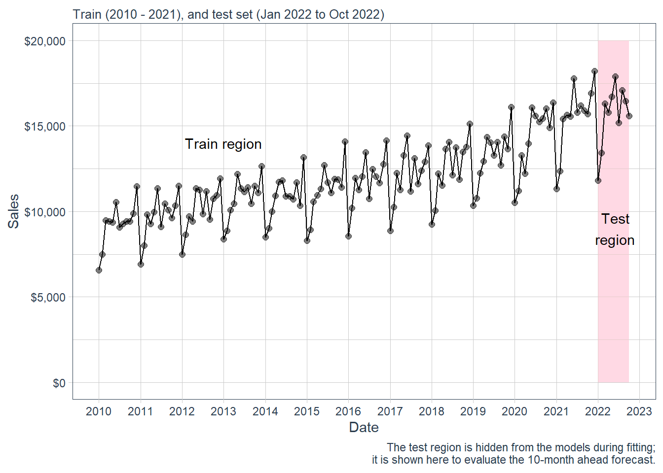
The forecasting task is to predict the 10 months in the test region, from January to October 2022.
Here is a zoom version of the plot above.
Code
beer %>%
  filter(date > as.Date("2020-01-01")) %>%
  ggplot(aes(date, sales)) +
  annotate("text", x = ymd("2020-08-01"), y = 17000,
           color = "black", label = "Train region") +
  geom_rect(xmin = as.numeric(ymd("2022-01-01")),
            xmax = as.numeric(ymd("2022-09-30")), ymin = 0, ymax = 20000,
            alpha = 0.02, fill = "pink") +
  annotate("text", x = ymd("2022-05-01"), y = 14000,
           color = "black", label = "Test region") +
  geom_line(col = "black") +
  geom_point(col = "black", alpha = 0.5, size = 5) +
  theme_tq() +
  scale_x_date(date_breaks = "1 year", date_labels = "%Y") +
  labs(subtitle =
  "Train (2010 - 2021) and test set (Jan 2022 to Oct 2022)",
  x = "Date", y = "Sales",
       caption = "The test region is hidden from the models during fitting;
       it is shown here to evaluate the 10-month ahead forecast.") +
  scale_y_continuous(labels = scales::dollar)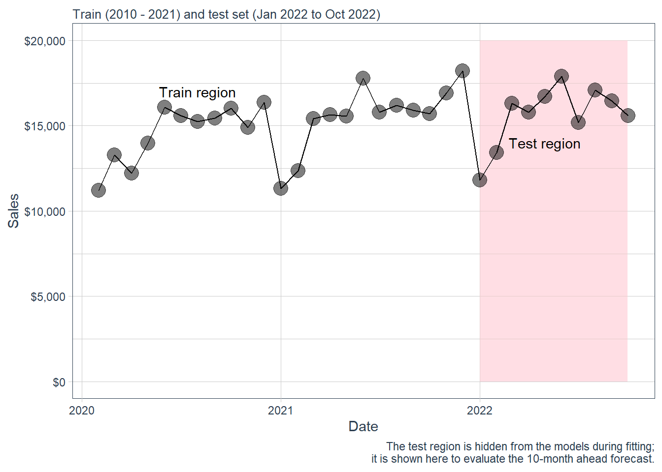
1.4 Time series properties.
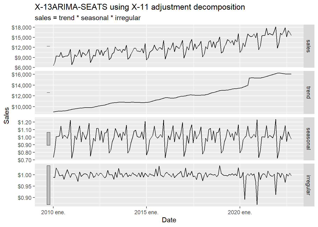
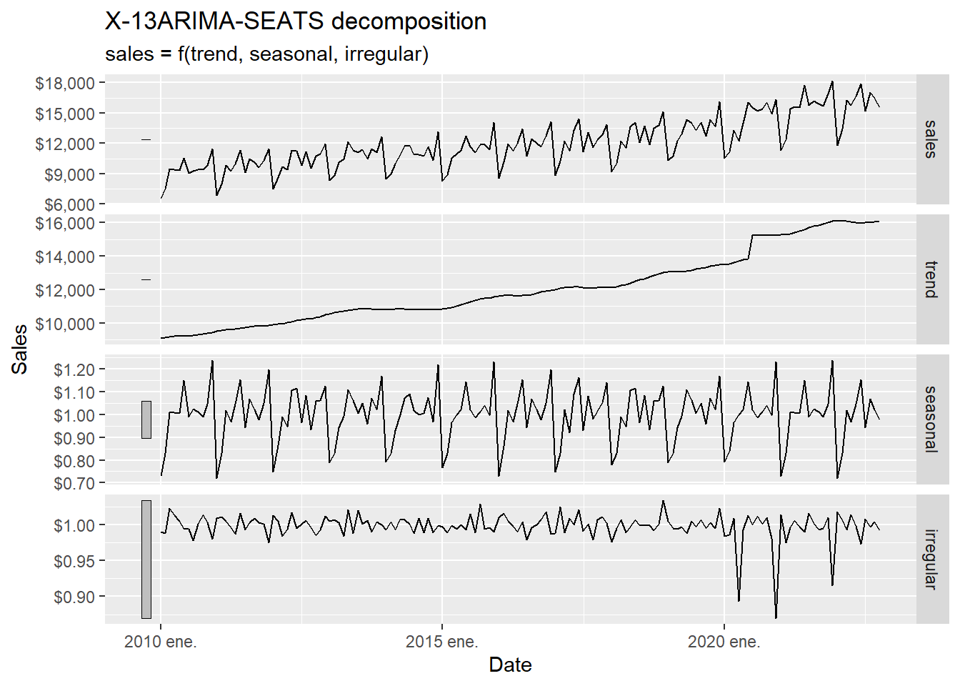
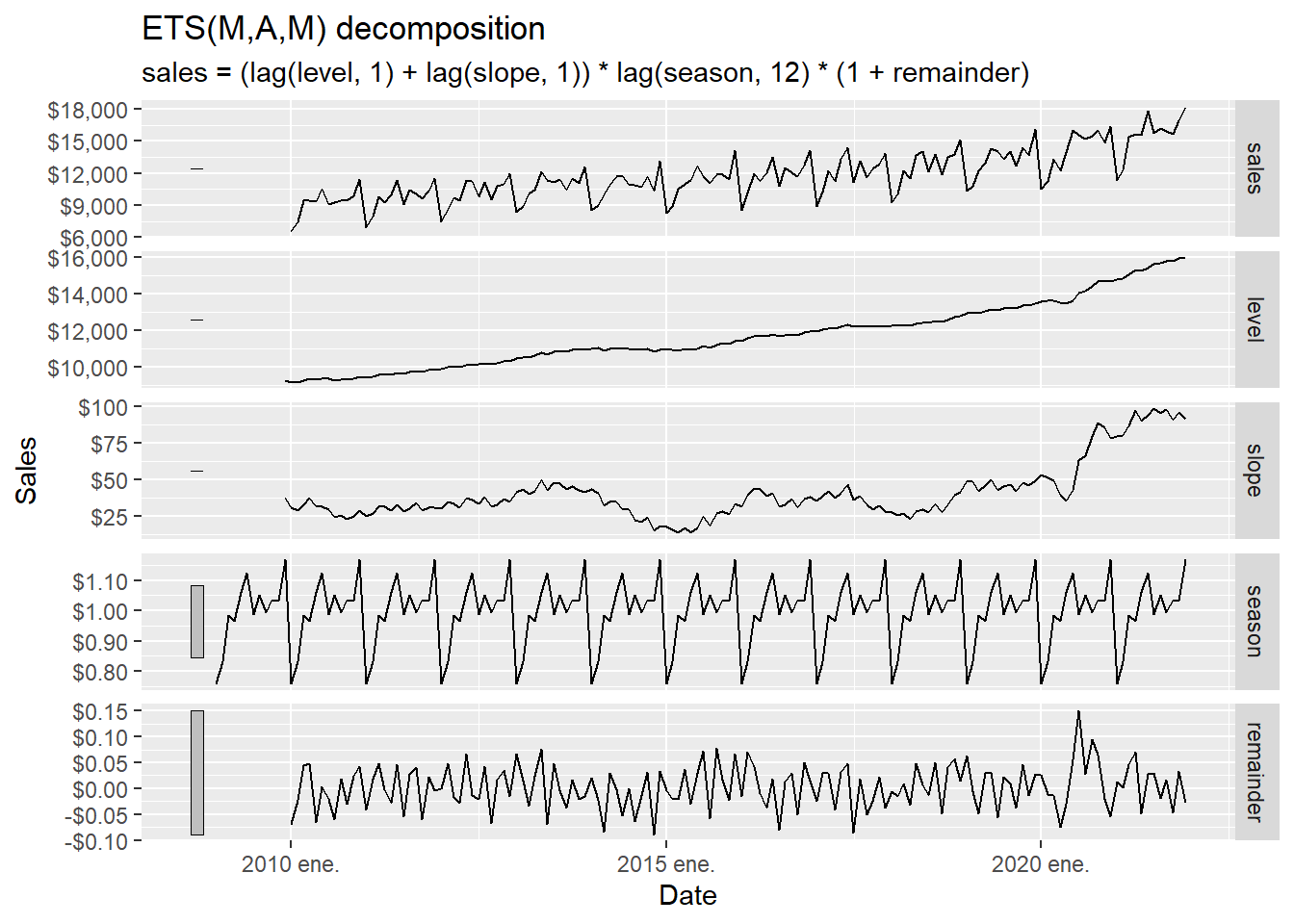
The forecasting techniques should capture the main time-series components, especially trend and seasonality. Here we use the Hyndman and Athanasopoulos (2021) fpp3 package to study those properties before estimating the forecasting models. To use fpp3, we transform beer from a tibble to a tsibble object.
A time series is an ordered process, so the position of each observation is part of the information. For many business series, the observed value can be understood as the combination of three latent components:
\[ y_t = T_t + S_t + R_t \]
in an additive decomposition, or
\[ y_t = T_t \times S_t \times R_t \]
in a multiplicative decomposition. Here, \(T_t\) is the trend-cycle component, \(S_t\) is the seasonal component, and \(R_t\) is the remaining irregular component. The multiplicative version is natural when seasonal movements grow or shrink with the level of the series. In business sales, December seasonality may be larger in dollar terms when the whole series is at a higher level.
The decomposition works as a diagnostic step before forecasting. It tells us what kind of structure a forecast model must explain: long-run movement, repeated monthly seasonality, and unusual shocks.
According to Hyndman and Athanasopoulos (2021), the X-11 method was originated in the US Census Bureau and further developed by Statistics Canada. The decomposition process tends to be highly robust to outliers and level shifts in the time series. The details of the X-11 method are described in Dagum and Bianconcini (2016).
The code below asks X-11 to estimate the unobserved components \(T_t\), \(S_t\), and \(R_t\) from the observed series \(y_t\). The word estimate is important: we observe sales directly. The trend and irregular component are inferred from the observed series using moving averages and seasonal filters.
The decomposition can be read as follows:
| Element | Role |
|---|---|
| Input | The observed monthly sales series \(y_t\). |
| Estimated trend-cycle | The slowly moving component \(T_t\). |
| Estimated seasonality | The recurring monthly pattern \(S_t\). |
| Estimated irregular component | The remaining short-run movement \(R_t\). |
| Use in this chapter | Diagnose what later forecast models need to capture. |
Code
The trend shows a clear change in the first half of 2020. The next table inspects that period directly.
Code
# A tsibble: 8 x 3 [1M]
       date sales  trend
      <mth> <dbl>  <dbl>
1 2020 mar. 13281 13618.
2 2020 abr. 12225 13724.
3 2020 may. 13977 13828.
4 2020 jun. 16065 13914.
5 2020 jul. 15577 15298.
6 2020 ago. 15225 15329.
7 2020 sep. 15446 15338.
8 2020 oct. 16024 15324.
The consumption trend significantly increased from June 2020 to July 2020. It is big enough to create a discontinuity in the trend plot below.
Code
beer_tbls %>%
  model(x11 = X_13ARIMA_SEATS(sales ~ x11())) %>%
  components() %>%
  select(date, trend) %>%
  ggplot(aes(yearmonth(date), trend)) +
  geom_point(alpha = 0.3, size = 4) +
  geom_point(aes(x = yearmonth("2020 jun."), y = 13950.99),
             alpha = 0.3, size = 4, colour = "red") +
  geom_point(aes(x = yearmonth("2020 jul."), y = 15356.13),
             alpha = 0.3, size = 4, colour = "red") +
  labs(y = "Trend", x = "Date") +
  scale_y_continuous(labels = scales::dollar)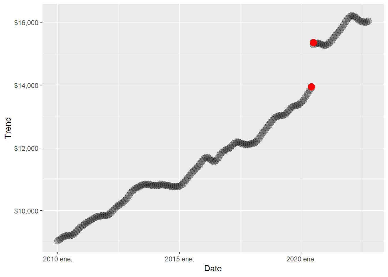
There are also three negative spikes in the irregular component.
Code
# A tsibble: 3 x 3 [1M]
       date sales irregular
      <mth> <dbl>     <dbl>
1 2020 abr. 12225     0.892
2 2020 dic. 16353     0.868
3 2021 dic. 18201     0.912
Code
beer_tbls %>%
  model(x11 = X_13ARIMA_SEATS(sales ~ x11())) %>%
  components() %>%
  select(date, irregular) %>%
  ggplot(aes(yearmonth(date), irregular)) +
  geom_point(alpha = 0.3, size = 4) +
  geom_point(aes(x = yearmonth("2020 apr."), y = 0.8894670),
             alpha = 0.3, size = 4, colour = "red") +
  geom_point(aes(x = yearmonth("2020 dec."), y = 0.8688517),
             alpha = 0.3, size = 4, colour = "red") +
  geom_point(aes(x = yearmonth("2021 dec."), y = 0.9099203),
             alpha = 0.3, size = 4, colour = "red") +
  labs(y = "Irregular", x = "Date") +
  scale_y_continuous(labels = scales::dollar)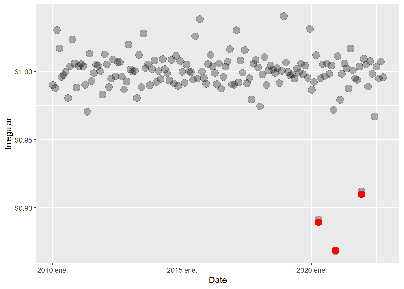
The trend and irregular events are consistent across decomposition techniques. We implement the SEATS decomposition below. SEATS stands for Seasonal Extraction in ARIMA Time Series. According to Hyndman and Athanasopoulos (2021), this procedure was developed at the Bank of Spain, and is now widely used by government agencies around the world. See Dagum and Bianconcini (2016) for further details.
SEATS reaches the same conceptual destination as X-11 through an ARIMA-based route. It starts from an ARIMA representation of the series and decomposes that model into trend-cycle, seasonal, and irregular pieces. In practical terms, this is a useful robustness check. If X-11 and SEATS point to the same relevant events, the conclusion is less likely to be an artifact of one specific decomposition algorithm.
Code
A seasonal plot is similar to a time plot except that the data are plotted against the individual seasons, in this case months, in which the data were observed.
Code
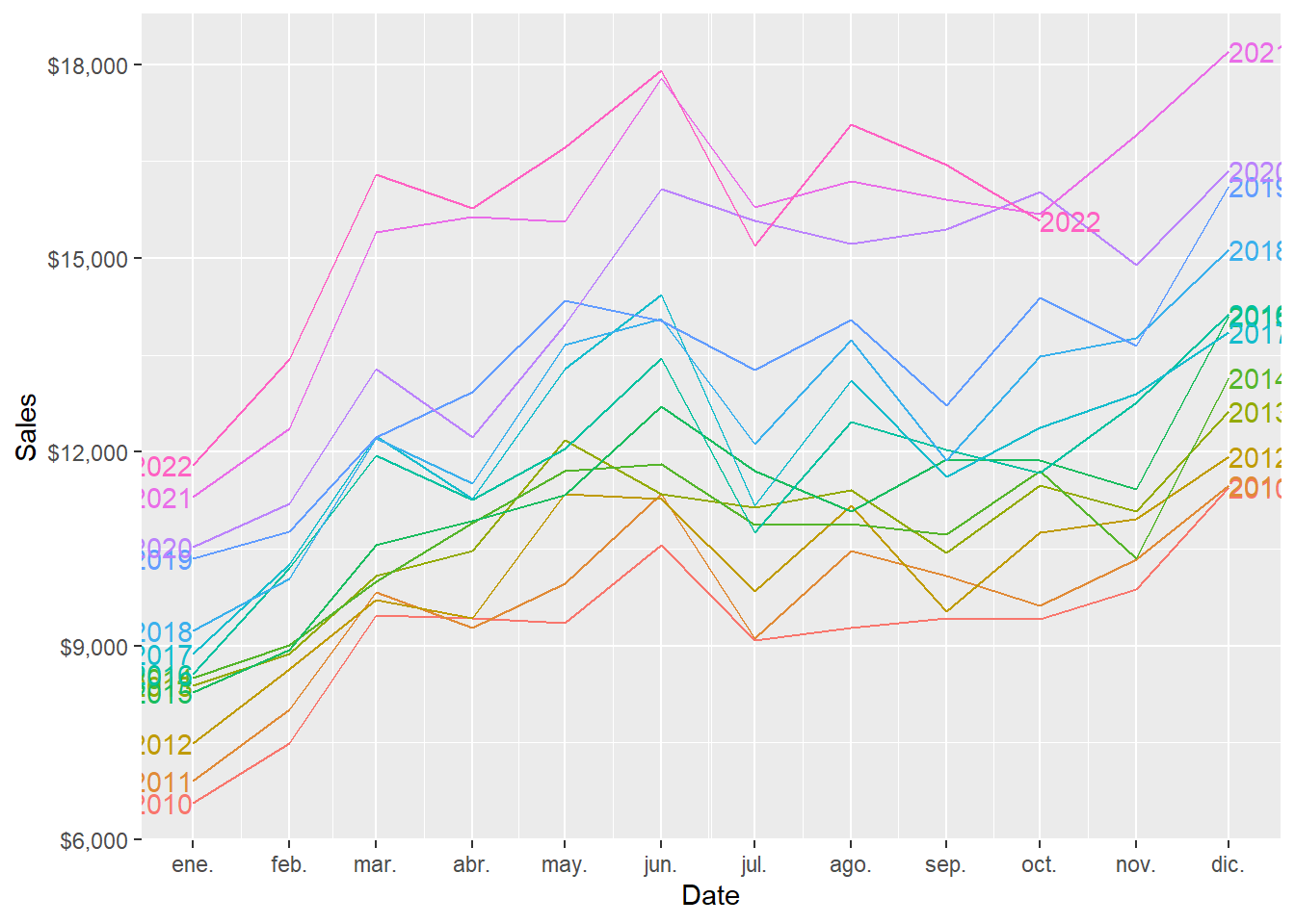
And this is the zoom version of the plot above.
Code
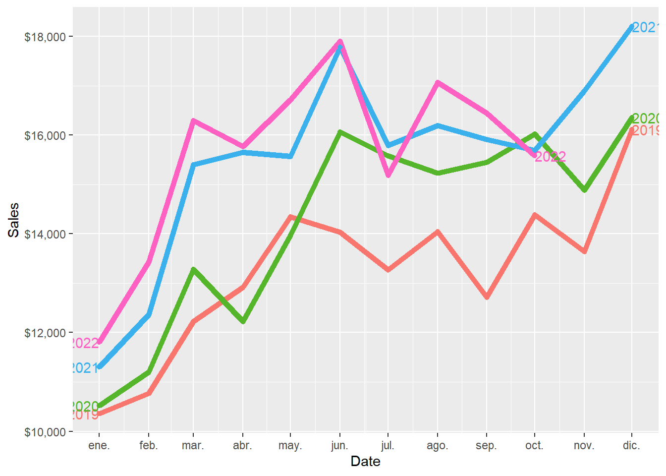
An alternative plot that emphasises the seasonal patterns is where the data for each month are collected together in separate mini time plots.
Code
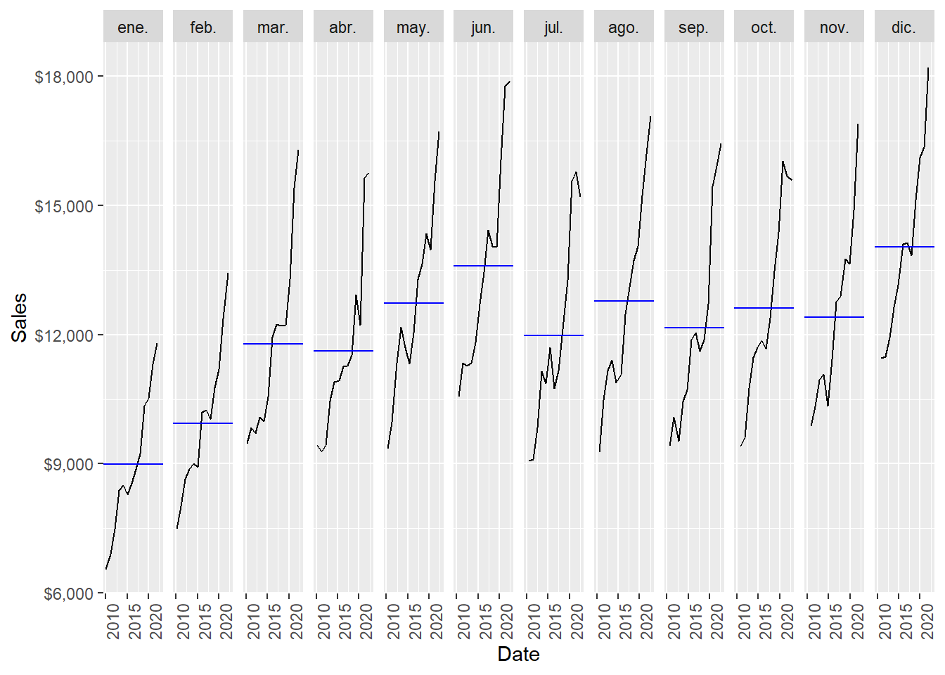
December is the month of the year with the highest average sales, followed by June. January is the month of the year with the lowest average sales, followed by February.
Following Hyndman and Athanasopoulos (2021), just as correlation measures the extent of a linear relationship between two variables, autocorrelation measures the linear relationship between lagged values of a time series. When data have a trend, the autocorrelations for small lags tend to be large and positive because observations nearby in time are also nearby in value. So the ACF of a trended time series tends to have positive values that slowly decrease as the lags increase. When data are seasonal, the autocorrelations will be larger for the seasonal lags (at multiples of the seasonal period, in this case 12) than for other lags.
For lag \(k\), the autocorrelation is the correlation between the series and its own lagged version:
\[ \rho_k = \operatorname{Corr}(y_t, y_{t-k}). \]
The ACF plot estimates \(\rho_k\) for several values of \(k\). If \(\rho_{12}\), \(\rho_{24}\), and \(\rho_{36}\) are relatively large, the plot is telling us that observations twelve, twenty-four, and thirty-six months apart tend to move together. That is the mathematical signature of annual seasonality in monthly data.
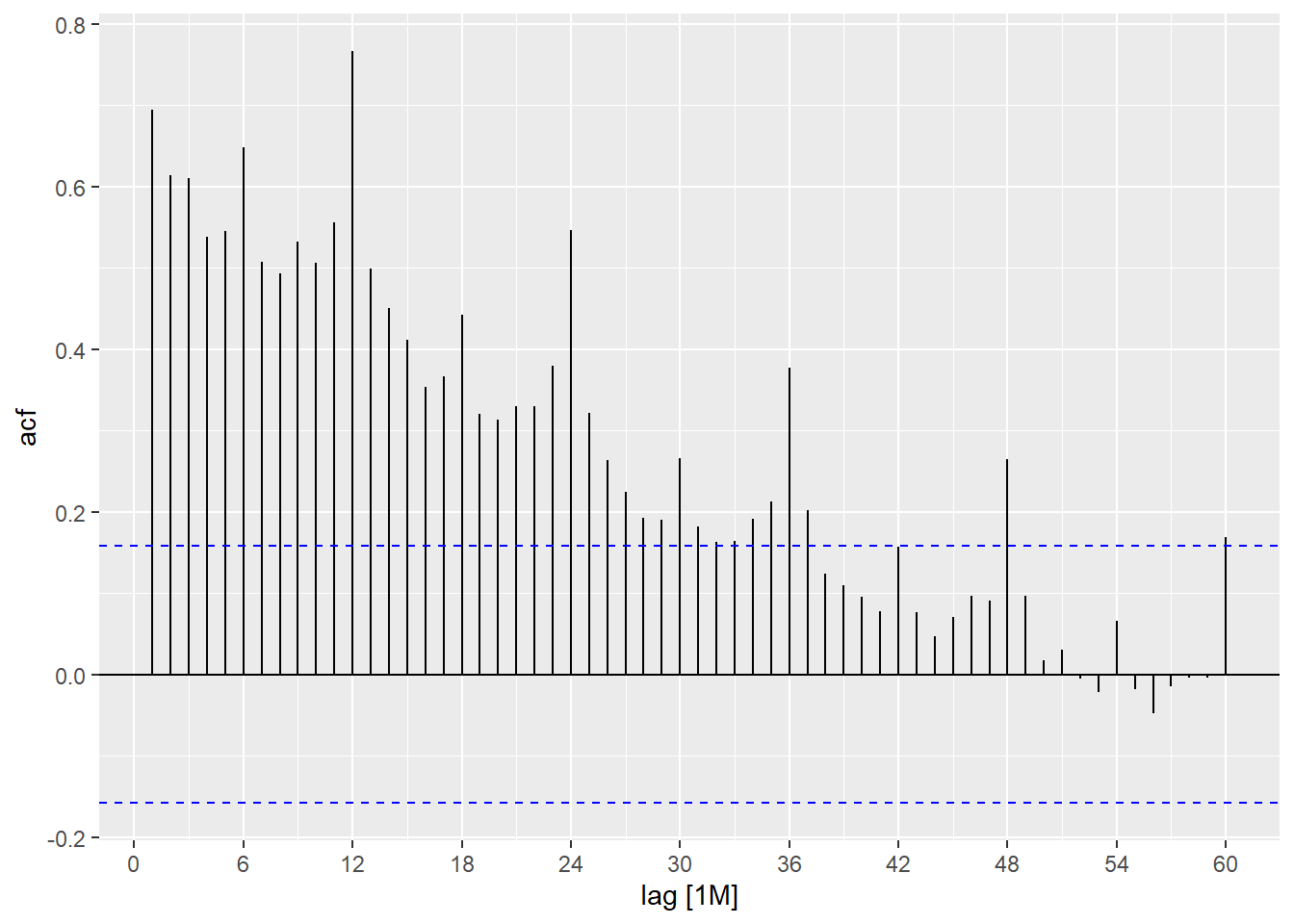
Beer sales is both trended and seasonal. The slow decrease in the ACF as the lags increase is due to the trend, while the scalloped shape is due to the seasonality.
1.5 Forecasts with fpp3.
Here we implement some selected forecast techniques using the Hyndman and Athanasopoulos (2021) fpp3 package. First define the training and test set (2022).
All forecasting methods in this section follow the same logic:
\[ \text{training data} \longrightarrow \text{estimated model} \longrightarrow \text{ten forecasts} \longrightarrow \text{out-of-sample error}. \]
In R, this becomes beer_train %>% model(...) %>% forecast(h = 10), followed by accuracy(..., beer_2022). The syntax is compact, and each step has a clear statistical meaning. The model is fitted using only observations up to December 2021. The forecast is then compared against the ten months in 2022.
1.6 Four simple techniques.
We estimate four simple forecast techniques. The mean method sets every forecast equal to the historical average. The naïve method repeats the last observed value. The seasonal naïve method repeats the last observed value from the same season. The drift method allows the forecasts to increase or decrease along a straight-line trend.
These simple methods are useful because their equations are transparent. Let \(m=12\) be the seasonal period for monthly data.
Mean method:
\[ \hat{y}_{T+h\mid T} = \bar{y} = \frac{1}{T}\sum_{t=1}^{T} y_t. \]
Naïve method:
\[ \hat{y}_{T+h\mid T} = y_T. \]
Seasonal naïve method:
\[ \hat{y}_{T+h\mid T} = y_{T+h-m}, \qquad h=1,\ldots,m. \]
For this chapter, \(h=1,\ldots,10\), so every forecast is copied from the same month in the previous year. The January 2022 forecast is the January 2021 value, the February 2022 forecast is the February 2021 value, and so on.
Drift method:
\[ \hat{y}_{T+h\mid T} = y_T + h\left(\frac{y_T-y_1}{T-1}\right). \]
The drift method is a naïve extension that adds a straight-line slope estimated from the first and last observations in the training sample.
The four formulas can be compared directly:
| Method | Forecast rule | Main idea |
|---|---|---|
| Mean | \(\hat{y}_{T+h\mid T}=\bar{y}\) | Use the historical average for every future month. |
| Naïve | \(\hat{y}_{T+h\mid T}=y_T\) | Repeat the last observed value. |
| Seasonal naïve | \(\hat{y}_{T+h\mid T}=y_{T+h-m}\) | Copy the same month from the previous year. |
| Drift | \(\hat{y}_{T+h\mid T}=y_T+h(y_T-y_1)/(T-1)\) | Extend a straight-line historical slope. |
This table is useful pedagogically because the code below estimates four named models, while the equations show exactly what each model does.
Estimate the four models.
Code
# A tibble: 4 × 2
  .model                 sigma2
  <chr>                   <dbl>
1 fpp3: mean           5430658.
2 fpp3: naïve          3279288.
3 fpp3: seasonal naïve  491364.
4 fpp3: drift          3279288.
The 10-month forecasts.
We compute the MAPE for each forecast rule.
Code
# A tibble: 4 × 2
  .model                MAPE
  <chr>                <dbl>
1 fpp3: seasonal naïve  3.89
2 fpp3: naïve          18.1
3 fpp3: drift          20.9
4 fpp3: mean           23.5
The object beer_fc contains the ten values \(\hat{y}_{T+h\mid T}\) for each model. The object beer_2022 contains the ten realized values \(y_{T+h}\). Therefore, accuracy(beer_fc, beer_2022) performs evaluation only: it compares already-produced forecasts against the holdout sample.
Code
    MAPE
3.889793
The forecast results can be inspected visually.
Code
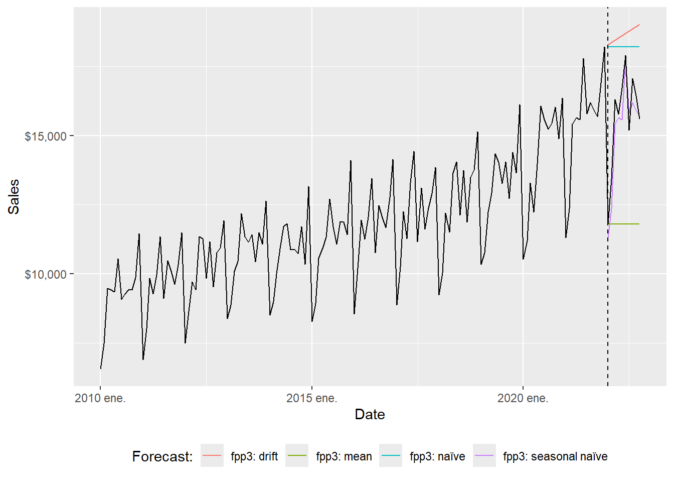
The full-range plot compresses the 2022 comparison. The zoom version focuses on the evaluation window.
Code
beer_zoom <- beer_tbls %>%
  select(date, sales) %>%
  filter_index("2019-12" ~ .)

beer_fc %>%
  autoplot(beer_zoom, level = NULL, lwd = 2)  +
  geom_vline(xintercept = as.Date("2022-01-01"), lty = 2) +
  labs(y = "Sales", x = "Date") +
  guides(colour = guide_legend(title = "Forecast:")) +
  theme(legend.position = "bottom")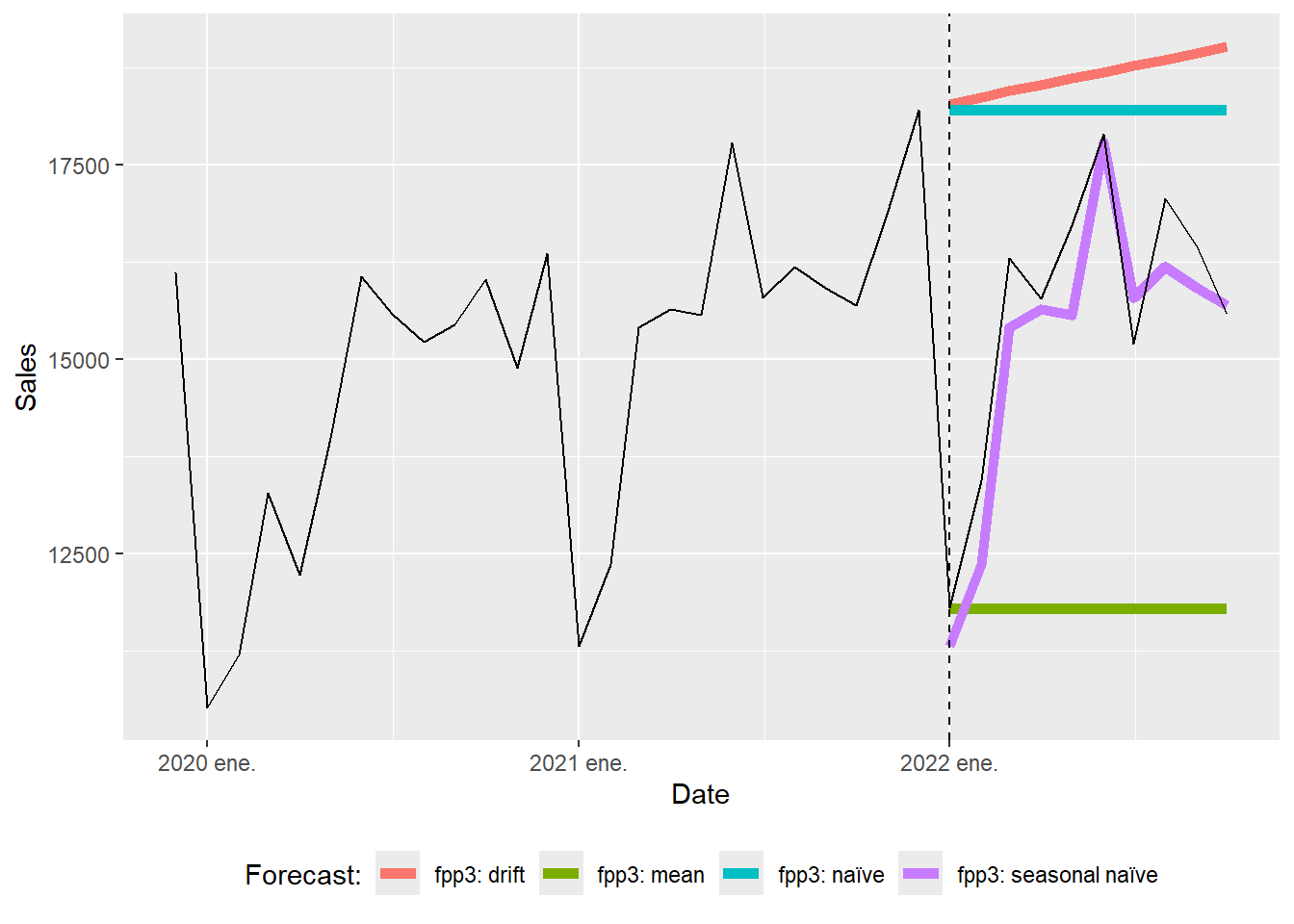
The seasonal naïve forecasts can be inspected separately.
Code
beer_zoom <- beer_tbls %>%
  select(date, sales) %>%
  filter_index("2019-12" ~ .)

beer_sn_fc <- beer_fc %>%
  filter(.model == "fpp3: seasonal naïve")

  ggplot(beer_zoom, aes(yearmonth(date), sales), lwd = 2, alpha = 0.4) +
  geom_line() +
  geom_point(size = 5, color = "black", alpha = 0.5,
             shape = 21, fill = "black") +
  geom_point(aes(y = .mean), size = 5,
             color = "red", alpha = 0.5, shape = 21,
             fill = "red", data = beer_sn_fc) +
  geom_line(aes(y = .mean), color = "red", size = 0.5, data = beer_sn_fc) +
    geom_vline(xintercept = as.numeric(as.Date("2021-12-01")),
               linetype = 2) +
  labs(y = "Sales", x = "Date",
       caption = c(paste("MAPE=",(round(sn_mape, 5))))) +
  theme(legend.position = "bottom") +
    scale_y_continuous(labels = scales::dollar)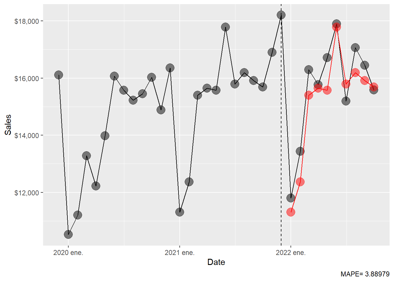
Simple techniques can be strong baselines. A more complex model earns its place only when it improves on these transparent rules.
1.7 Exponential smoothing.
According to Hyndman and Athanasopoulos (2021), forecasts produced using exponential smoothing methods are weighted averages of past observations, with the weights decaying exponentially as the observations get older. In other words, the more recent the observation the higher the associated weight. This framework generates reliable forecasts quickly and for a wide range of time series, which is a great advantage and of major importance to applications in industry.
The simplest exponential smoothing idea can be written as
\[ \ell_t = \alpha y_t + (1-\alpha)\ell_{t-1}, \qquad 0 < \alpha < 1. \]
Here, \(\ell_t\) is the current estimate of the level of the series. A large \(\alpha\) gives more weight to the newest observation; a small \(\alpha\) makes the estimated level move more slowly. ETS extends this idea by estimating a level component, a trend component, a seasonal component, and an error structure.
In this subsection, we let the ETS() function select the model by minimising the AICc.
Series: sales
Model: ETS(M,A,M)
  Smoothing parameters:
    alpha = 0.1602027
    beta  = 0.00961933
    gamma = 0.0001010184

  Initial states:
    l[0]     b[0]     s[0]    s[-1]    s[-2]    s[-3]    s[-4]     s[-5]
 9247.67 37.19533 1.168876 1.031489 1.036782 0.993476 1.051993 0.9885615
    s[-6]    s[-7]     s[-8]     s[-9]    s[-10]    s[-11]
 1.125236 1.062294 0.9661073 0.9855889 0.8314213 0.7581742

  sigma^2:  0.0021

     AIC     AICc      BIC
2536.576 2541.433 2587.063
The ETS(M,A,M) corresponds to a Holt-Winters multiplicative method with multiplicative errors for when seasonal variations are changing proportional to the level of the series. The notation ETS(M,A,M) means:
| Letter | Meaning in this model |
|---|---|
First M |
Multiplicative error: forecast uncertainty is proportional to the level. |
A |
Additive trend: the trend adds or subtracts a roughly constant amount. |
Second M |
Multiplicative seasonality: seasonal effects scale with the level. |
A compact way to read the selected model is
\[ y_t = (\ell_{t-1}+b_{t-1})s_{t-m}(1+\varepsilon_t), \]
where \(\ell_t\) is level, \(b_t\) is trend, \(s_t\) is seasonality, \(m=12\), and \(\varepsilon_t\) is a one-step-ahead innovation. The corresponding point forecast is approximately
\[ \hat{y}_{T+h\mid T} = (\ell_T + h b_T)s_{T+h-m}, \qquad h=1,\ldots,12. \]
The model is transparent once we name its estimated parts: ETS() estimates the level, trend, seasonal states, and smoothing parameters; forecast() advances those states into the ten future months.
Code
The ETS(M,A,M) 10-month forecast.
# A fable: 10 x 4 [1M]
# Key:     .model [1]
   .model          date
   <chr>          <mth>
 1 ETS(sales) 2022 ene.
 2 ETS(sales) 2022 feb.
 3 ETS(sales) 2022 mar.
 4 ETS(sales) 2022 abr.
 5 ETS(sales) 2022 may.
 6 ETS(sales) 2022 jun.
 7 ETS(sales) 2022 jul.
 8 ETS(sales) 2022 ago.
 9 ETS(sales) 2022 sep.
10 ETS(sales) 2022 oct.
# ℹ 2 more variables: sales <dist>, .mean <dbl>
The ETS(M,A,M) MAPE.
Code
  MAPE
3.7717
The ETS(M,A,M) forecast can be plotted against the observed series.
Code
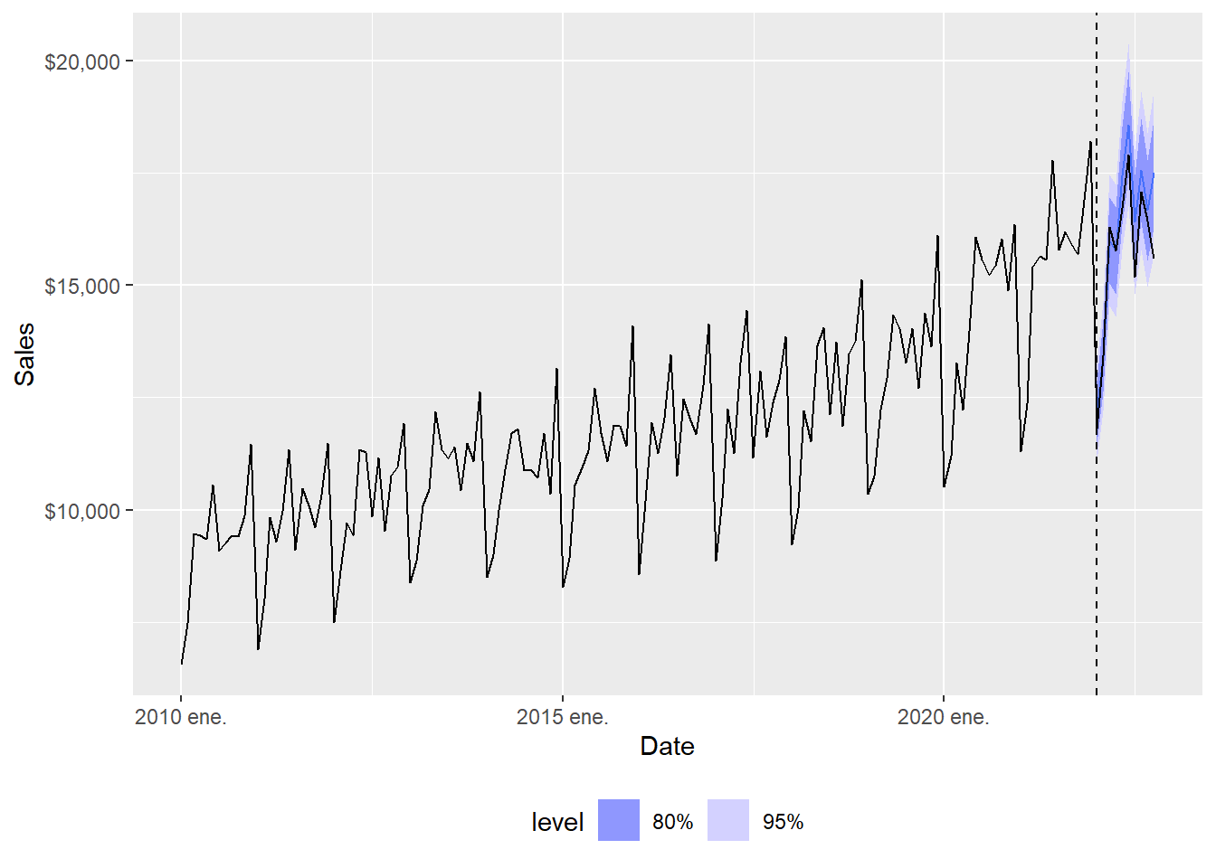
The full-range plot compresses the forecast comparison, so the zoom view is easier to read.
Code
  ggplot(beer_zoom, aes(yearmonth(date), sales), lwd = 2, alpha = 0.4) +
  geom_line() +
  geom_point(size = 5, color = "black", alpha = 0.5,
             shape = 21, fill = "black") +
  geom_point(aes(y = .mean), size = 5,
             color = "red", alpha = 0.5, shape = 21,
             fill = "red", data = beer_ets_fc) +
  geom_line(aes(y = .mean), color = "red", size = 0.5, data = beer_ets_fc) +
  geom_vline(xintercept = as.numeric(as.Date("2021-12-01")),
               linetype = 2) +
  labs(x = "Date", y = "Sales",
       caption = c(paste("MAPE=",(round(ets_mape, 5))))) +
  theme(legend.position = "bottom") +
  scale_y_continuous(labels = scales::dollar)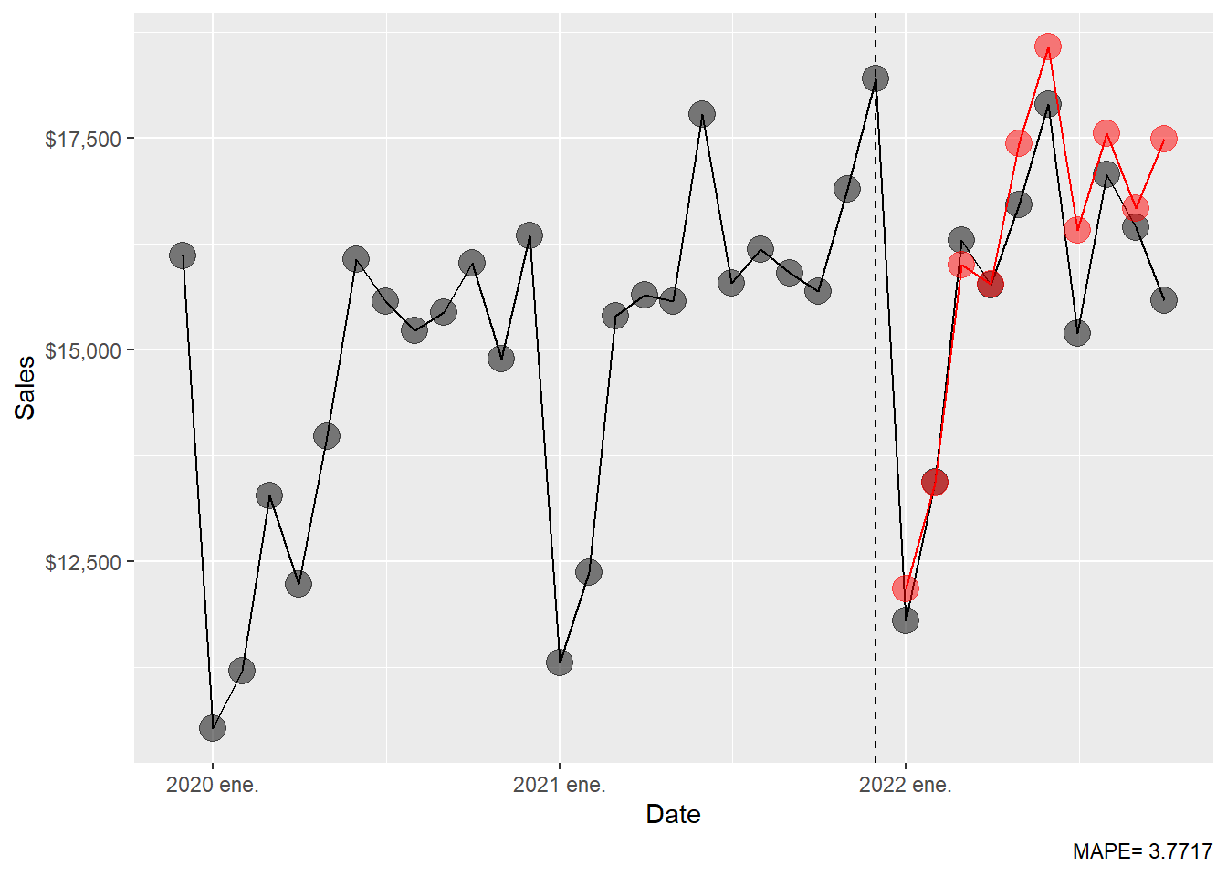
The MAPE table is extended with the ETS result.
1.8 ARIMA.
According to Hyndman and Athanasopoulos (2021), exponential smoothing models emphasize trend and seasonality. ARIMA models emphasize autocorrelation: the way a series is related to its own recent values and recent forecast errors. The ARIMA() function combines unit root tests, AICc minimisation, and maximum likelihood estimation to select an ARIMA model. Setting stepwise = FALSE and approximation = FALSE asks R to run a more exhaustive search.
Following the notation used in Chapter 9 of Hyndman and Athanasopoulos (2021), a non-seasonal ARIMA model is written as
\[ \text{ARIMA}(p,d,q). \]
The three orders have direct meanings:
| Order | Name |
|---|---|
| \(p\) | Autoregressive order |
| \(d\) | Differencing order |
| \(q\) | Moving-average order |
The basic building blocks can be read without compact operator notation. An autoregressive model of order \(p\) uses recent values:
\[ y_t = c+\phi_1y_{t-1}+\phi_2y_{t-2}+\cdots+\phi_py_{t-p}+\varepsilon_t. \]
The coefficient \(\phi_1\) measures how much the previous observation helps explain the current observation after accounting for the other terms. A moving-average model of order \(q\) uses recent forecast errors:
\[ y_t = c+\varepsilon_t+\theta_1\varepsilon_{t-1} \theta_2\varepsilon_{t-2}+\cdots+\theta_q\varepsilon_{t-q}. \]
The coefficient \(\theta_1\) measures how much yesterday’s unexpected shock carries into today’s value. Differencing is the step that turns levels into changes:
\[ y'_t = y_t-y_{t-1}. \]
For monthly data, seasonal ARIMA adds seasonal orders:
\[ \text{ARIMA}(p,d,q)(P,D,Q)_{m}, \]
where \(m=12\) for monthly seasonality. The seasonal orders have parallel meanings:
| Order | Name | What it controls in monthly data |
|---|---|---|
| \(P\) | Seasonal autoregressive order | Dependence on values one or more years apart. |
| \(D\) | Seasonal differencing order | Differences against the same month in a previous year. |
| \(Q\) | Seasonal moving-average order | Dependence on seasonal forecast errors. |
| \(m\) | Seasonal period | The number of observations in one seasonal cycle. Here \(m=12\). |
In words, ARIMA first chooses the amount of ordinary differencing \(d\) and seasonal differencing \(D\). Then it chooses how many lagged values and lagged errors are useful: \(p\), \(q\), \(P\), and \(Q\). The ARIMA() function performs an organized model search: it tries candidate orders, estimates parameters by maximum likelihood, and chooses a specification using AICc.
Code
Series: sales
Model: ARIMA(4,1,1)(0,1,1)[12]

Coefficients:
          ar1      ar2     ar3      ar4      ma1     sma1
      -0.0716  -0.0164  0.2239  -0.3366  -0.7664  -0.6620
s.e.   0.1064   0.1049  0.0962   0.0842   0.0830   0.1049

sigma^2 estimated as 311616:  log likelihood=-1015.88
AIC=2045.75   AICc=2046.66   BIC=2065.88
The selected model is reported by R. In this chapter, the selected specification is ARIMA(4,1,1)(0,1,1)[12]. This can be read piece by piece:
| Part | Meaning in this fitted model |
|---|---|
| \(p=4\) | Use four recent lagged values after differencing. |
| \(d=1\) | Use one ordinary difference to reduce trend. |
| \(q=1\) | Use one recent forecast error. |
| \(P=0\) | No seasonal autoregressive term is selected. |
| \(D=1\) | Use one seasonal difference, comparing a month with the same month one year earlier. |
| \(Q=1\) | Use one seasonal forecast error. |
| \(m=12\) | Monthly data have a twelve-month seasonal cycle. |
The model therefore says: first remove ordinary trend and annual seasonal persistence; then model what remains using four recent values, one recent error, and one seasonal error. That reading is the main pedagogical point. The order notation tells us what information the model uses.
The residuals for the best ARIMA model.
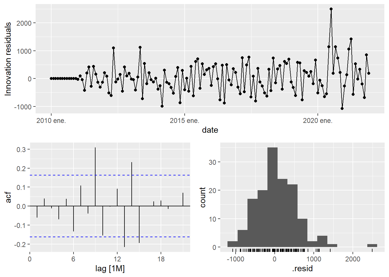
The residual diagnostic is the model audit. For a well-specified ARIMA model, the residuals should behave approximately like white noise:
\[ E(\hat{\varepsilon}_t) \approx 0, \qquad \operatorname{Corr}(\hat{\varepsilon}_t,\hat{\varepsilon}_{t-k}) \approx 0 \quad \text{for } k>0. \]
If the residual ACF still shows strong structure, the model has left predictable information unused. If the residuals look mostly uncorrelated, the model has captured the main time dependence available in the training data.
The forecast for the best ARIMA model.
# A fable: 10 x 4 [1M]
# Key:     .model [1]
   .model          date
   <chr>          <mth>
 1 arima_auto 2022 ene.
 2 arima_auto 2022 feb.
 3 arima_auto 2022 mar.
 4 arima_auto 2022 abr.
 5 arima_auto 2022 may.
 6 arima_auto 2022 jun.
 7 arima_auto 2022 jul.
 8 arima_auto 2022 ago.
 9 arima_auto 2022 sep.
10 arima_auto 2022 oct.
# ℹ 2 more variables: sales <dist>, .mean <dbl>
The ARIMA MAPE.
Code
MAPE
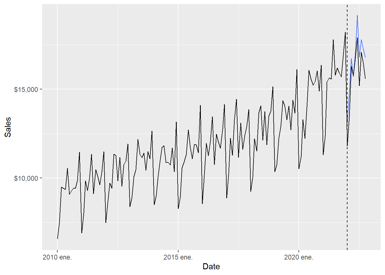
4.401266 The ARIMA forecast results can be inspected visually.
Code
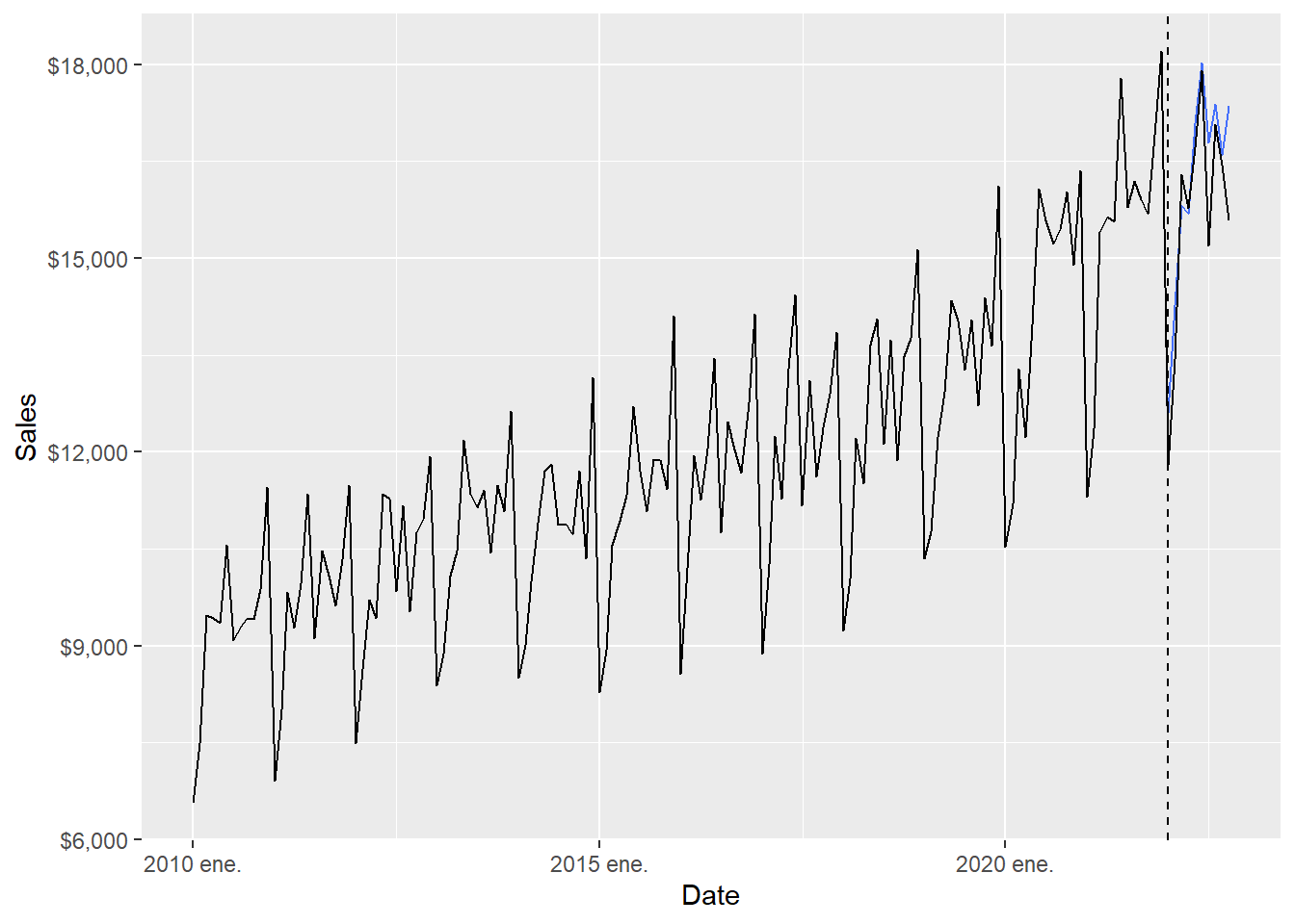
The full-range plot compresses the 2022 comparison. The zoom version focuses on the forecast months.
Code
  ggplot(beer_zoom, aes(yearmonth(date), sales), lwd = 2, alpha = 0.4) +
  geom_line() +
  geom_point(size = 5, color = "black", alpha = 0.5,
             shape = 21, fill = "black") +
  geom_point(aes(y = .mean), size = 5,
             color = "red", alpha = 0.5, shape = 21,
             fill = "red", data = beer_arima_fc) +
  geom_line(aes(y = .mean), color = "red", size = 0.5, data = beer_arima_fc) +
  geom_vline(xintercept = as.numeric(as.Date("2021-12-01")),
               linetype = 2) +
  labs(x = "Date", y = "Sales",
       caption = c(paste("MAPE=",(round(arima_mape, 5))))) +
  theme(legend.position = "bottom") +
  scale_y_continuous(labels = scales::dollar)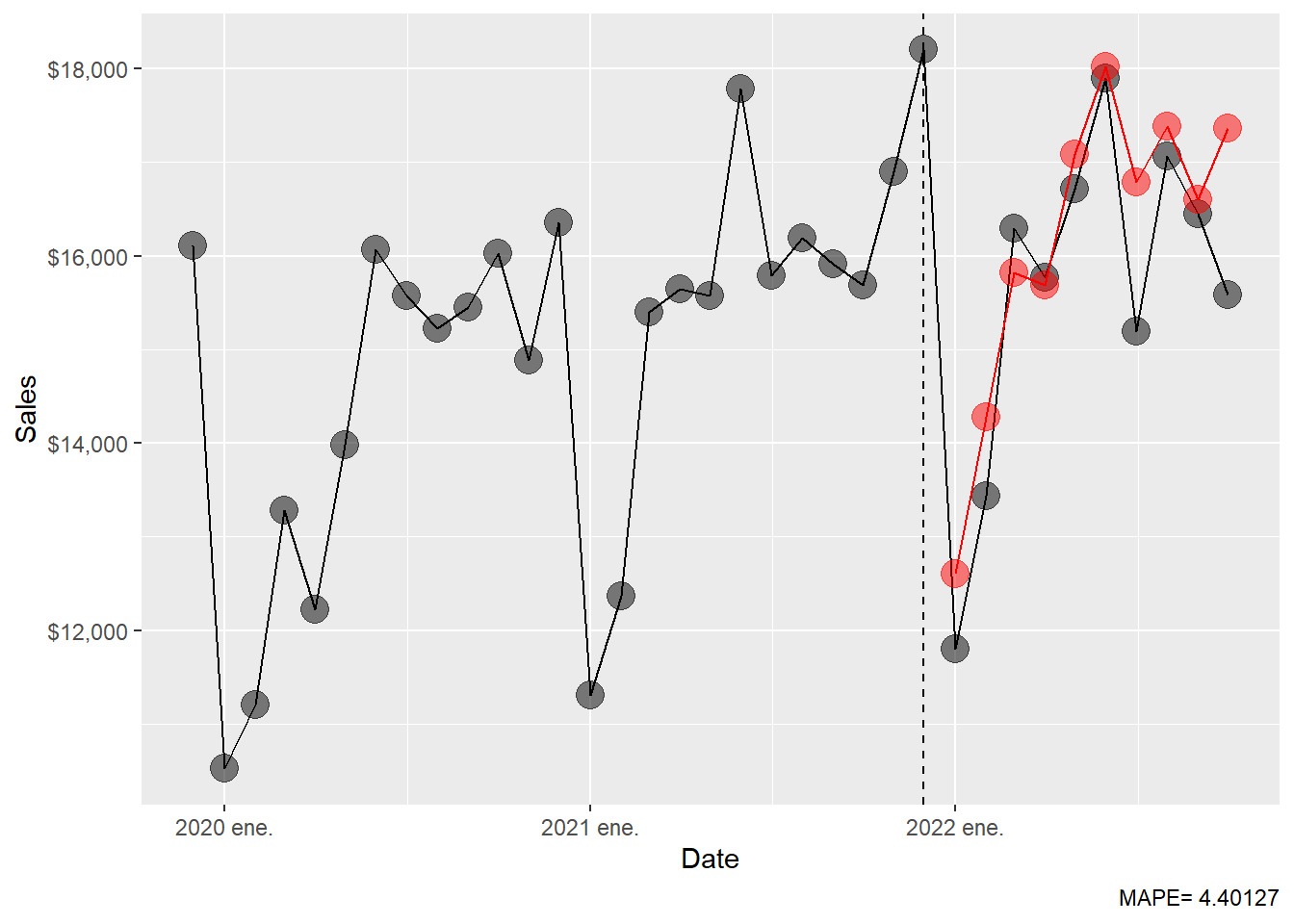
The MAPE table is extended with the ARIMA result.
Code
# A tibble: 6 × 2
  .model                         MAPE
  <chr>                         <dbl>
1 fpp3: ETS(M,A,M)               3.77
2 fpp3: seasonal naïve           3.89
3 fpp3: ARIMA(4,1,1)(0,1,1)[12]  4.40
4 fpp3: naïve                   18.1
5 fpp3: drift                   20.9
6 fpp3: mean                    23.5
The ARIMA result should be interpreted together with the seasonal naïve and ETS results. The test window has only ten months, so small MAPE differences deserve caution. In this render, ETS has a MAPE around 3.77, seasonal naïve around 3.89, and ARIMA around 4.40. That ranking suggests that trend and seasonality explain most of the test period, and that the extra ARIMA autocorrelation structure improves the simple baselines while ETS remains the strongest model in this particular holdout window.
1.9 Neural network.
Neural networks are flexible nonlinear forecasting models. With time series data, lagged values of the series can be used as inputs, just as lagged values appear in a linear autoregression. When a neural network uses autoregressive inputs, we call it a neural network autoregression or NNAR model.
The starting point is still the same forecasting question: can recent history help predict the next value? A linear autoregression answers that question with a weighted sum of lagged observations. A NNAR model allows the weights to interact through hidden units, so the effect of one lag can depend on the values of other lags.
\[ y_t = f(y_{t-1}, y_{t-2}, \ldots, y_{t-p}, y_{t-m}, y_{t-2m}, \ldots) + \varepsilon_t. \]
Here, \(f(\cdot)\) is the forecasting rule learned from the training data. The inputs are lagged sales values. For example, \(y_{t-1}\) is last month’s sales and \(y_{t-12}\) is sales in the same month one year earlier.
With one hidden layer, a neural network forecast can be described in three stages. First, the model forms an input vector \(x_t\) from lagged sales values. Second, each hidden unit combines those inputs and passes the result through a nonlinear function. Third, the output layer combines the hidden units into the forecast:
\[ f(x_t) = w_0 + \sum_{j=1}^{k} w_j \sigma(a_j + v_j^\top x_t), \]
where \(x_t\) is the vector of lagged inputs, \(k\) is the number of hidden units, \(\sigma(\cdot)\) is the nonlinear activation function, and the weights \(w_j\), \(a_j\), and \(v_j\) are estimated from the training data.
The equation can be read as a recipe:
| Component | Plain-language role |
|---|---|
| \(x_t\) | The lagged sales values available before the forecast is made. |
| \(v_j^\top x_t\) | A weighted summary of those lagged values for hidden unit \(j\). |
| \(\sigma(\cdot)\) | A nonlinear transformation that allows curved relationships. |
| \(w_j\) | The weight assigned to hidden unit \(j\) in the final forecast. |
| \(k\) | The number of hidden units, which controls flexibility. |
The audit question for NNAR is therefore simple: what information enters the model? In this chapter, the NNAR model receives lagged sales values only. Future test values, external regressors and hand-adjusted forecasts stay outside the model.
Series: sales
Model: NNAR(15,1,8)[12]

Average of 20 networks, each of which is
a 15-8-1 network with 137 weights
options were - linear output units

sigma^2 estimated as 1138
The reported model is NNAR(15,1,8)[12]. This notation can be read as follows:
| Part | Meaning |
|---|---|
| 15 | The model uses recent non-seasonal lag information up to 15 months. |
| 1 | The model also includes one seasonal lag structure for monthly data. |
| 8 | The hidden layer has 8 units. |
| [12] | The seasonal cycle has 12 months. |
In plain language, NNETAR() learns a nonlinear forecasting rule from recent monthly history and annual seasonal history.
The calculation can be read in four steps:
| Step | Interpretation |
|---|---|
| Build inputs | Collect recent lags and seasonal lags of sales. |
| Hidden layer | Combine those lags into \(k=8\) nonlinear summaries. |
| Output layer | Combine the nonlinear summaries into one forecast. |
| Evaluation | Compare the ten forecasted values with the ten 2022 observations. |
The forecast for the best NNAR model.
# A fable: 10 x 4 [1M]
# Key:     .model [1]
   .model             date        sales  .mean
   <chr>             <mth>       <dist>  <dbl>
 1 NNETAR(sales) 2022 ene. sample[5000] 13103.
 2 NNETAR(sales) 2022 feb. sample[5000] 14773.
 3 NNETAR(sales) 2022 mar. sample[5000] 16721.
 4 NNETAR(sales) 2022 abr. sample[5000] 15705.
 5 NNETAR(sales) 2022 may. sample[5000] 17027.
 6 NNETAR(sales) 2022 jun. sample[5000] 19154.
 7 NNETAR(sales) 2022 jul. sample[5000] 16794.
 8 NNETAR(sales) 2022 ago. sample[5000] 17780.
 9 NNETAR(sales) 2022 sep. sample[5000] 17238.
10 NNETAR(sales) 2022 oct. sample[5000] 16788.
The NNAR MAPE.
Code
    MAPE
6.020197
The NNAR forecast results can be inspected visually.
Code
The full-range plot compresses the 2022 comparison. The zoom version focuses on the forecast months.
Code
  ggplot(beer_zoom, aes(yearmonth(date), sales), lwd = 2, alpha = 0.4) +
  geom_line() +
  geom_point(size = 5, color = "black", alpha = 0.5,
             shape = 21, fill = "black") +
  geom_point(aes(y = .mean), size = 5,
             color = "red", alpha = 0.5, shape = 21,
             fill = "red", data = beer_nnet_fc) +
  geom_line(aes(y = .mean), color = "red", size = 0.5, data = beer_nnet_fc) +
  geom_vline(xintercept = as.numeric(as.Date("2021-12-01")),
               linetype = 2) +
  labs(x = "Date", y = "Sales",
       caption = c(paste("MAPE=",(round(nnet_mape, 5))))) +
  theme(legend.position = "bottom") +
  scale_y_continuous(labels = scales::dollar)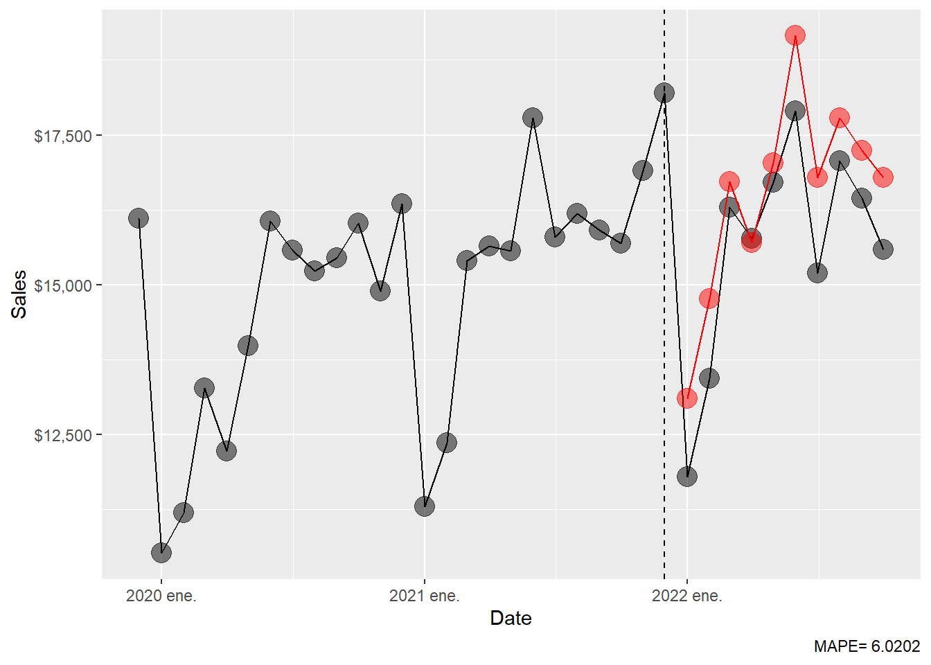
The MAPE table is extended with the NNAR result.
Code
# A tibble: 7 × 2
  .model                         MAPE
  <chr>                         <dbl>
1 fpp3: ETS(M,A,M)               3.77
2 fpp3: seasonal naïve           3.89
3 fpp3: ARIMA(4,1,1)(0,1,1)[12]  4.40
4 fpp3: NNAR(15,1,8)[12]         6.02
5 fpp3: naïve                   18.1
6 fpp3: drift                   20.9
7 fpp3: mean                    23.5
The NNAR result is informative even though it ranks below ETS, seasonal naïve and ARIMA in this holdout period. Its MAPE is around 8.79. This tells us that the added nonlinear flexibility produced weaker 2022 forecasts for this short test window. A useful teaching point follows: a flexible model can learn complicated patterns, yet forecasting performance still depends on whether those patterns persist into the holdout period.
The final table is an empirical comparison over one specific holdout window. The mathematical object being compared is always the same:
\[ \left\{ \hat{y}_{T+1\mid T}, \hat{y}_{T+2\mid T}, \ldots, \hat{y}_{T+10\mid T} \right\}. \]
What changes from row to row is the rule used to generate those ten forecasts. The seasonal naïve method copies the previous year’s monthly pattern; ETS updates level, trend, and seasonality through smoothing equations; ARIMA models autocorrelation after differencing; NNAR learns a nonlinear function of lagged observations. The MAPE table is therefore the last step in a complete chain: model assumption, estimated parameters, forecast values, forecast errors, and summary accuracy.
The main empirical interpretation is that the strong seasonal structure of the series is central. Seasonal naïve already performs well, which means that copying last year’s monthly pattern is a serious benchmark. ETS improves slightly by updating level, trend and seasonality. ARIMA also performs well, suggesting that differencing and autocorrelation help, although the selected ARIMA model is a little less accurate than ETS here. NNAR is more flexible, yet its holdout error is larger in this example. For students, the lesson is direct: out-of-sample error is the criterion that disciplines model complexity.