3 The Merton model
The Merton model is useful when we are interested in evaluating the credit risk of public firms. Let \(T\) denote the debt maturity date, \(D\) the promised debt payment due at that date, and \(V_T\) the value of the firm’s assets at maturity. In Merton, default occurs at \(T\) if the firm does not have enough asset value to cover the promised debt payment:
\[ V_T<D. \]
Here, \(D\) is the promised debt payment due at maturity. The current market value of debt is a different object. The distinction is essential because \(D\) is the default boundary. It is the amount the firm must be able to pay at \(T\). In Merton, the market value of debt today can be inferred after valuing the firm’s claims, for example as the difference between the asset value \(V_0\) and the equity value \(E_0\).
The model estimates how likely that event is, under the model assumptions, and it also produces other credit-risk quantities. The relevant object is a probability assigned to a future event. In this setting, a single firm defaults once or survives over the horizon, so Merton treats default as a future event and asks how much probability the model assigns to \(V_T<D\). The model can be used as a tool to evaluate changes in the firm’s balance sheet and to understand how those changes affect credit risk.
A direct empirical route would be to estimate default probability from many comparable firms. We could collect firms with similar sector, leverage, rating, maturity, and macroeconomic conditions, and then calculate the fraction that defaulted over the relevant horizon. That approach is useful when a large and reliable historical sample exists. It produces a real-world or physical default probability, an estimate of how often similar firms default.
Merton follows a different route. Instead of starting from thousands of historical default observations, it starts from a small set of market-based inputs for one public firm. These inputs are equity value, equity volatility, promised debt payment, maturity, and the risk-free rate. They are market signals that contain current information about the firm’s capital structure and market risk.
The advantage is that Merton produces a firm-specific, market-implied measure of default risk. If equity value falls, equity volatility rises, promised debt increases, or maturity changes, the model-implied probability of default responds directly. A historical default frequency from comparable firms can be useful, but it is an average across past firms and past conditions. Merton gives a forward-looking pricing measure for the firm being analyzed.
The Merton probability of default in this chapter is risk-neutral. It is the probability assigned to default states by the pricing model. For pricing credit-risk claims, that market-implied probability is exactly the object we need. For forecasting realized default frequencies, we would need an additional real-world calibration.
The philosophy of these models goes back to Black and Scholes (1973), Merton (1973) and Merton (1974). They treat the firm’s financial claims, especially equity and debt, as contingent claims written on the assets of the firm. A contingent claim is a financial claim whose payoff depends on what happens to an underlying variable. In Merton, the underlying variable is the future value of the firm’s assets, \(V_T\). The assets are the underlying source of value; equity and debt are the claims whose payoffs depend on whether \(V_T\) is above or below the promised debt payment \(D\).
The same structural-credit language remains active. Recent research extends structural models by allowing the firm’s debt policy, and therefore the default boundary, to move over time; moving boundaries change predicted credit spreads (Feldhütter and Schaefer 2023). In industry practice, Moody’s 2025 EDF-X example shows the related use of forward-looking PD signals to identify credit deterioration before a bankruptcy event (Moody’s 2025). This chapter keeps the classic Merton model because it makes the core objects visible. Those objects are asset value, promised debt payment, asset volatility, distance to default, and the conversion from those objects to a model-implied PD.
The route through the chapter is deliberately sequential. First, we replicate Hull’s Merton equations and solve for the unobserved asset value \(V_0\) and asset volatility \(\sigma_V\). Second, we connect the fitted model to the risk-neutral default probability \(N(-d_2)\). Third, we simulate risk-neutral asset paths to make the terminal-default event visible. Fourth, we read equity as a call option on the firm’s assets. Finally, we use sensitivity and capital-structure scenarios to ask how changes in equity value, volatility, promised debt payment, maturity, and the risk-free rate affect the model-implied probability of default.
The chapter starts with the actual Merton mechanism. Equity value is observed in the market, but the market value and volatility of the firm’s assets are not observed directly. Merton uses the option-pricing relationship between equity and assets as a calibration equation. Once \(V_0\) and \(\sigma_V\) have been inferred, the model can assign probability to the future default event \(V_T<D\).
3.1 Estimating asset value and risk-neutral PD
Inputs and Hull equations
We use Example 24.3 in (Hull 2022). The observed inputs are \(E_0=3\), \(\sigma_E=0.8\), \(rf=0.05\), \(T=1\), and \(D=10\). Here, \(D\) is the promised debt payment due at maturity. The current market value of debt is a different quantity. Using these inputs, we estimate the value of the assets today, \(V_0\), and the volatility of the assets, \(\sigma_V\). Those estimated asset quantities are then used to calculate the Merton risk-neutral probability of default \(pd\), among other results.
The risk-free rate appears here because equation 24.3 is a valuation equation. We are not assuming that the firm’s assets truly earn the risk-free rate in the real world. We are valuing equity under the risk-neutral measure, which is the same logic used to price a European call option. In that artificial valuation world, default is still the event \(V_T < D\). After estimating \(V_0\) and \(\sigma_V\), we will write the risk-neutral probability of that event as \(N(-d_2)\).
In this section, probability of default means the model-implied risk-neutral default probability unless stated otherwise.
These are the known parameters.
The reason \(V_0\) and \(\sigma_V\) are difficult is that neither is directly observed. Hull’s example uses two observable equity quantities, \(E_0\) and \(\sigma_E\), to infer them. We therefore replicate equations 24.3 and 24.4 from (Hull 2022) before translating them into R.
The first equation comes from the payoff of equity at maturity. If the firm’s assets are worth more than the promised debt payment, equity receives the residual value. If the firm’s assets are worth less than the promised debt payment, equity receives zero:
\[ E_T=\max(V_T-D,0). \]
Equation 24.3 is the closed-form value of that payoff. It is the risk-neutral expected equity payoff, discounted at the risk-free rate. In other words, the observed market value of equity today must equal the model value of the equity claim on the firm’s assets.
\[ E_0 = V_0N(d_1)-De^{-rT}N(d_2). \tag{24.3} \]
The terms \(d_1\) and \(d_2\) are:
\[ d_1 = \frac{\ln(V_0/D)+\left(r+\sigma_V^2/2\right)T} {\sigma_V\sqrt{T}}, \qquad d_2=d_1-\sigma_V\sqrt{T}. \]
Here \(N(\cdot)\) is the cumulative standard normal distribution. In the code, Hull’s \(r\) is our rf. This equation says that, given an asset value \(V_0\) and asset volatility \(\sigma_V\), the option-pricing formula must reproduce the observed equity value \(E_0\).
The two normal terms do not play the same role. In this chapter, \(N(d_2)\) will become the survival probability under the risk-neutral distribution, so \(N(-d_2)\) will be the risk-neutral default probability. The term \(N(d_1)\) enters through the sensitivity of equity value to the firm’s asset value.
Hull obtains equation 24.4 from Itô’s lemma. It links the observed equity volatility to the unobserved asset volatility:
\[ \sigma_E E_0 = \frac{\partial E}{\partial V}\sigma_V V_0 = N(d_1)\sigma_V V_0. \tag{24.4} \]
This equation is needed because equity is levered. Equity volatility is usually higher than asset volatility, and the scaling depends on the option delta \(N(d_1)\) and on the ratio between asset value and equity value. Together, equations 24.3 and 24.4 give two conditions for the two unknowns, \(V_0\) and \(\sigma_V\). The code below writes each condition as an error. The numerical solution is the pair \((V_0,\sigma_V)\) that makes both errors as close to zero as possible.
To make the link with the code explicit, define the error from equation 24.3 as
\[ F(V_0,\sigma_V) = V_0N(d_1)-De^{-rT}N(d_2)-E_0, \]
and the error from equation 24.4 as
\[ G(V_0,\sigma_V) = N(d_1)\sigma_V V_0-\sigma_EE_0. \]
The target is not to make one equation fit while ignoring the other. We want both errors to be close to zero at the same time. Hull’s footnote 10 implements that idea by minimizing the sum of squared errors:
\[ \min_{V_0,\sigma_V} \left[ F(V_0,\sigma_V)^2+G(V_0,\sigma_V)^2 \right]. \]
This is exactly what the R function min.footnote10() computes below.
The numerical search also needs starting values. These starting values give the algorithm an economically sensible place to begin. For \(V_0\), we start with equity value plus the risk-free present value of the promised debt payment, \(E_0+De^{-rfT}\). This is a starting scale for the unobserved asset value, not an assumption that debt is risk-free. For \(\sigma_V\), we use a simple deleveraging guess, \(\sigma_E E_0/(E_0+De^{-rfT})\), because asset volatility is usually lower than equity volatility when equity is levered.
Solving the two Merton equations
The optimizer is then run with L-BFGS-B and positive lower bounds. This keeps both \(V_0\) and \(\sigma_V\) in economically meaningful territory during the search. Because \(V_0\) is measured in units of value while \(\sigma_V\) is a decimal volatility, the code also gives optim() scale information for the numerical search.
Code
start_V0 <- E0 + D * exp(-rf * TT)
start_sv <- se * E0 / start_V0

d1_merton <- function(V0, sv) {
  (log(V0 / D) + (rf + sv^2 / 2) * TT) / (sv * sqrt(TT))
}

d2_merton <- function(V0, sv) {
  d1_merton(V0, sv) - sv * sqrt(TT)
}

eq24.3 <- function(V0, sv) {
  V0 * pnorm(d1_merton(V0, sv)) -
    D * exp(-rf * TT) * pnorm(d2_merton(V0, sv)) -
    E0
}

eq24.4 <- function(V0, sv) {
  pnorm(d1_merton(V0, sv)) * sv * V0 - se * E0
}

# Footnote 10 indicates that we should minimize F(x,y)^2+G(x,y)^2
min.footnote10 <- function(x)
  (eq24.3(x[1], x[2]))^2 + (eq24.4(x[1], x[2]))^2
# The minimization leads to the values of V0 and sv.
V0_sv <- optim(
  par = c(V0 = start_V0, sv = start_sv),
  fn = min.footnote10,
  method = "L-BFGS-B",
  lower = c(V0 = 1e-6, sv = 1e-6),
  control = list(
    parscale = c(V0 = 10, sv = 0.2),
    ndeps = c(V0 = 1e-6, sv = 1e-8)
  )
)
# Define the values as parameters.
V0 <- unname(V0_sv$par["V0"])
sv <- unname(V0_sv$par["sv"])
The optimizer therefore starts at
\[ V_0^{start} =E_0+De^{-rT} =12.5123, \]
and
\[ \sigma_V^{start} = \frac{\sigma_EE_0}{E_0+De^{-rT}} =0.1918. \]
These are only starting values. The final estimates are allowed to move away from them when the optimizer minimizes \(F(V_0,\sigma_V)^2+G(V_0,\sigma_V)^2\).
The optimizer returns the following Merton asset estimates:
\[ \widehat{V}_0=12.3954, \qquad \widehat{\sigma}_V=0.2123047 =21.2305%. \]
These two estimates are the bridge to the rest of the section. First, \(V_0\) and \(\sigma_V\) determine the risk-neutral default weight \(N(-d_2)\). Then they imply the market value of debt, which lets us infer the Merton-implied bond yield spread.
From \(d_2\) to the risk-neutral PD
Calculate the Merton risk-neutral probability of default as a function of \(V_0\) and \(\sigma_V\). In Hull’s notation, this probability is \(N(-d_2)\). The next paragraphs unpack what that notation means.
Code
PD <- function(V0, sv) {
  pnorm(-(((log(V0 / D) + (rf + sv^2 / 2) * TT) /
             (sv * sqrt(TT))) - sv * sqrt(TT))) }
# Calculate the risk-neutral probability of default given the previous parameters.
pd <- PD(V0, sv)
knitr::kable(
  data.frame(
    Quantity = c(
      "Estimated asset value",
      "Estimated asset volatility",
      "Merton risk-neutral PD"
    ),
    Value = c(
      fmt_num(V0, 4),
      fmt_pct(sv, 4),
      fmt_pct(pd, 4)
    )
  ),
  caption = "Estimated Merton asset value, asset volatility, and risk-neutral default probability.",
  row.names = FALSE
)| Quantity | Value |
|---|---|
| Estimated asset value | 12.3954 |
| Estimated asset volatility | 21.2305% |
| Merton risk-neutral PD | 12.6971% |
The risk-neutral probability of default is 0.1269712, or 12.6971%. This number is market-implied by the option-pricing structure of the model. It answers a pricing question. Under the risk-neutral distribution used to value equity, how much weight is assigned to default states? A direct historical or real-world default probability would require a separate calibration from risk-neutral probabilities to real-world probabilities.
The next table isolates \(d_1\), \(d_2\), \(N(d_1)\) and \(N(d_2)\) so we can connect the formula to the default region.
Code
# Inspect the role of d and N(d).
d1 <- d1_merton(V0, sv)
d2 <- d2_merton(V0, sv)
Nd1 <- pnorm(d1)
Nd2 <- pnorm(d2)
merton_d_table <- data.frame(
  Quantity = c("$d_1$", "$N(d_1)$", "$d_2$", "$N(d_2)$", "$N(-d_2)$"),
  Value = c(
    fmt_num(d1, 7),
    fmt_num(Nd1, 7),
    fmt_num(d2, 7),
    fmt_num(Nd2, 7),
    fmt_num(pd, 7)
  )
)

knitr::kable(
  merton_d_table,
  caption = "The d-values and normal probabilities behind the Merton PD.",
  escape = FALSE,
  row.names = FALSE
)| Quantity | Value |
|---|---|
| \(d_1\) | 1.3531304 |
| \(N(d_1)\) | 0.9119930 |
| \(d_2\) | 1.1408256 |
| \(N(d_2)\) | 0.8730288 |
| \(N(-d_2)\) | 0.1269712 |
Before connecting this result with the figure, unpack the notation. The symbol \(N(\cdot)\) means the cumulative standard normal distribution. In plain words, \(N(x)\) is the area to the left of \(x\) under the standard normal curve. The value \(d_2\) comes from the Black-Scholes-Merton formula. In this chapter, \(d_2\) has a concrete credit-risk role. After the model writes future asset values in standard normal units, \(d_2\) determines the cutoff between survival and default.
The default condition remains the original Merton condition:
\[ V_T<D. \]
The formula converts that asset-value condition into standard normal units:
\[ Z<-d_2. \]
This is only a change of scale. We read the same future-asset event in standard normal units. Survival corresponds to the right-tail region, and default corresponds to the left-tail region. The survival probability under the risk-neutral distribution is
\[ P^Q(V_T>D)=N(d_2), \]
and the default probability is
\[ P^Q(V_T<D)=N(-d_2). \]
The value \(N(d_1)\) has a different role. It should be read as the option delta in the Merton equity formula. It measures how sensitive the market value of equity is to a change in the market value of the firm’s assets. The clean credit-risk probability is \(N(-d_2)\).
This is why the 12.6971% probability should be read as a risk-neutral default probability implied by the Merton pricing structure. A direct empirical default frequency would require a separate real-world calibration.
The next figure illustrates how \(N(-d_2)\) appears as the left-tail default area under the standard normal distribution.
Figure Figure 3.1 shows exactly this area in red. Every point in the red tail represents a standardized future asset value low enough to make \(V_T<D\) at maturity.
Code
xseq <- seq(-4, 4, 0.01)
densities <- dnorm(xseq, 0, 1) # Standard normal distribution.
legend_nd2_expression <- paste0("N(d[2])==", round(Nd2, 7))
legend_pd_expression <- paste0("N(-d[2])==", round(pd, 7), "~'in red.'")
normal_density_data <- data.frame(
  x = xseq,
  density = densities
)
left_tail_data <- normal_density_data[normal_density_data$x < -d2, ]
right_tail_data <- normal_density_data[normal_density_data$x >= -d2, ]

ggplot2::ggplot(normal_density_data, ggplot2::aes(x = x, y = density)) +
  ggplot2::geom_area(
    data = right_tail_data,
    fill = "green",
    color = NA
  ) +
  ggplot2::geom_area(
    data = left_tail_data,
    fill = "red",
    color = NA
  ) +
  ggplot2::geom_line(linewidth = 0.9, color = "black") +
  ggplot2::geom_hline(yintercept = 0, linewidth = 0.4, color = "black") +
  ggplot2::geom_vline(
    xintercept = -d2,
    linetype = "dotted",
    linewidth = 1.2,
    color = "black"
  ) +
  ggplot2::annotate(
    "text",
    x = -3.80,
    y = 0.377,
    hjust = 0,
    label = legend_nd2_expression,
    parse = TRUE,
    size = 3.4
  ) +
  ggplot2::annotate(
    "text",
    x = -3.80,
    y = 0.352,
    hjust = 0,
    label = "'in green and'",
    parse = TRUE,
    size = 3.4
  ) +
  ggplot2::annotate(
    "text",
    x = -3.80,
    y = 0.327,
    hjust = 0,
    label = legend_pd_expression,
    parse = TRUE,
    size = 3.4
  ) +
  ggplot2::annotate(
    "text",
    x = -3.80,
    y = 0.305,
    hjust = 0,
    label = "N(d[2])+N(-d[2])==1",
    parse = TRUE,
    size = 3.4
  ) +
  ggplot2::coord_cartesian(xlim = c(-4, 4), ylim = c(0, 0.42), expand = FALSE) +
  ggplot2::labs(
    x = expression(paste("d values (", -d[2], " is the dotted line)")),
    y = "Density"
  ) +
  ggplot2::theme_classic(base_size = 12)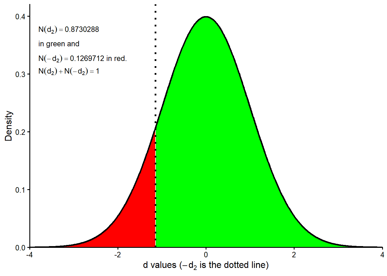
Checking the numerical solution
The next diagnostic checks the minimization that leads to \(V_0\) and \(\sigma_V\). Equations 24.3 and 24.4 in (Hull 2022) are solved numerically in this implementation, so \(V_0\) and \(\sigma_V\) come from minimizing the squared pricing errors. To check the solution, we retrieve the value of \(F(V_0,\sigma_V)^2+G(V_0,\sigma_V)^2\) evaluated at the estimated pair \((\widehat{V}_0,\widehat{\sigma}_V)\). This objective function is positive because both errors are squared, so a good solution should produce a value close to zero.
Code
merton_objective_at_solution <- min.footnote10(x = c(V0, sv))

knitr::kable(
  data.frame(
    Quantity = c(
      "Objective function value",
      "Rounded objective function value"
    ),
    Value = c(
      fmt_num(merton_objective_at_solution, 10),
      fmt_num(round(merton_objective_at_solution, 6), 6)
    )
  ),
  caption = "Objective function value at the estimated Merton solution.",
  row.names = FALSE
)| Quantity | Value |
|---|---|
| Objective function value | 0.0000000000 |
| Rounded objective function value | 0.000000 |
The constrained optimization above worked well. The objective function is zero in practical terms.
The minimization can also be checked visually. To show the objective function on two axes, we first hold \(\sigma_V\) fixed at its estimated value and vary \(V_0\). Then we hold \(V_0\) fixed and vary \(\sigma_V\). These are one-dimensional slices of the same two-parameter objective function.
Code
# Fix sv and evaluate different values of V0.
V0.seq <- seq(from = 4, to = 20, length.out = 100)
sv.rep <- rep(sv, 100)
# Function to be evaluated.
FG <- function(V0, sv) { (eq24.3(V0, sv))^2 + (eq24.4(V0, sv))^2 }
# Apply the function with fixed sv and different V0 values.
FG.V0 <- mapply(FG, V0.seq, sv.rep)
The first slice is the objective function as a function of \(V_0\) while \(\sigma_V\) is held at its estimated value.
Code
objective_at_solution <- FG(V0, sv)
slice_v0_data <- data.frame(
  asset_value = V0.seq,
  objective = FG.V0
)
solution_v0_data <- data.frame(
  asset_value = V0,
  objective = objective_at_solution
)

ggplot2::ggplot(slice_v0_data, ggplot2::aes(x = asset_value, y = objective)) +
  ggplot2::geom_line(linewidth = 1.1, color = "black") +
  ggplot2::geom_vline(xintercept = V0, linetype = "dashed", linewidth = 0.7) +
  ggplot2::geom_hline(
    yintercept = objective_at_solution,
    linetype = "dashed",
    linewidth = 0.7
  ) +
  ggplot2::geom_point(
    data = solution_v0_data,
    ggplot2::aes(x = asset_value, y = objective),
    inherit.aes = FALSE,
    shape = 21,
    size = 4.2,
    stroke = 1.2,
    color = "red",
    fill = "white"
  ) +
  ggplot2::labs(
    x = expression(V[0]),
    y = expression(F(x, y)^2 + G(x, y)^2)
  ) +
  ggplot2::theme_classic(base_size = 12)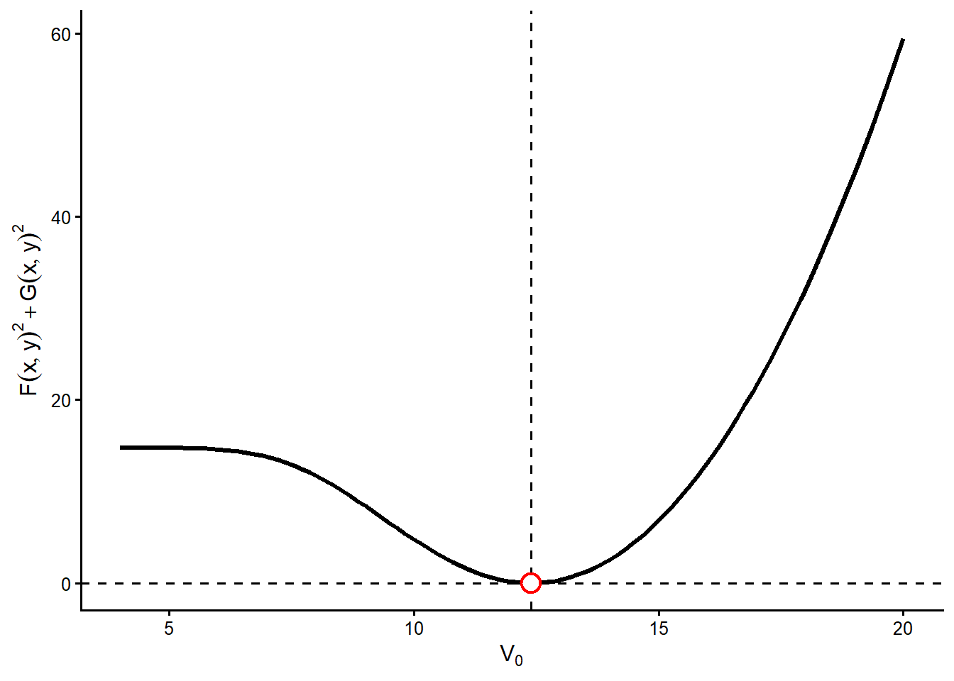
Figure 3.2 is a one-dimensional slice of the minimization problem. In this slice, \(\sigma_V\) is held fixed at the estimated value and only \(V_0\) changes. The vertical dashed line marks the estimated asset value, and the red circle marks the value of the objective function at that estimate. The curve reaches its lowest point near the estimated \(V_0\), so nearby alternatives for the asset value produce larger squared errors in equations 24.3 and 24.4. Economically, moving away from this \(V_0\) makes it harder for the model to match both the observed equity value and the observed equity volatility.
This figure is a diagnostic check separate from the estimation method. It shows that, conditional on the estimated \(\sigma_V\), the optimizer has found a sensible asset value. For completeness, we now make the symmetric check by fixing \(V_0\) and varying \(\sigma_V\).
Code
# Now fix V0, and evaluate different sv values.
sv.seq <- seq(0.001, 0.6, length.out = 100)
V0.rep <- rep(V0, 100)
# Evaluate the function with these parameters.
FG.sv <- mapply(FG, V0.rep, sv.seq)
slice_sv_data <- data.frame(
  asset_volatility = sv.seq,
  objective = FG.sv
)
solution_sv_data <- data.frame(
  asset_volatility = sv,
  objective = objective_at_solution
)

ggplot2::ggplot(
  slice_sv_data,
  ggplot2::aes(x = asset_volatility, y = objective)
) +
  ggplot2::geom_line(linewidth = 1.1, color = "black") +
  ggplot2::geom_vline(xintercept = sv, linetype = "dashed", linewidth = 0.7) +
  ggplot2::geom_hline(
    yintercept = objective_at_solution,
    linetype = "dashed",
    linewidth = 0.7
  ) +
  ggplot2::geom_point(
    data = solution_sv_data,
    ggplot2::aes(x = asset_volatility, y = objective),
    inherit.aes = FALSE,
    shape = 21,
    size = 4.2,
    stroke = 1.2,
    color = "red",
    fill = "white"
  ) +
  ggplot2::labs(
    x = expression(sigma[V]),
    y = expression(F(x, y)^2 + G(x, y)^2)
  ) +
  ggplot2::theme_classic(base_size = 12)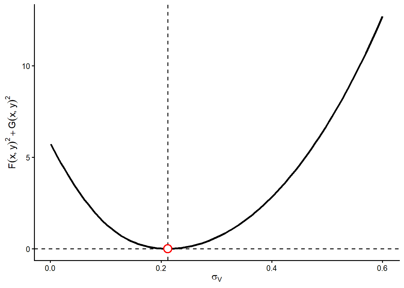
Figure 3.3 gives the second slice. Now \(V_0\) is fixed at the estimated value and \(\sigma_V\) changes. The estimated asset volatility again sits near the bottom of the curve. If \(\sigma_V\) is too low, the model understates how strongly equity reacts to asset risk. If \(\sigma_V\) is too high, the model overstates that risk transmission. Both mistakes increase the objective function because the two Hull equations are no longer matched as closely.
Taken together, Figure 3.2 and Figure 3.3 show that the numerical solution is locally coherent in each parameter direction. The next diagnostic evaluates the objective function over a grid where \(V_0\) and \(\sigma_V\) move at the same time.
Contour plots, also called level plots, show a three-dimensional objective function on a two-dimensional plane.
Code
contour_data <- expand.grid(
  asset_value = V0.seq,
  asset_volatility = sv.seq
)
contour_data$objective <- as.vector(z)
solution_surface_data <- data.frame(
  asset_value = V0,
  asset_volatility = sv
)
contour_breaks <- c(
  0.001, 0.01, 0.05, 0.1, 0.25, 0.5,
  1, 2, 5, 10, 20, 50, 100
)
contour_label_levels <- c(1, 5, 10, 50, 100)
contour_label_lines <- contourLines(
  x = V0.seq,
  y = sv.seq,
  z = z,
  levels = contour_label_levels
)
contour_label_data <- do.call(
  rbind,
  lapply(contour_label_levels, function(level_value) {
    level_lines <- contour_label_lines[
      vapply(
        contour_label_lines,
        function(line) isTRUE(all.equal(line$level, level_value)),
        logical(1)
      )
    ]
    longest_line <- level_lines[[which.max(vapply(level_lines, function(line) {
      length(line$x)
    }, numeric(1)))]]
    label_index <- round(length(longest_line$x) * 0.72)
    data.frame(
      asset_value = longest_line$x[label_index],
      asset_volatility = longest_line$y[label_index],
      objective = level_value
    )
  })
)
contour_label_data$label <- sub(
  "\\.0$",
  "",
  format(contour_label_data$objective, trim = TRUE)
)

ggplot2::ggplot(
  contour_data,
  ggplot2::aes(x = asset_value, y = asset_volatility, z = objective)
) +
  ggplot2::geom_contour(
    ggplot2::aes(color = ggplot2::after_stat(level)),
    breaks = contour_breaks,
    linewidth = 0.75
  ) +
  ggplot2::geom_label(
    data = contour_label_data,
    ggplot2::aes(
      x = asset_value,
      y = asset_volatility,
      label = label
    ),
    inherit.aes = FALSE,
    size = 4,
    label.size = 0,
    fill = "white",
    alpha = 0.85
  ) +
  ggplot2::geom_vline(xintercept = V0, linetype = "dashed", linewidth = 0.6) +
  ggplot2::geom_hline(yintercept = sv, linetype = "dashed", linewidth = 0.6) +
  ggplot2::geom_point(
    data = solution_surface_data,
    ggplot2::aes(x = asset_value, y = asset_volatility),
    inherit.aes = FALSE,
    shape = 21,
    size = 4.2,
    stroke = 1.2,
    color = "red",
    fill = "white"
  ) +
  ggplot2::scale_color_viridis_c(
    option = "C",
    end = 0.9,
    trans = "log10",
    guide = "none"
  ) +
  ggplot2::labs(
    x = expression(V[0]),
    y = expression(sigma[V])
  ) +
  ggplot2::theme_classic(base_size = 12)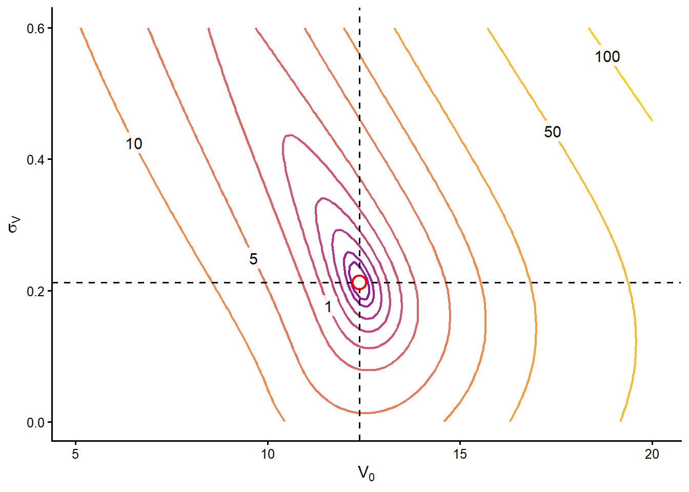
Each contour line connects combinations of \(V_0\) and \(\sigma_V\) that produce the same value of \(F(V_0,\sigma_V)^2+G(V_0,\sigma_V)^2\). The numbers printed on selected lines give direct reference values for the objective function. The red point marks the estimated pair. The dashed lines make its two coordinates easier to read. A good numerical solution should sit near the innermost low-objective region because that is where the two Hull equations are matched most closely.
The interactive surface shows the same objective function in three dimensions. In HTML, it can be rotated to inspect how the low-objective region sits around the estimated pair.
Code
The diagnostics can be summarized as follows.
Code
merton_optimization_diagnostic <- data.frame(
  Diagnostic = c(
    "Objective value at solution",
    "Slice in $V_0$",
    "Slice in $\\sigma_V$",
    "Contour plot",
    "Interactive surface"
  ),
  `What is checked` = c(
    "Whether both Hull equation errors are essentially zero at the estimated pair.",
    "Whether moving only $V_0$ away from the solution increases the objective.",
    "Whether moving only $\\sigma_V$ away from the solution increases the objective.",
    "Whether $(\\widehat{V}_0,\\widehat{\\sigma}_V)$ sits in the low-objective region when both variables move.",
    "Whether the two-dimensional contour view matches the three-dimensional objective surface."
  ),
  `Reading in this example` = c(
    paste0("The rounded objective is ", fmt_num(round(merton_objective_at_solution, 6), 6), "."),
    "The red point lies near the lowest part of the $V_0$ slice.",
    "The red point lies near the lowest part of the $\\sigma_V$ slice.",
    "The estimated pair is inside the innermost low-error region.",
    "The valley of the objective surface is centered near the estimated pair."
  ),
  check.names = FALSE
)

knitr::kable(
  merton_optimization_diagnostic,
  caption = "How to read the Merton numerical-solution diagnostics.",
  escape = FALSE,
  row.names = FALSE
)| Diagnostic | What is checked | Reading in this example |
|---|---|---|
| Objective value at solution | Whether both Hull equation errors are essentially zero at the estimated pair. | The rounded objective is 0.000000. |
| Slice in \(V_0\) | Whether moving only \(V_0\) away from the solution increases the objective. | The red point lies near the lowest part of the \(V_0\) slice. |
| Slice in \(\sigma_V\) | Whether moving only \(\sigma_V\) away from the solution increases the objective. | The red point lies near the lowest part of the \(\sigma_V\) slice. |
| Contour plot | Whether \((\widehat{V}_0,\widehat{\sigma}_V)\) sits in the low-objective region when both variables move. | The estimated pair is inside the innermost low-error region. |
| Interactive surface | Whether the two-dimensional contour view matches the three-dimensional objective surface. | The valley of the objective surface is centered near the estimated pair. |
Model-implied debt value and spread
The fitted Merton model also implies debt-related measures. These are not new observed inputs. They are computed from the estimated asset value, the observed equity value, and the promised debt payment due at maturity.
Code
# Model-implied debt quantities.
market_value_debt <- V0 - E0
pv_promised_payment_debt <- D * exp(-rf * TT)
credit_value_gap <- pv_promised_payment_debt - market_value_debt
implied_loss_rate <- credit_value_gap /
  pv_promised_payment_debt
implied_lgd <- implied_loss_rate / pd
implied_recovery_rate <- 1 - implied_lgd
reconstructed_debt_value <- pv_promised_payment_debt *
  (1 - pd * implied_lgd)
debt_summary <- data.frame(
  Measure = c(
    "Model-implied market value of debt",
    "Risk-free present value of the promised payment",
    "Credit-risk value gap",
    "Credit-risk value discount",
    "Risk-neutral probability of default",
    "Constant-equivalent implied LGD",
    "Constant-equivalent implied recovery rate",
    "Debt value reconstructed from PD and implied recovery"
  ),
  Value = c(
    fmt_num(market_value_debt, 4),
    fmt_num(pv_promised_payment_debt, 4),
    fmt_num(credit_value_gap, 4),
    fmt_pct(implied_loss_rate, 4),
    fmt_pct(pd, 4),
    fmt_pct(implied_lgd, 4),
    fmt_pct(implied_recovery_rate, 4),
    fmt_num(reconstructed_debt_value, 4)
  )
)
knitr::kable(
  debt_summary,
  caption = "Debt measures implied by the fitted Merton model.",
  row.names = FALSE
)| Measure | Value |
|---|---|
| Model-implied market value of debt | 9.3954 |
| Risk-free present value of the promised payment | 9.5123 |
| Credit-risk value gap | 0.1169 |
| Credit-risk value discount | 1.2290% |
| Risk-neutral probability of default | 12.6971% |
| Constant-equivalent implied LGD | 9.6794% |
| Constant-equivalent implied recovery rate | 90.3206% |
| Debt value reconstructed from PD and implied recovery | 9.3954 |
The first row is the model-implied market value of debt, denoted \(B_0\). There is one debt value here, but two useful ways to read it. The payoff view starts at maturity. In Merton, debt holders receive the promised payment \(D\) only if the firm has enough asset value, \(V_T>D\). If the firm defaults, \(V_T<D\), debt holders receive the available asset value \(V_T\) instead. Therefore, the debt payoff is
\[ B_T=\min(V_T,D). \]
The same payoff can be written as a risk-free promise minus a default shortfall:
\[ B_T = D-\max(D-V_T,0). \]
This expression shows where default enters the debt value. The risk-free promise is \(D\). The term \(\max(D-V_T,0)\) is the shortfall absorbed by debt holders when the firm ends below the promised debt payment. If \(V_T\geq D\), the shortfall is zero. If \(V_T<D\), the shortfall is positive.
The payoff view values that default-contingent debt payoff under the risk-neutral distribution:
\[ B_0 = e^{-rfT}E^Q[\min(V_T,D)]. \]
The balance-sheet view gets the same debt value from the fact that firm assets are split between equity and debt claims:
\[ B_0=V_0-E_0. \]
In this implementation we use the balance-sheet expression because \(V_0\) has already been estimated and \(E_0\) is observed. Numerically,
\[ B_0 = V_0-E_0 = 12.3954-3.0000 = 9.3954. \]
This is not a second definition of debt value. It is the same \(B_0\) read from the other side of the Merton balance sheet. The equity value \(E_0\) has already been calibrated with a payoff that depends on whether \(V_T\) is above or below \(D\), so the residual debt value also carries the effect of default.
The second row of the table is the present value that the promised debt payment would have if it were risk-free, \(De^{-rfT}\). The difference between \(De^{-rfT}\) and \(B_0\) is the credit-risk value gap. It measures how much present value is lost because debt holders may receive less than \(D\) at maturity.
We calculate this gap because it is the bridge between the Merton balance sheet and credit-market language. Once we know how much value is lost because of default risk, we can express that loss as a percentage, connect it to \(PD^Q\times LGD\), infer an implied recovery rate, and later translate the same debt value into a yield spread.
\[ De^{-rfT}-B_0 = 9.5123- 9.3954 = 0.1169. \]
At this point, the gap is still measured in value units. In the example, Merton prices the debt at 9.3954 instead of the risk-free present value 9.5123. The difference, 0.1169, is the amount of present value removed by default risk.
To connect this value gap with default probabilities and recovery rates, we need to put it in rate form. A probability is a rate, and loss given default is also a rate. Therefore, divide the value gap by the risk-free present value of the promised payment:
\[ \text{credit-risk value discount} = \frac{De^{-rfT}-B_0}{De^{-rfT}}. \]
Substituting the numbers gives:
\[ \text{credit-risk value discount} = \frac{0.1169} {9.5123} = 0.012290 = 1.2290\%. \]
This 1.2290% is not a default probability. It says that default risk removes 1.2290% of the risk-free present value of the promised payment. It combines two forces, the probability of default and the severity of the loss if default occurs.
Credit-risk models often write expected loss as default probability times loss given default. Here the probability is the Merton risk-neutral PD, so the value discount can be read as a risk-neutral expected loss rate:
\[ \text{credit-risk value discount} = PD^Q\times LGD = PD^Q(1-R). \]
The Merton model has already produced the risk-neutral default probability, \(PD^Q=12.6971\%\). The model has not separately given us a fixed recovery rate. In the structural model, recovery in default depends on the terminal asset value \(V_T\). The calculation below therefore backs out a constant-equivalent \(LGD\). This is the single loss-given-default rate that reproduces the Merton debt value when paired with \(PD^Q\).
Solve the expected-loss relation for \(LGD\):
\[ LGD^{impl} = \frac{\text{credit-risk value discount}}{PD^Q} = \frac{1.2290\%} {12.6971\%} = 9.6794\%. \]
The constant-equivalent implied recovery rate is the remaining part of the promised value after this implied loss:
\[ R^{impl} = 1-LGD^{impl} = 1-0.096794 = 90.3206\%. \]
This means the Merton debt value behaves, in this simplified expected-loss reading, as if default occurs with risk-neutral probability 12.6971% and the constant-equivalent recovery rate needed to reproduce the Merton debt value is 90.3206% of the promised value. The final row checks the calculation by reconstructing the debt value. Start with the risk-free present value of the promise and subtract the risk-neutral expected loss rate:
\[ De^{-rfT}\left[1-PD^Q(1-R^{impl})\right] = 9.5123 \left[ 1- 0.1269712 \left(1-0.903206\right) \right] = 9.3954, \]
which matches the model-implied market value of debt, \(B_0=9.3954\).
Could we figure out the bond yield spread implied by the Merton model? Yes. The cleanest way to do it here is to use the already computed model-implied market value of debt, \(B_0=9.3954\).
In this simplified Merton setup, debt is treated like a zero-coupon promise to pay \(D\) at maturity \(T\). The continuously compounded yield \(y\) on that debt is the value that satisfies:
\[ B_0=De^{-yT}. \]
Solving for \(y\) gives:
\[ y=\frac{1}{T}\log\left(\frac{D}{B_0}\right). \]
The Merton-implied credit spread is then the difference between this implied debt yield and the risk-free rate:
\[ s=y-rf. \]
The code below calculates these quantities.
Code
merton_implied_debt_yield <- (1 / TT) * log(D / market_value_debt)
merton_implied_spread <- merton_implied_debt_yield - rf
spread_summary <- data.frame(
  Measure = c(
    "Model-implied market value of debt",
    "Promised debt payment at maturity",
    "Risk-free rate",
    "Implied debt yield",
    "Merton-implied credit spread",
    "Merton-implied credit spread in basis points"
  ),
  Value = c(
    fmt_num(market_value_debt, 4),
    fmt_num(D, 4),
    fmt_pct(rf, 4),
    fmt_pct(merton_implied_debt_yield, 4),
    fmt_pct(merton_implied_spread, 4),
    fmt_num(10000 * merton_implied_spread, 1)
  )
)
knitr::kable(
  spread_summary,
  caption = "Merton-implied bond yield and credit spread.",
  row.names = FALSE
)| Measure | Value |
|---|---|
| Model-implied market value of debt | 9.3954 |
| Promised debt payment at maturity | 10.0000 |
| Risk-free rate | 5.0000% |
| Implied debt yield | 6.2366% |
| Merton-implied credit spread | 1.2366% |
| Merton-implied credit spread in basis points | 123.7 |
Numerically, the model-implied market value of debt is 9.3954. Since the promised debt payment is 10 and maturity is 1 in this example, the implied debt yield is 6.2366%. With a risk-free rate of 5.00%, the Merton-implied spread is 1.2366%, or about 123.7 basis points.
This is a model-implied benchmark. It is the spread that makes the model-implied value of debt consistent with the promised debt payment at maturity. In practice, an observed corporate bond spread can differ from this benchmark because of liquidity, taxes, seniority, covenants, multiple debt maturities, and broader risk-premium effects. The comparison is still useful. If the market spread is much higher than the Merton-implied spread, the bond is paying more compensation than this structural default model suggests. If it is much lower, the bond is paying less.
Later sections develop that comparison directly. They take default probabilities, recovery assumptions, corporate bond prices, and CDS spreads, then ask how default risk becomes market compensation.
3.2 Risk-neutral asset paths and default at maturity
We now return to the main Merton example and simulate the daily evolution of the market value of the firm’s assets over one year. The simulation logic follows the geometric Brownian motion framework used in (Hull 2022), Chapters 14 and 15. Because this section is connected to the valuation formula, the simulations use the risk-neutral drift \(rf\). These are valuation scenarios under the same risk-neutral world used to value the equity option. They are useful for visualizing the model mechanics, not for forecasting the firm’s real-world asset path.
Code
# For valuation, Merton assumes V follows a risk-neutral GBM process.
V0.sim <- function(i) {  # the argument i is not used here.
  GBM(N = 365, T = 1, t0 = 0, x0 = V0, theta = rf, sigma = sv) }
set.seed(3) # Reproducibility
paths <- sapply(1:10, V0.sim) # Create 10 paths for V.
final_row <- nrow(paths)
path_time_10 <- seq(0, final_row - 1)
path_data_10 <- data.frame(
  time_day = rep(path_time_10, times = ncol(paths)),
  path_id = factor(rep(seq_len(ncol(paths)), each = nrow(paths))),
  asset_value = as.vector(paths)
)
terminal_path_data_10 <- data.frame(
  time_day = max(path_time_10),
  asset_value = paths[final_row, ],
  terminal_state = ifelse(paths[final_row, ] < D, "Default", "No default")
)
initial_path_data_10 <- data.frame(
  time_day = 0,
  asset_value = V0
)

ggplot2::ggplot(
  path_data_10,
  ggplot2::aes(x = time_day, y = asset_value, group = path_id)
) +
  ggplot2::geom_line(linewidth = 0.45, color = "black") +
  ggplot2::geom_hline(yintercept = D, linewidth = 0.9, color = "red") +
  ggplot2::geom_point(
    data = initial_path_data_10,
    ggplot2::aes(x = time_day, y = asset_value),
    inherit.aes = FALSE,
    size = 3,
    color = "blue"
  ) +
  ggplot2::geom_point(
    data = terminal_path_data_10,
    ggplot2::aes(x = time_day, y = asset_value, color = terminal_state),
    inherit.aes = FALSE,
    shape = 1,
    size = 3,
    stroke = 1.1
  ) +
  ggplot2::scale_color_manual(
    values = c("Default" = "red", "No default" = "green"),
    guide = "none"
  ) +
  ggplot2::labs(
    x = "Time in days (from 0 to T)",
    y = expression(V[t])
  ) +
  ggplot2::theme_classic(base_size = 12)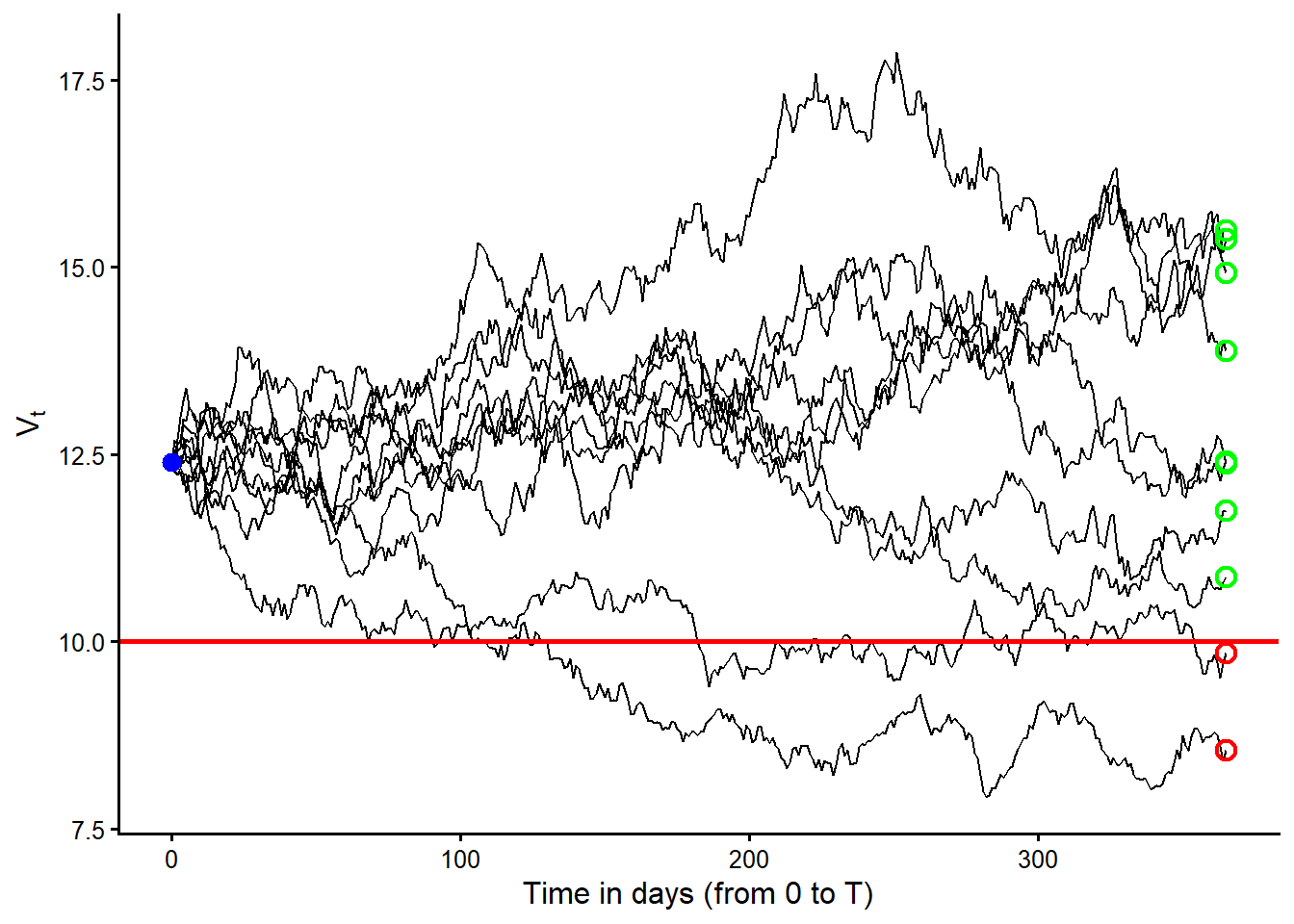
Figure Figure 3.6 should be read as follows. Each black curve is one risk-neutral path for the firm’s asset value, \(V_t\). The horizontal red line is the promised debt payment, \(D\). The blue point marks the starting value, \(V_0\). The open circles at maturity classify the terminal values. Green means \(V_T>D\) and red means \(V_T<D\).
These simulations can be interpreted as 10 risk-neutral valuation scenarios for the firm’s assets. They are paths generated under the risk-neutral measure, so the drift is the risk-free rate and not the firm’s real-world expected asset return. The formal name is 10 simulated geometric Brownian motion paths under the risk-neutral measure.
Before counting defaults at maturity, let’s first count the paths in which \(V_t<D\) at least once before or at maturity. Here I use \(t\), not \(T\), because this first count asks whether a path ever crosses below the promised debt payment during the year. That is different from Merton default, which is determined by whether \(V_T<D\) at maturity.
[1] 2 4 9The value of the assets was lower than the promised debt payment \(D\) at some time in risk-neutral scenarios 2, 4, 9. The next figure isolates those cases. Red paths finish below \(D\) and therefore default at maturity. The blue path crosses below \(D\) during the year but finishes above \(D\).
Code
make_path_data <- function(path_matrix, path_ids = seq_len(ncol(path_matrix))) {
  path_matrix <- as.matrix(path_matrix)
  data.frame(
    time_day = rep(seq(0, nrow(path_matrix) - 1), times = ncol(path_matrix)),
    path_id = factor(rep(path_ids, each = nrow(path_matrix)), levels = path_ids),
    asset_value = as.vector(path_matrix)
  )
}

paths_below_D_matrix <- paths[, paths_below_D, drop = FALSE]
paths_below_D_data <- make_path_data(paths_below_D_matrix, paths_below_D)
paths_below_D_data$terminal_state <- rep(
  ifelse(
    paths_below_D_matrix[final_row, ] < D,
    "Default at maturity",
    "Crosses D before maturity, no default"
  ),
  each = nrow(paths_below_D_matrix)
)

ggplot2::ggplot(
  paths_below_D_data,
  ggplot2::aes(
    x = time_day,
    y = asset_value,
    group = path_id,
    color = terminal_state
  )
) +
  ggplot2::geom_line(linewidth = 0.9) +
  ggplot2::geom_hline(yintercept = D, linewidth = 0.9, color = "red") +
  ggplot2::geom_point(
    data = data.frame(time_day = 0, asset_value = V0),
    ggplot2::aes(x = time_day, y = asset_value),
    inherit.aes = FALSE,
    size = 3,
    color = "blue"
  ) +
  ggplot2::scale_color_manual(
    values = c(
      "Crosses D before maturity, no default" = "blue",
      "Default at maturity" = "red"
    ),
    guide = "none"
  ) +
  ggplot2::labs(
    x = "Time in days (from 0 to T)",
    y = expression(V[t])
  ) +
  ggplot2::theme_classic(base_size = 12)
Figure Figure 3.7 isolates the paths from the 10-scenario simulation that cross \(D\) at least once. The blue path is the key teaching case. It enters the region below the red debt threshold before maturity, then recovers and ends above \(D\) at \(T\). In the basic Merton model, default is determined by the terminal condition \(V_T<D\). In this small risk-neutral simulation, that happens in 2 cases. According to these 10 risk-neutral scenarios, the simulated probability of default is 20%. The code below counts the cases in which \(V_T<D\).
Code
sim_pd_10 <- sum(paths[final_row, ] < D) / ncol(paths)
knitr::kable(
  data.frame(
    Quantity = c(
      "Simulated default paths",
      "Total simulated paths",
      "Simulated risk-neutral PD",
      "Analytical Merton PD"
    ),
    Value = c(
      fmt_int(sum(paths[final_row, ] < D)),
      fmt_int(ncol(paths)),
      fmt_pct(sim_pd_10, 0),
      fmt_pct(pd_merton, 4)
    )
  ),
  caption = "Default count and simulated risk-neutral PD with 10 paths.",
  row.names = FALSE
)| Quantity | Value |
|---|---|
| Simulated default paths | 2 |
| Total simulated paths | 10 |
| Simulated risk-neutral PD | 20% |
| Analytical Merton PD | 12.6971% |
The simulated risk-neutral probability of default of 20% looks high relative to the model value of 12.6971%. This happens because the number of simulations is small. The following examples show how these values tend to converge as we move from 10 to 100 simulated paths, and then from 100 to 1,000, 10,000, and 100,000 simulated terminal values.
The next simulation uses 100 paths from \(V_0\) to \(V_T\). The visual coding is the same as before. Gray curves are risk-neutral asset paths, the red horizontal line is \(D\), and the blue point is the common starting value \(V_0\).
Code
set.seed(3) # Reproducibility
paths <- sapply(1:100, V0.sim) # Create 100 paths.
final_row <- nrow(paths)
path_data_100 <- make_path_data(paths)

ggplot2::ggplot(
  path_data_100,
  ggplot2::aes(x = time_day, y = asset_value, group = path_id)
) +
  ggplot2::geom_line(linewidth = 0.25, color = "gray35", alpha = 0.55) +
  ggplot2::geom_hline(yintercept = D, linewidth = 0.9, color = "red") +
  ggplot2::geom_point(
    data = data.frame(time_day = 0, asset_value = V0),
    ggplot2::aes(x = time_day, y = asset_value),
    inherit.aes = FALSE,
    size = 3,
    color = "blue"
  ) +
  ggplot2::labs(
    x = "Time in days (from 0 to T)",
    y = expression(V[t])
  ) +
  ggplot2::theme_classic(base_size = 12)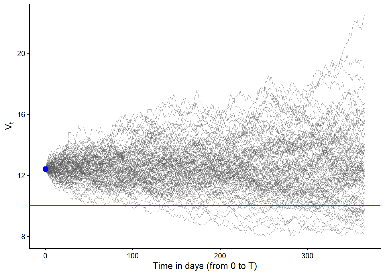
Code
sim_pd_100 <- sum(paths[final_row, ] < D) / ncol(paths)
knitr::kable(
  data.frame(
    Quantity = c(
      "Simulated default paths",
      "Total simulated paths",
      "Simulated risk-neutral PD",
      "Analytical Merton PD"
    ),
    Value = c(
      fmt_int(sum(paths[final_row, ] < D)),
      fmt_int(ncol(paths)),
      fmt_pct(sim_pd_100, 0),
      fmt_pct(pd_merton, 4)
    )
  ),
  caption = "Default count and simulated risk-neutral PD with 100 paths.",
  row.names = FALSE
)| Quantity | Value |
|---|---|
| Simulated default paths | 17 |
| Total simulated paths | 100 |
| Simulated risk-neutral PD | 17% |
| Analytical Merton PD | 12.6971% |
With 100 paths, individual trajectories are less important than the terminal count. The simulated risk-neutral probability of default is 17%. This is closer to the model value of 12.6971%.
The next figure keeps only the 17 paths that end in default.
Code
default_cases_100 <- which(paths[final_row, ] < D)
default_path_data_100 <- make_path_data(
  paths[, default_cases_100, drop = FALSE],
  default_cases_100
)

ggplot2::ggplot(
  default_path_data_100,
  ggplot2::aes(x = time_day, y = asset_value, group = path_id)
) +
  ggplot2::geom_line(linewidth = 0.45, color = "gray25", alpha = 0.75) +
  ggplot2::geom_hline(yintercept = D, linewidth = 0.9, color = "red") +
  ggplot2::geom_point(
    data = data.frame(time_day = 0, asset_value = V0),
    ggplot2::aes(x = time_day, y = asset_value),
    inherit.aes = FALSE,
    size = 3,
    color = "blue"
  ) +
  ggplot2::labs(
    x = "Time in days (from 0 to T)",
    y = expression(V[t])
  ) +
  ggplot2::theme_classic(base_size = 12)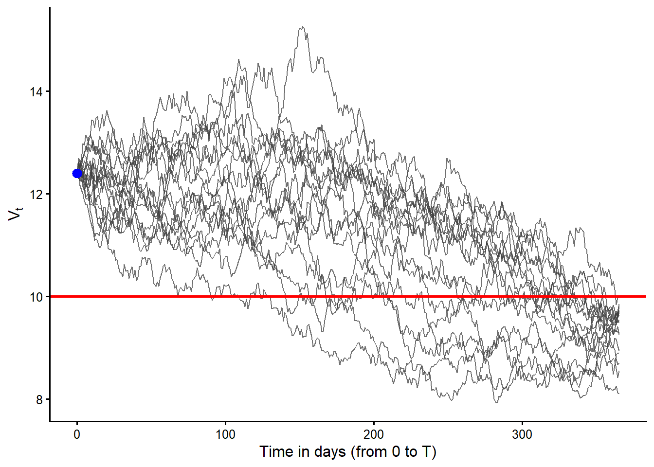
Figure Figure 3.9 filters the 100 simulated paths and keeps only the paths with \(V_T<D\). These are the default cases under the Merton terminal-default rule. The red line is still \(D\), so the important feature is the terminal position of each path relative to that line. Earlier crossings matter for intuition, but the basic Merton default event is decided at maturity.
The next figure keeps the 11 cases in which \(V_t\) went below \(D\) at some point, but \(V_T\) finished above \(D\), so the firm did not default at maturity.
Code
almost_default_no_default_data <- make_path_data(
  paths[, almost_default_no_default, drop = FALSE],
  almost_default_no_default
)
almost_default_colors <- grDevices::hcl.colors(
  length(almost_default_no_default),
  "Dark 3"
)
names(almost_default_colors) <- levels(almost_default_no_default_data$path_id)

ggplot2::ggplot(
  almost_default_no_default_data,
  ggplot2::aes(
    x = time_day,
    y = asset_value,
    group = path_id,
    color = path_id
  )
) +
  ggplot2::geom_line(linewidth = 0.55, alpha = 0.9) +
  ggplot2::geom_hline(yintercept = D, linewidth = 0.9, color = "red") +
  ggplot2::geom_point(
    data = data.frame(time_day = 0, asset_value = V0),
    ggplot2::aes(x = time_day, y = asset_value),
    inherit.aes = FALSE,
    size = 3,
    color = "blue"
  ) +
  ggplot2::scale_color_manual(values = almost_default_colors, guide = "none") +
  ggplot2::labs(
    x = "Time in days (from 0 to T)",
    y = expression(V[t])
  ) +
  ggplot2::theme_classic(base_size = 12)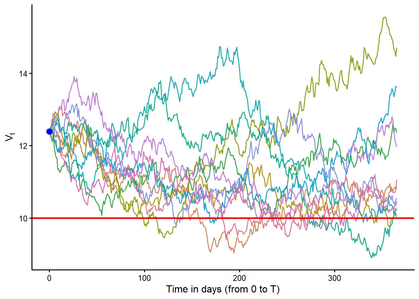
Figure Figure 3.10 shows the other side of the crossing story. Every colored path falls below \(D\) at least once, but each one finishes above \(D\) at maturity. The different colors only separate the paths visually. The financial message is that the path history helps us see the simulated movement of assets, while the basic Merton default event is decided at \(T\).
We can also simulate terminal asset values directly from the risk-neutral distribution of \(V_T\). The resulting distribution is log-normal. This is useful because the default event depends only on whether the terminal value is below \(D\).
The next figure shows how the simulated risk-neutral probability of default changes as the number of simulated terminal values increases. The red bars are simulated terminal values with \(V_T<D\). The blue bars are simulated terminal values with \(V_T\ge D\). The dashed vertical line is the promised debt payment \(D\).
Code
simulate_terminal_assets <- function(n) {
  exp(rnorm(n, log(V0) + (rf - (sv^2) / 2) * TT, sv * sqrt(TT)))
}

set.seed(13)
convergence_sizes <- c(100, 1000, 10000)
convergence_labels <- paste0(
  "N = ",
  format(convergence_sizes, big.mark = ",", scientific = FALSE)
)
VT_convergence <- lapply(convergence_sizes, simulate_terminal_assets)
names(VT_convergence) <- convergence_labels

vt_convergence_data <- do.call(
  rbind,
  lapply(names(VT_convergence), function(sample_label) {
    values <- VT_convergence[[sample_label]]
    data.frame(
      sample_label = sample_label,
      terminal_asset_value = values,
      region = ifelse(values < D, "Default region", "No default region")
    )
  })
)
vt_convergence_data$sample_label <- factor(
  vt_convergence_data$sample_label,
  levels = convergence_labels
)

convergence_pd_data <- do.call(
  rbind,
  lapply(names(VT_convergence), function(sample_label) {
    values <- VT_convergence[[sample_label]]
    data.frame(
      sample_label = sample_label,
      x = 17.6,
      y = 380,
      label = paste0(
        "Sim: ", fmt_pct(mean(values < D), 1), "\n",
        "Merton: ", fmt_pct(pd_merton, 1)
      )
    )
  })
)
convergence_pd_data$sample_label <- factor(
  convergence_pd_data$sample_label,
  levels = convergence_labels
)

ggplot2::ggplot(
  vt_convergence_data,
  ggplot2::aes(x = terminal_asset_value, fill = region)
) +
  ggplot2::geom_histogram(
    binwidth = 0.25,
    boundary = D,
    color = "white",
    linewidth = 0.1
  ) +
  ggplot2::geom_vline(xintercept = D, linetype = "dashed", linewidth = 0.65) +
  ggplot2::geom_text(
    data = convergence_pd_data,
    ggplot2::aes(x = x, y = y, label = label),
    inherit.aes = FALSE,
    hjust = 0,
    vjust = 1,
    size = 2.9,
    lineheight = 0.95
  ) +
  ggplot2::facet_wrap(~sample_label, ncol = 3) +
  ggplot2::coord_cartesian(xlim = c(4, 30), ylim = c(0, 400), expand = FALSE) +
  ggplot2::scale_fill_manual(
    values = c("Default region" = "red", "No default region" = "blue"),
    guide = "none"
  ) +
  ggplot2::labs(
    x = "Value of the assets at maturity",
    y = "Frequency"
  ) +
  ggplot2::theme_classic(base_size = 12) +
  ggplot2::theme(
    strip.background = ggplot2::element_blank(),
    strip.text = ggplot2::element_text(face = "bold")
  )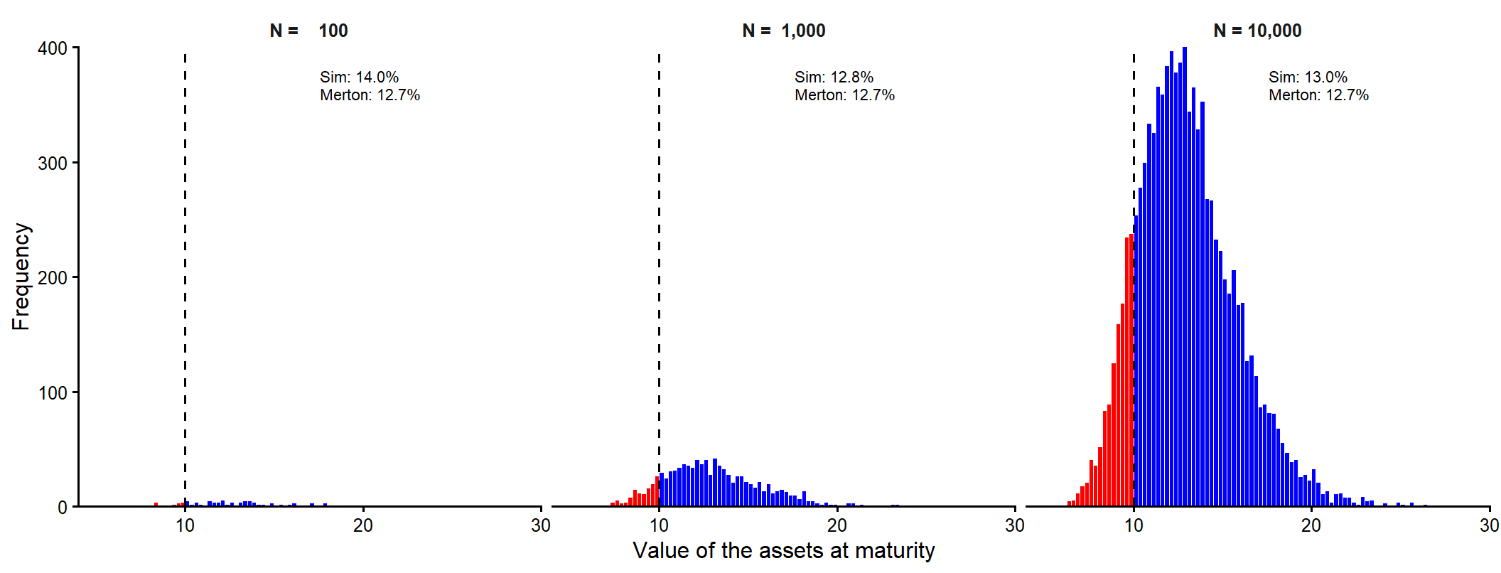
Figure Figure 3.11 makes the sampling error visible. Each panel answers the same question. What fraction of simulated terminal asset values falls below the promised debt payment \(D\)? With 100 simulated terminal values, the simulated probability can be noticeably away from the analytical Merton value. With 1,000 and then 10,000 simulated terminal values, the red area becomes a more stable approximation of the analytical risk-neutral probability \(N(-d_2)\).
The next figure repeats the same terminal-value simulation with 100,000 draws. It uses the same visual coding as Figure 3.11. Red bars mark default states, blue bars mark non-default states, and the dashed vertical line marks \(D\). The larger sample makes the simulated red area a close numerical counterpart to the analytical Merton probability.
Code
set.seed(13)
# 100,000 values of VT at once.
VT <- exp(rnorm(100000, log(V0) + (rf - (sv^2) / 2)*TT, sv*sqrt(TT)))
# Plot results.
h <- hist(VT, 100, plot = FALSE)
hist_data <- data.frame(
  xmin = head(h$breaks, -1),
  xmax = tail(h$breaks, -1),
  count = h$counts
)
hist_data$region <- ifelse(hist_data$xmin < D, "Default region", "No default region")
sim_pd_100k <- mean(VT < D)
hist_label_x <- 18.4
hist_label_y <- max(hist_data$count) * 0.92
hist_label_gap <- max(hist_data$count) * 0.075
hist_merton_label <- paste0(
  "paste('Merton ', N(-d[2]), ' = ", fmt_pct(pd_merton, 4), "')"
)
ggplot2::ggplot(hist_data) +
  ggplot2::geom_rect(
    ggplot2::aes(
      xmin = xmin,
      xmax = xmax,
      ymin = 0,
      ymax = count,
      fill = region
    ),
    color = "white",
    linewidth = 0.1
  ) +
  ggplot2::geom_vline(xintercept = D, linetype = "dashed", linewidth = 0.7) +
  ggplot2::annotate(
    "text",
    x = hist_label_x,
    y = hist_label_y,
    hjust = 0,
    vjust = 1,
    label = paste0("Red area = ", fmt_pct(sim_pd_100k, 3)),
    size = 3.2
  ) +
  ggplot2::annotate(
    "text",
    x = hist_label_x,
    y = hist_label_y - hist_label_gap,
    hjust = 0,
    vjust = 1,
    label = "Simulated risk-neutral PD",
    size = 3.2
  ) +
  ggplot2::annotate(
    "text",
    x = hist_label_x,
    y = hist_label_y - 2 * hist_label_gap,
    hjust = 0,
    vjust = 1,
    label = hist_merton_label,
    parse = TRUE,
    size = 3.2
  ) +
  ggplot2::annotate(
    "text",
    x = hist_label_x,
    y = hist_label_y - 3 * hist_label_gap,
    hjust = 0,
    vjust = 1,
    label = "The two values are close.",
    size = 3.2
  ) +
  ggplot2::coord_cartesian(xlim = c(4, 30), expand = FALSE) +
  ggplot2::scale_fill_manual(
    values = c("Default region" = "red", "No default region" = "blue"),
    guide = "none"
  ) +
  ggplot2::labs(
    x = "Value of the assets at maturity",
    y = "Frequency"
  ) +
  ggplot2::theme_classic(base_size = 12)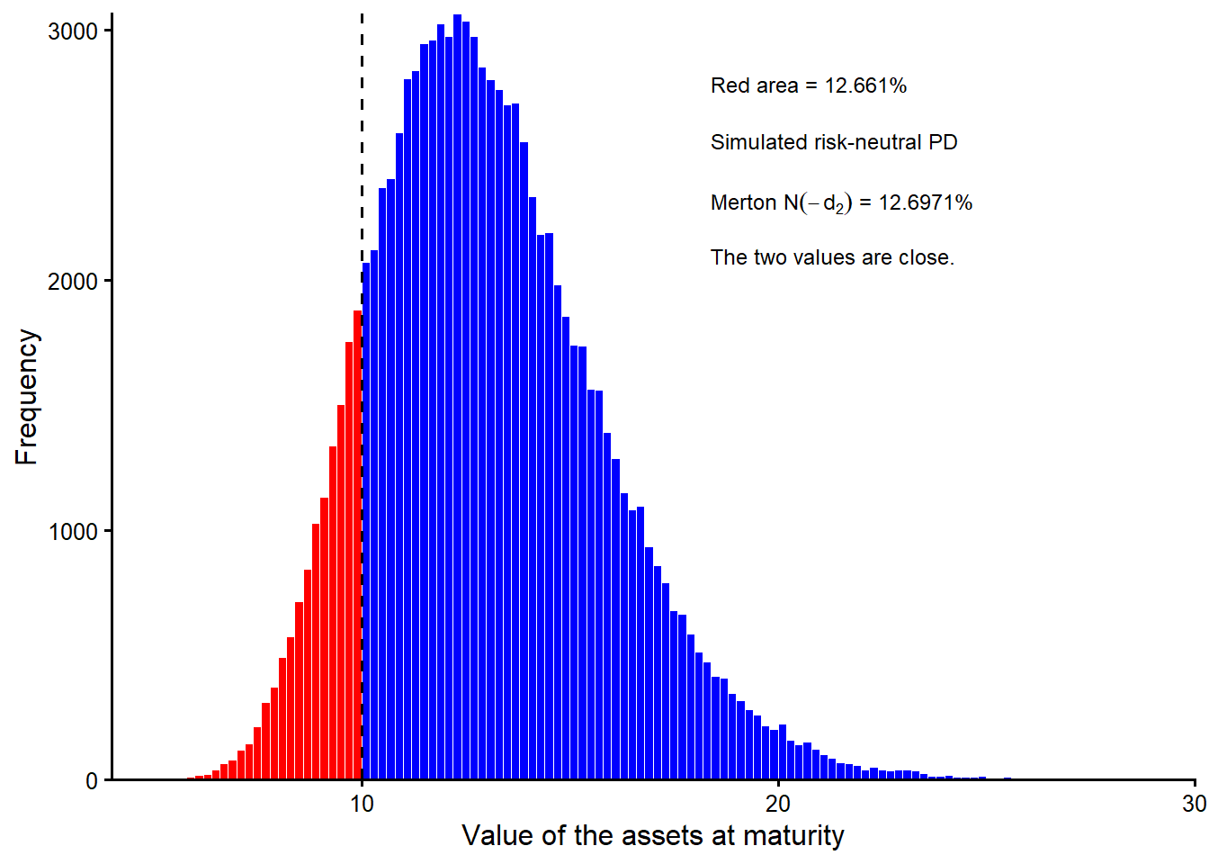
The simulated risk-neutral probability of default can be calculated as:
Code
knitr::kable(
  data.frame(
    Quantity = c(
      "Simulated terminal asset values",
      "Terminal values below D",
      "Simulated risk-neutral PD",
      "Analytical Merton PD"
    ),
    Value = c(
      fmt_int(length(VT)),
      fmt_int(sum(VT < D)),
      fmt_pct(sim_pd_100k, 4),
      fmt_pct(pd_merton, 4)
    )
  ),
  caption = "Large-sample simulated risk-neutral PD compared with the analytical Merton PD.",
  row.names = FALSE
)| Quantity | Value |
|---|---|
| Simulated terminal asset values | 100,000 |
| Terminal values below D | 12,661 |
| Simulated risk-neutral PD | 12.6610% |
| Analytical Merton PD | 12.6971% |
Figure Figure 3.12 is the large-sample continuation of Figure 3.11. The simulated value 0.12661 is now very close to the model value 0.1269712. The red area in the histogram is therefore the simulation-based approximation of the model-implied risk-neutral probability \(N(-d_2)\).
3.3 Equity as a call option payoff
We already used the equity payoff \(E_T=\max(V_T-D,0)\) to motivate Hull’s valuation equation. This section reuses the same payoff for a different purpose. It interprets equity as a residual claim on the firm’s market asset value and shows why the Merton model can use option-pricing logic.
The phrase residual claimant has a concrete meaning here. In the basic Merton setup, the firm has one promised debt payment due at maturity. At \(T\), the firm’s assets are valued at their market value \(V_T\), and payments follow priority. Debt holders are senior claimants. They are paid first, up to the promised amount \(D\). Equity holders are junior claimants. They receive only what remains after debt has been paid. Therefore:
\[ \text{Debt payoff at }T=\min(V_T,D), \]
and:
\[ E_T=\max(V_T-D,0). \]
If \(V_T>D\), creditors receive \(D\) and shareholders receive the surplus \(V_T-D\). If \(V_T<D\), the firm does not have enough market value to repay the promised debt payment in full. Creditors receive the available asset value, shareholders receive zero, and the firm is in default.
This is a market-value claims view, not an accounting balance sheet. The model is not using book assets from financial statements at maturity. It is describing how the market value of the firm’s assets is split between senior debt and junior equity claims.
A European call option has terminal payoff:
\[ c_T=\max(S_T-K,0). \]
Merton equity has the same payoff shape:
\[ E_T=\max(V_T-D,0). \]
The mapping is direct. The asset value \(V_T\) plays the role of the underlying price \(S_T\), and the promised debt payment \(D\) plays the role of the strike price \(K\).
| European call option | Merton market-value claim |
|---|---|
| Underlying price at maturity, \(S_T\) | Market value of assets at maturity, \(V_T\) |
| Strike price, \(K\) | Promised debt payment due at maturity, \(D\) |
| Call is in the money if \(S_T>K\) | Equity receives a positive residual if \(V_T>D\) |
| Call expires worthless if \(S_T<K\) | Equity is zero and the firm defaults if \(V_T<D\) |
| Call payoff, \(\max(S_T-K,0)\) | Equity payoff, \(\max(V_T-D,0)\) |
This mapping is useful because it turns the credit problem into a contingent-claim problem. Default is the out-of-the-money region of equity. Survival is the in-the-money region. The debt payment \(D\) becomes the default boundary. The option formula in section 3.2 therefore belongs in the credit-risk argument. It prices the equity claim once equity is understood as a call on the firm’s assets.
It also clarifies what is being valued. The call formula values the equity claim. The whole-firm market asset value is the broader object. In the Hull/Merton example, section 3.2 inferred a market asset value of \(V_0=12.3954\). The observed equity value is \(E_0=3\), so the model-implied market value of debt is \(B_0=V_0-E_0=9.3954\). A buyer of the whole firm as a package of market-value assets would look at \(V_0\). A buyer of only the shares would be buying the equity claim, whose observed market value is \(E_0\). The difference between those two values is the debt claim.
The figure below makes the maturity payoff shape visible.
Code
ET <- pmax(VT - D, 0) # payoff function of a typical call option.
payoff_data <- data.frame(
  terminal_asset_value = sort(VT),
  terminal_equity_value = sort(ET)
)

ggplot2::ggplot(
  payoff_data,
  ggplot2::aes(x = terminal_asset_value, y = terminal_equity_value)
) +
  ggplot2::geom_hline(yintercept = 0, linewidth = 0.35, color = "gray78") +
  ggplot2::geom_line(linewidth = 1.25, color = "#0B5CAD") +
  ggplot2::geom_vline(xintercept = D, linetype = "dashed", linewidth = 0.7) +
  ggplot2::annotate(
    "label",
    x = 6.1,
    y = 4.4,
    hjust = 0,
    label = paste0(
      "Equity payoff is zero\n",
      "in ", fmt_pct(sim_pd_100k, 3), " of the\n",
      "100,000 cases."
    ),
    label.size = 0,
    linewidth = 0,
    fill = "white",
    alpha = 0.9,
    size = 3.8
  ) +
  ggplot2::coord_cartesian(xlim = c(5, 20), ylim = c(-0.55, 10), expand = FALSE) +
  ggplot2::labs(
    x = expression(paste("Simulated assets at maturity (", V[T], ")")),
    y = expression(paste("Simulated equity at maturity (", E[T], ")"))
  ) +
  ggplot2::theme_classic(base_size = 12)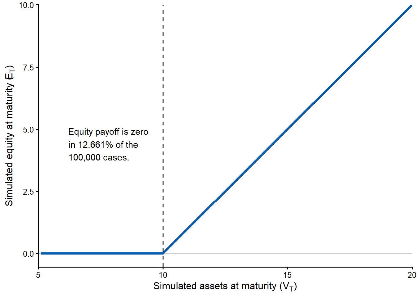
Figure Figure 3.13 shows the payoff split at maturity. The flat part to the left of \(D\) is the limited-liability region. Asset value is too low to repay the promised debt payment, so equity is worth zero. To the right of \(D\), equity increases one-for-one with assets because every additional unit above the promised debt payment belongs to shareholders.
This payoff relation, \(E_T=\max(V_T-D, 0)\), is the key point of the inside view. It is the maturity counterpart of the valuation equation used earlier to infer \(V_0\) and \(\sigma_V\) from observed equity data.
The important distinction is therefore this. \(E_T\) is the future state-dependent equity payoff, \(E_0\) is the observed equity value today, \(V_0\) is the model’s market value of assets today, and \(D\) is the promised debt payment at maturity. The estimate \(V_0\) can be compared with the book value of total assets to understand the difference between book values and market values. The market value of debt is another model-implied quantity, and it is different from the promised debt payment \(D\).
3.4 Model-implied PD sensitivity analyses
The previous section gives us a convenient function, \(pd = f(E_0, \sigma_E, rf, T, D)\). These five observable inputs are used to estimate \(V_0\) and \(\sigma_V\) before calculating \(pd\).
Throughout this section, \(pd\) means the Merton risk-neutral/implied probability of default. The exercises below are model-implied sensitivity analyses. We change one or two observable inputs, keep the remaining observable inputs and model assumptions fixed, solve again for the unobservable \(V_0\) and \(\sigma_V\), and then recompute \(N(-d_2)\) under the risk-neutral distribution. The asset quantities \(V_0\) and \(\sigma_V\) are therefore part of the new Merton solution at each point.
The function below makes that workflow explicit. Every time we call pd(E0, se, rf, TT, D), the code rebuilds equations 24.3 and 24.4, solves again for \(V_0\) and \(\sigma_V\) with optim(), and then returns \(N(-d_2)\). This is why the sensitivity curves are model-implied recalculations rather than simple one-variable plots that hold the hidden asset quantities fixed.
Code
pd <- function(E0, se, rf, TT, D) {
  d1_merton <- function(V0, sv) {
    (log(V0 / D) + (rf + sv^2 / 2) * TT) / (sv * sqrt(TT))
  }

  d2_merton <- function(V0, sv) {
    d1_merton(V0, sv) - sv * sqrt(TT)
  }

  eq24.3 <- function(V0, sv) {
    V0 * pnorm(d1_merton(V0, sv)) -
      D * exp(-rf * TT) * pnorm(d2_merton(V0, sv)) -
      E0
  }

  eq24.4 <- function(V0, sv) {
    pnorm(d1_merton(V0, sv)) * sv * V0 - se * E0
  }

  objective <- function(x) {
    eq24.3(x[1], x[2])^2 + eq24.4(x[1], x[2])^2
  }

  start_V0 <- E0 + D * exp(-rf * TT)
  start_sv <- se * E0 / start_V0

  solution <- optim(
    par = c(V0 = start_V0, sv = start_sv),
    fn = objective,
    method = "L-BFGS-B",
    lower = c(V0 = 1e-6, sv = 1e-6),
    control = list(
      parscale = c(V0 = 10, sv = 0.2),
      ndeps = c(V0 = 1e-6, sv = 1e-8)
    )
  )

  V0_hat <- unname(solution$par["V0"])
  sv_hat <- unname(solution$par["sv"])

  pnorm(-d2_merton(V0_hat, sv_hat))
}
Code
# Evaluate the case of the textbook example.
pd1 <- pd(3, 0.8, 0.05, 1, 10)
knitr::kable(
  data.frame(
    Quantity = c(
      "Observed equity value",
      "Observed equity volatility",
      "Risk-free rate",
      "Debt maturity",
      "Promised debt payment",
      "Merton risk-neutral PD"
    ),
    Value = c(
      fmt_num(E0, 0),
      fmt_pct(se, 0),
      fmt_pct(rf, 0),
      fmt_num(TT, 0),
      fmt_num(D, 0),
      fmt_pct(pd1, 4)
    )
  ),
  caption = "Original Hull/Merton input position for the sensitivity analysis.",
  row.names = FALSE
)| Quantity | Value |
|---|---|
| Observed equity value | 3 |
| Observed equity volatility | 80% |
| Risk-free rate | 5% |
| Debt maturity | 1 |
| Promised debt payment | 10 |
| Merton risk-neutral PD | 12.6971% |
The code below creates input grids and evaluates the pd function across those grids.
Code
l = 50 # Vectors of length 50.
# Create vectors of the parameters.
x.E <- seq(from = 1, to = 20, length.out = l)
x.rf <- seq(0, 0.20, length.out = l)
x.D <- seq(1, 20, length.out = l)
x.T <- seq(0.5, 20, length.out = l)
x.se <- seq(0.01, 3, length.out = l)
# Evaluate the pd at different values.
pd.E <- mapply(pd, x.E, se, rf, TT, D)
pd.rf <- mapply(pd, E0, se, x.rf, TT, D)
pd.D <- mapply(pd, E0, se, rf, TT, x.D)
pd.T <- mapply(pd, E0, se, rf, x.T, D)
pd.se <- mapply(pd, E0, x.se, rf, TT, D)
plot_pd_sensitivity <- function(x, y, current_x, x_label,
y_limits = NULL, x_as_percent = FALSE,
y_digits = 0) {
plot_data <- data.frame(
input_value = x,
risk_neutral_pd = y
)
current_point <- data.frame(
input_value = current_x,
risk_neutral_pd = pd1
)
if (is.null(y_limits)) {
y_limits <- c(0, max(c(y, pd1), na.rm = TRUE) * 1.06)
}
p <- ggplot2::ggplot(
plot_data,
ggplot2::aes(x = input_value, y = risk_neutral_pd)
) +
ggplot2::geom_hline(
yintercept = 0,
linewidth = 0.35,
color = "gray82"
) +
ggplot2::geom_line(linewidth = 1.45, color = "#0b5cad") +
ggplot2::geom_vline(
xintercept = current_x,
linetype = "dashed",
linewidth = 0.55,
color = "gray35"
) +
ggplot2::geom_hline(
yintercept = pd1,
linetype = "dashed",
linewidth = 0.55,
color = "gray35"
) +
ggplot2::geom_point(
data = current_point,
ggplot2::aes(x = input_value, y = risk_neutral_pd),
shape = 21,
size = 3.6,
stroke = 1.1,
color = "#b84300",
fill = "white"
) +
ggplot2::coord_cartesian(ylim = y_limits) +
ggplot2::scale_y_continuous(labels = function(x) fmt_pct(x, y_digits)) +
ggplot2::labs(x = x_label, y = "Risk-neutral PD") +
ggplot2::theme_classic(base_size = 12) +
ggplot2::theme(
panel.grid.major.y = ggplot2::element_line(
color = "gray90",
linewidth = 0.25
),
panel.grid.minor = ggplot2::element_blank()
)
if (x_as_percent) {
p <- p + ggplot2::scale_x_continuous(labels = function(x) fmt_pct(x, 0))
}
p
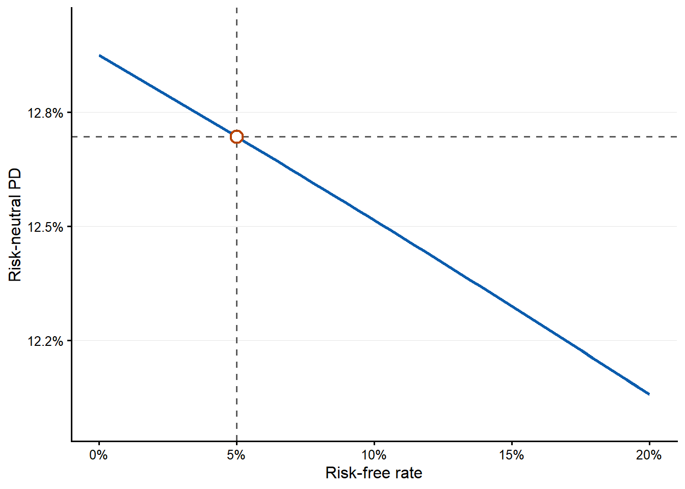
}The risk-free-rate grid ranges from 0% to 20%. This keeps the plot focused on a moderate range around the textbook example and away from extreme interest-rate environments.
One-input sensitivity curves
The first curve asks how the risk-neutral PD changes as the observed equity value \(E_0\) changes. The code evaluates the probability-of-default function 50 times, once for each value of \(E_0\) from 1 to 20. At each value of \(E_0\), the code re-estimates \(V_0\) and \(\sigma_V\) and then computes a new risk-neutral probability of default.
Code
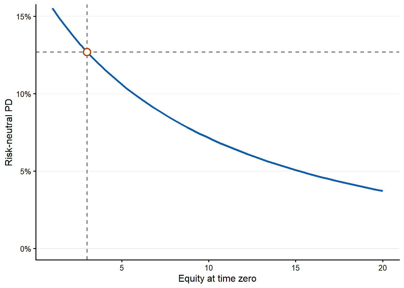
These relationships between the observable inputs and the risk-neutral probability of default are nonlinear. The current level of each input shapes the result because the same absolute change can have a high or low impact depending on where the firm starts.
Code
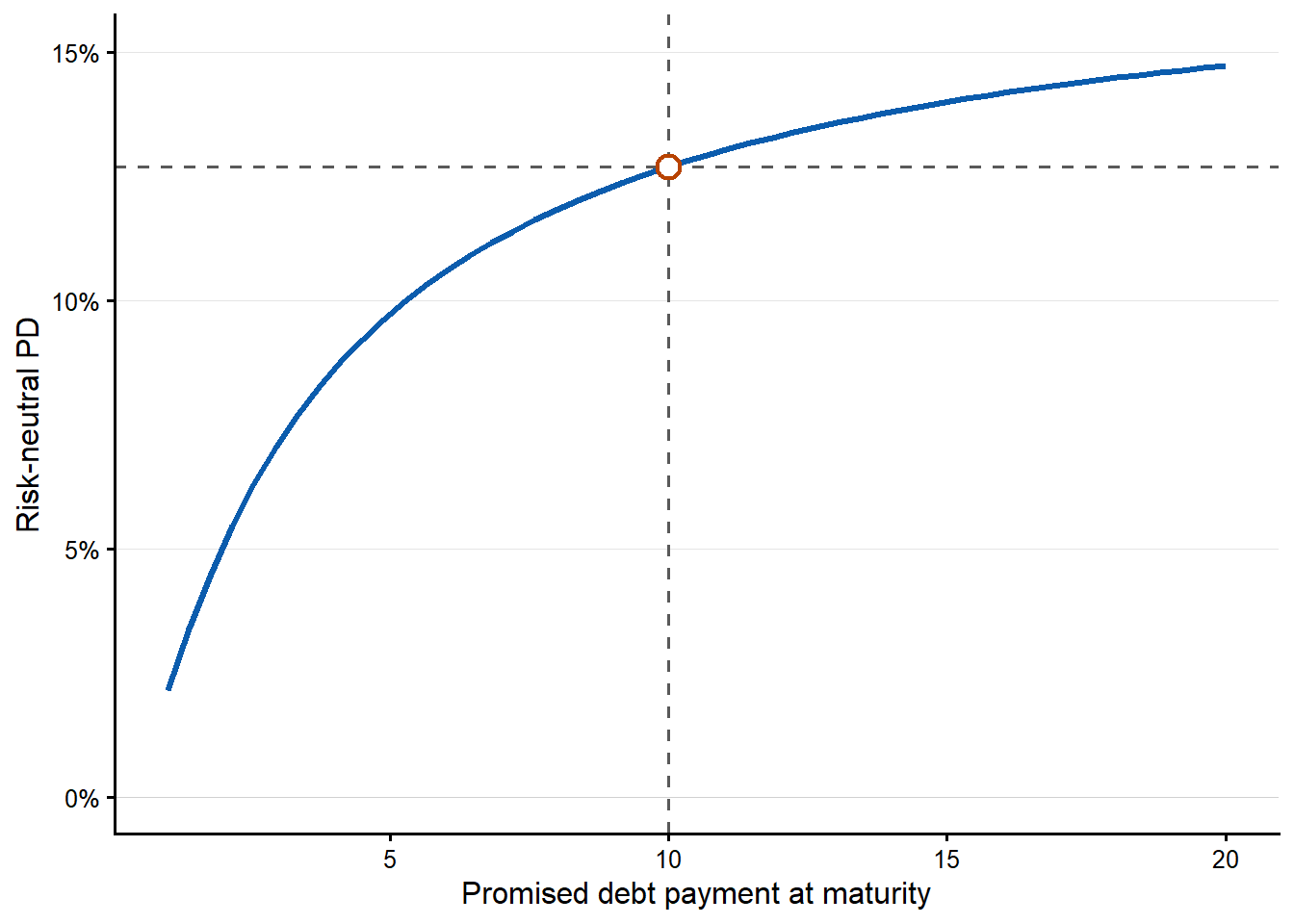
The next curve changes the promised debt payment due at maturity, \(D\). Increasing or decreasing \(D\) by 1 unit can have a different impact on the model-implied probability of default because the curve is nonlinear.
Code
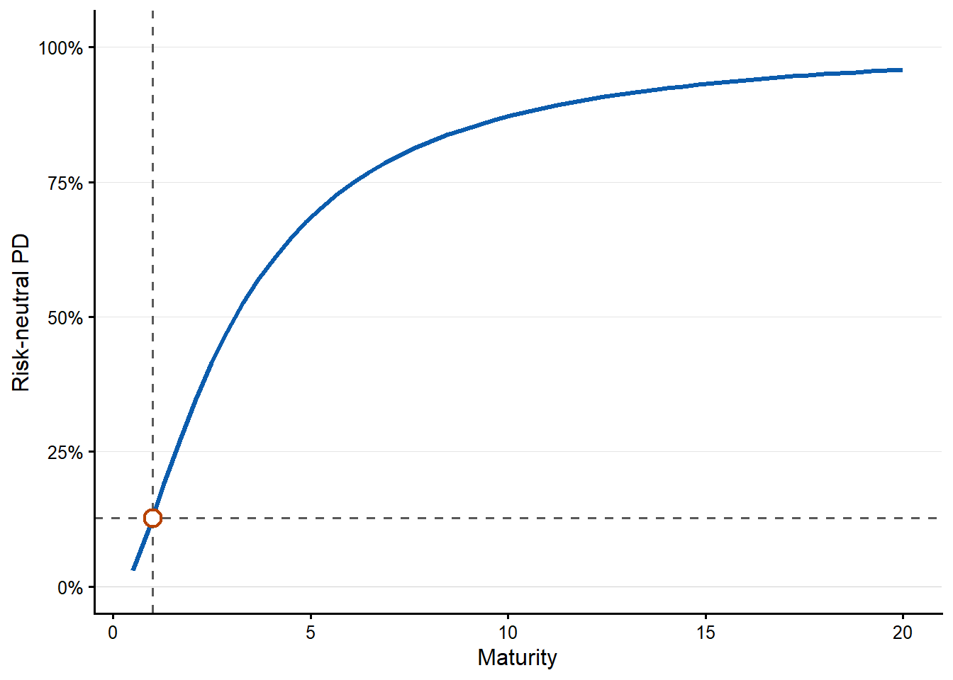
The maturity curve requires a careful reading. In this model-implied sensitivity exercise, changing maturity also triggers a new solution for \(V_0\) and \(\sigma_V\). For each maturity value on the horizontal axis, the remaining observable inputs are kept fixed, the unobserved asset quantities are re-estimated, and the risk-neutral PD is recomputed. This is a model comparison. A real debt negotiation would also depend on cash flows, covenants, recovery, refinancing risk, and the bank’s required spread.
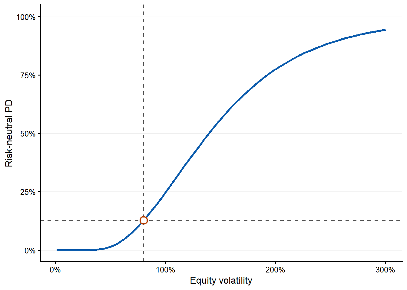
The last one-input curve changes the observed equity volatility \(\sigma_E\).
Code
The five one-input figures are easier to use when their messages are read together. The next table summarizes the grid calculation behind the plots. Each row changes one observed input, solves the Merton equations again, and reports the lowest and highest risk-neutral PD on that grid.
Code
sensitivity_summary_table <- data.frame(
  Input = c(
    "$E_0$",
    "$r_f$",
    "$D$",
    "$T$",
    "$\\sigma_E$"
  ),
  `Grid range` = c(
    paste0(fmt_num(min(x.E), 0), " to ", fmt_num(max(x.E), 0)),
    paste0(fmt_pct(min(x.rf), 0), " to ", fmt_pct(max(x.rf), 0)),
    paste0(fmt_num(min(x.D), 0), " to ", fmt_num(max(x.D), 0)),
    paste0(fmt_num(min(x.T), 1), " to ", fmt_num(max(x.T), 0), " years"),
    paste0(fmt_pct(min(x.se), 0), " to ", fmt_pct(max(x.se), 0))
  ),
  `PD range on grid` = c(
    paste0(fmt_pct(min(pd.E, na.rm = TRUE), 2), " to ", fmt_pct(max(pd.E, na.rm = TRUE), 2)),
    paste0(fmt_pct(min(pd.rf, na.rm = TRUE), 2), " to ", fmt_pct(max(pd.rf, na.rm = TRUE), 2)),
    paste0(fmt_pct(min(pd.D, na.rm = TRUE), 2), " to ", fmt_pct(max(pd.D, na.rm = TRUE), 2)),
    paste0(fmt_pct(min(pd.T, na.rm = TRUE), 2), " to ", fmt_pct(max(pd.T, na.rm = TRUE), 2)),
    paste0(fmt_pct(min(pd.se, na.rm = TRUE), 2), " to ", fmt_pct(max(pd.se, na.rm = TRUE), 2))
  ),
  `Financial reading` = c(
    "More equity market value gives the firm a larger cushion above the promised debt payment.",
    "The effect is small in this example because the option valuation equation and asset re-estimation both move.",
    "A higher promised debt payment raises the default boundary.",
    "More time gives the asset value more room to move under the risk-neutral distribution.",
    "Higher observed equity volatility implies a more unstable residual claim and usually higher asset risk."
  )
)

knitr::kable(
  sensitivity_summary_table,
  caption = "Reading the one-input Merton sensitivity curves.",
  escape = FALSE,
  row.names = FALSE
)| Input | Grid.range | PD.range.on.grid | Financial.reading |
|---|---|---|---|
| \(E_0\) | 1 to 20 | 3.71% to 15.53% | More equity market value gives the firm a larger cushion above the promised debt payment. |
| \(r_f\) | 0% to 20% | 12.13% to 12.88% | The effect is small in this example because the option valuation equation and asset re-estimation both move. |
| \(D\) | 1 to 20 | 2.14% to 14.73% | A higher promised debt payment raises the default boundary. |
| \(T\) | 0.5 to 20 years | 2.91% to 95.85% | More time gives the asset value more room to move under the risk-neutral distribution. |
| \(\sigma_E\) | 1% to 300% | 0.00% to 94.41% | Higher observed equity volatility implies a more unstable residual claim and usually higher asset risk. |
Two-input views
The previous plots changed one observable input at a time. The inputs were \(E_0\), \(\sigma_E\), \(rf\), \(T\) or \(D\). We were able to do that because we constructed a vector of 50 different values for these inputs. Again, \(V_0\) and \(\sigma_V\) are re-estimated each time because they are inferred from \(E_0\), \(\sigma_E\), \(rf\), \(T\) and \(D\) each time the function is evaluated.
The two-input view lets two market inputs move at the same time, \(E_0\) and \(\sigma_E\). This is financially useful because equity value measures how much market cushion the firm has above the promised debt payment, while equity volatility measures how unstable that cushion is. A firm with low equity value and high equity volatility should imply a higher probability of default than a firm with high equity value and low equity volatility.
To make the comparison complete, we evaluate all combinations of 50 values of \(E_0\) and 50 values of \(\sigma_E\). For this two-input view, we cap \(E_0\) at 10 and \(\sigma_E\) at 150% so the relevant region around the original example remains readable. The result is a \(50 \times 50\) grid. Each cell answers a concrete question. If the observed equity value were this level and the observed equity volatility were that level, what Merton risk-neutral PD would the model imply?
Code
x.E_two_input <- seq(from = 1, to = 10, length.out = l)
x.se_two_input <- seq(from = 0.01, to = 1.5, length.out = l)
# Create the empty matrix.
p_E_se <- matrix(0, nrow = l, ncol = l)
# Fill the empty matrix with probability of default values.
for(i in 1 : l){ # Is there an easier way to do this?
  for(j in 1 : l){
    p_E_se[i,j] <- mapply(pd, x.E_two_input[i], x.se_two_input[j], rf, TT, D) } }
The grid is easiest to read as a contour plot. Each contour line connects combinations of \(E_0\) and \(\sigma_E\) that produce the same risk-neutral PD after the model solves again for \(V_0\) and \(\sigma_V\).
Code
pd_grid <- expand.grid(
  equity_at_time_zero = x.E_two_input,
  equity_volatility = x.se_two_input
)
pd_grid$risk_neutral_pd <- as.vector(p_E_se)
current_pd_point <- data.frame(
  equity_at_time_zero = E0,
  equity_volatility = se,
  risk_neutral_pd = pd1
)
pd_contour_breaks <- seq(0.05, 0.95, by = 0.05)
pd_contour_label_levels <- c(0.05, 0.10, 0.15, 0.20, 0.40)
pd_contour_label_lines <- contourLines(
  x = x.E_two_input,
  y = x.se_two_input,
  z = p_E_se,
  levels = pd_contour_label_levels
)
pd_contour_label_list <- lapply(pd_contour_label_levels, function(level_value) {
  level_lines <- pd_contour_label_lines[
    vapply(
      pd_contour_label_lines,
      function(line) isTRUE(all.equal(line$level, level_value)),
      logical(1)
    )
  ]
  if (length(level_lines) == 0) {
    return(NULL)
  }
  longest_line <- level_lines[[which.max(vapply(level_lines, function(line) {
    length(line$x)
  }, numeric(1)))]]
  label_index <- max(1, round(length(longest_line$x) * 0.68))
  data.frame(
    equity_at_time_zero = longest_line$x[label_index],
    equity_volatility = longest_line$y[label_index],
    risk_neutral_pd = level_value
  )
})
pd_contour_label_data <- do.call(rbind, pd_contour_label_list)
if (is.null(pd_contour_label_data)) {
  pd_contour_label_data <- data.frame(
    equity_at_time_zero = numeric(),
    equity_volatility = numeric(),
    risk_neutral_pd = numeric()
  )
}
pd_contour_label_data$label <- fmt_pct(
  pd_contour_label_data$risk_neutral_pd,
  0
)

ggplot2::ggplot(
  pd_grid,
  ggplot2::aes(
    x = equity_at_time_zero,
    y = equity_volatility,
    z = risk_neutral_pd
  )
) +
  ggplot2::geom_contour(
    ggplot2::aes(color = ggplot2::after_stat(level)),
    breaks = pd_contour_breaks,
    linewidth = 0.85
  ) +
  ggplot2::geom_label(
    data = pd_contour_label_data,
    ggplot2::aes(
      x = equity_at_time_zero,
      y = equity_volatility,
      label = label
    ),
    inherit.aes = FALSE,
    size = 4,
    label.size = 0,
    fill = "white",
    alpha = 0.86
  ) +
  ggplot2::geom_vline(xintercept = E0, linetype = "dashed", linewidth = 0.55) +
  ggplot2::geom_hline(yintercept = se, linetype = "dashed", linewidth = 0.55) +
  ggplot2::geom_point(
    data = current_pd_point,
    ggplot2::aes(x = equity_at_time_zero, y = equity_volatility),
    inherit.aes = FALSE,
    shape = 21,
    size = 4.2,
    stroke = 1.2,
    color = "red",
    fill = "white"
  ) +
  ggplot2::scale_y_continuous(
    labels = function(x) fmt_pct(x, 0),
    limits = c(0.4, 1.2),
    breaks = seq(0.4, 1.2, by = 0.2),
    expand = ggplot2::expansion(mult = c(0, 0))
  ) +
  ggplot2::scale_x_continuous(
    limits = c(1, 10),
    breaks = seq(2, 10, by = 2),
    expand = ggplot2::expansion(mult = c(0, 0))
  ) +
  ggplot2::scale_color_viridis_c(
    option = "C",
    end = 0.9,
    guide = "none"
  ) +
  ggplot2::labs(
    x = expression(E[0]),
    y = expression(sigma[E])
  ) +
  ggplot2::theme_classic(base_size = 12)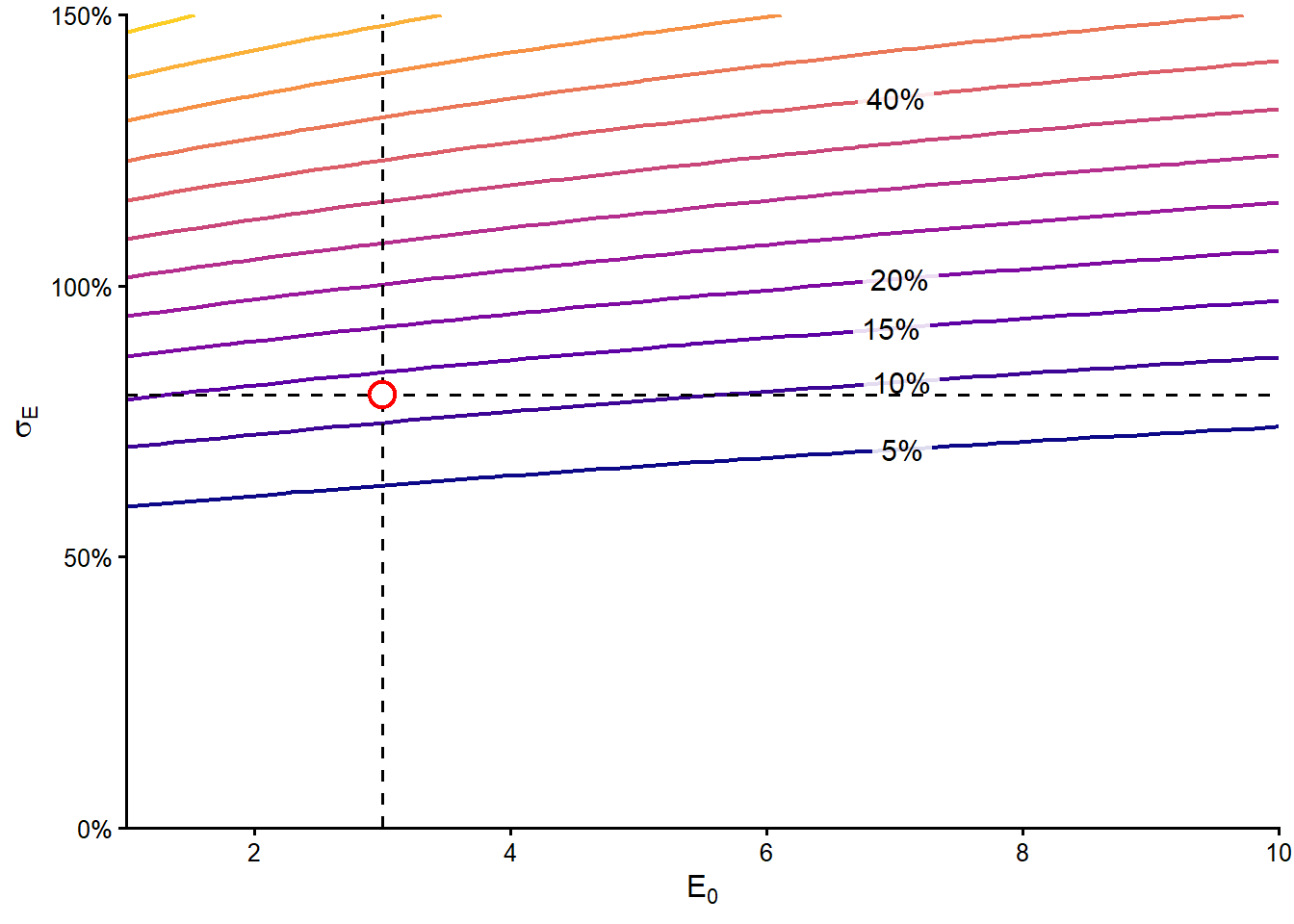
The red point is the original case, where \(E_0=3\), \(\sigma_E=80%\) and the model-implied PD is 12.6971%. The point lies between the 10% and 15% contour lines, which is consistent with the numerical value. The plot also shows the main financial pattern. Lower equity value and higher equity volatility move the firm toward higher default probabilities.
Code
l = 40 # Vectors of length 40.
# Create vectors of the parameters.
x.E <- seq(from = 2, to = 4, length.out = l)
x.se <- seq(0.2, 1.5, length.out = l)
# Create the empty matrix.
p_E_se <- matrix(0, nrow = l, ncol = l)
# Fill the empty matrix with probability of default values.
for(i in 1 : l){ # Is there an easier way to do this?
  for(j in 1 : l){
    p_E_se[i,j] <- mapply(pd, x.E[i], x.se[j], rf, TT, D) } }
Code
3.5 Capital-structure scenarios
The financial question is how a firm can reduce its model-implied probability of default before negotiating credit conditions. To make the comparison concrete, Daenerys Targaryen owns a large manufacturing firm that produces fire extinguishers. The firm’s inputs are exactly the same as in Hull’s example 24.3 (Hull 2022). She is planning to ask the Iron Bank of Braavos for a loan. Basic finance gives her two possible levers. She can reduce the promised debt payment \(D\), or increase the market value of equity \(E_0\) through a capital injection. Doing both at the same time would be more expensive, so she wants to compare the alternatives one at a time.
In this section, probability of default means the Merton risk-neutral/implied probability of default. The scenarios are useful for understanding how the model reacts to changes in capital structure. They are model-implied comparisons, not historical forecasts of how often firms like this default.
These are model-implied sensitivity scenarios. In each scenario, we change one observed input while keeping the remaining observed inputs and model assumptions fixed. The unobserved asset value \(V_0\) and asset volatility \(\sigma_V\) are then re-estimated by the Merton equations, so they are not held fixed. The resulting probability of default is the new risk-neutral PD implied by the full Merton solution.
Scenario 1. Reduce debt or inject equity
Which action produces the lower model-implied probability of default? Should she reduce the promised debt payment \(D\) by 2, or increase the equity value \(E_0\) by 2 through a capital injection?
Code
D.seq <- seq(from = 0.1, to = 13, by = 0.1)
pd_initial <- pd1
pd_scenario_2_initial <- pd(2, se, rf, TT, 2)
pd_scenario_3_initial <- pd(E0, se, rf, 1.5, 6)
scenario1_reduce_D <- pd(E0, se, rf, TT, D - 2)
scenario1_raise_E <- pd(E0 + 2, se, rf, TT, D)
scenario2_E0 <- 2
scenario2_D <- 2
scenario2_reduce_D <- pd(scenario2_E0, se, rf, TT, scenario2_D - 1)
scenario2_raise_E <- pd(scenario2_E0 + 1, se, rf, TT, scenario2_D)
scenario3_T <- 1.5
scenario3_D <- 6
scenario3_more_debt <- pd(E0, se, rf, scenario3_T, scenario3_D + 2)
scenario3_more_time <- pd(E0, se, rf, scenario3_T + 0.5, scenario3_D)
# Evaluate pd function: E0 changes from 1 to 5; D goes from 0.1 to 13.
E1 <- mapply(pd, 1, se, rf, TT, D.seq)
E2 <- mapply(pd, 2, se, rf, TT, D.seq)
E3 <- mapply(pd, 3, se, rf, TT, D.seq)
E4 <- mapply(pd, 4, se, rf, TT, D.seq)
E5 <- mapply(pd, 5, se, rf, TT, D.seq)

colors <- c("green", "purple", "black", "blue", "red")

make_capital_structure_data <- function(x, curves) {
  data.frame(
    promised_debt = rep(x, times = length(curves)),
    curve = factor(
      rep(names(curves), each = length(x)),
      levels = names(curves)
    ),
    risk_neutral_pd = unlist(curves, use.names = FALSE)
  )
}

plot_capital_structure <- function(curve_data, color_values,
                                   x_label, y_label,
                                   v_lines = NULL, h_lines = NULL,
                                   points_data = NULL,
                                   x_limits = NULL, y_limits = NULL,
                                   legend_text_size = 9) {
  p <- ggplot2::ggplot(
    curve_data,
    ggplot2::aes(
      x = promised_debt,
      y = risk_neutral_pd,
      color = curve
    )
  ) +
    ggplot2::geom_line(linewidth = 1.1) +
    ggplot2::scale_color_manual(values = color_values) +
    ggplot2::scale_y_continuous(labels = function(x) fmt_pct(x, 0)) +
    ggplot2::labs(x = x_label, y = y_label, color = NULL) +
    ggplot2::coord_cartesian(xlim = x_limits, ylim = y_limits) +
    ggplot2::theme_classic(base_size = 12) +
    ggplot2::theme(
      legend.position = c(0.98, 0.02),
      legend.justification = c(1, 0),
      legend.background = ggplot2::element_rect(
        fill = "white",
        color = NA,
        linewidth = 0.3
      ),
      legend.key = ggplot2::element_rect(fill = "white", color = NA),
      legend.text = ggplot2::element_text(size = legend_text_size)
    )

  if (!is.null(v_lines)) {
    p <- p + ggplot2::geom_vline(
      xintercept = v_lines,
      linetype = "dashed",
      linewidth = 0.55,
      color = "black"
    )
  }

  if (!is.null(h_lines)) {
    p <- p + ggplot2::geom_hline(
      yintercept = h_lines,
      linetype = "dashed",
      linewidth = 0.55,
      color = "black"
    )
  }

  if (!is.null(points_data)) {
    for (i in seq_len(nrow(points_data))) {
      p <- p + ggplot2::geom_point(
        data = points_data[i, ],
        ggplot2::aes(x = promised_debt, y = risk_neutral_pd),
        inherit.aes = FALSE,
        shape = 21,
        size = 4,
        stroke = 0.7,
        color = "black",
        fill = points_data$point_fill[i]
      )
    }
  }

  p
}
Before reading the figures, keep the three scenario comparisons in one place. Each row reports the starting position, the two actions considered, and the model-implied PD after each action.
Code
capital_structure_summary <- data.frame(
  Scenario = c(
    "1. Initial Hull position",
    "2. Lower-equity/lower-debt position",
    "3. Liquidity and maturity choice"
  ),
  `Initial position` = c(
    paste0("$E_0 = ", fmt_num(E0, 0), "$, $D = ", fmt_num(D, 0), "$, $T = ", fmt_num(TT, 0), "$"),
    paste0("$E_0 = ", fmt_num(scenario2_E0, 0), "$, $D = ", fmt_num(scenario2_D, 0), "$, $T = ", fmt_num(TT, 0), "$"),
    paste0("$E_0 = ", fmt_num(E0, 0), "$, $D = ", fmt_num(scenario3_D, 0), "$, $T = ", fmt_num(scenario3_T, 1), "$")
  ),
  `Initial risk-neutral PD` = c(
    fmt_pct(pd_initial, 2),
    fmt_pct(pd_scenario_2_initial, 2),
    fmt_pct(pd_scenario_3_initial, 2)
  ),
  `Action A` = c(
    paste0("Reduce $D$ to ", fmt_num(D - 2, 0)),
    paste0("Reduce $D$ to ", fmt_num(scenario2_D - 1, 0)),
    paste0("Raise $D$ to ", fmt_num(scenario3_D + 2, 0))
  ),
  `Risk-neutral PD after A` = c(
    fmt_pct(scenario1_reduce_D, 2),
    fmt_pct(scenario2_reduce_D, 2),
    fmt_pct(scenario3_more_debt, 2)
  ),
  `Action B` = c(
    paste0("Raise $E_0$ to ", fmt_num(E0 + 2, 0)),
    paste0("Raise $E_0$ to ", fmt_num(scenario2_E0 + 1, 0)),
    paste0("Extend $T$ to ", fmt_num(scenario3_T + 0.5, 1))
  ),
  `Risk-neutral PD after B` = c(
    fmt_pct(scenario1_raise_E, 2),
    fmt_pct(scenario2_raise_E, 2),
    fmt_pct(scenario3_more_time, 2)
  ),
  `Lower-PD alternative` = c(
    "Action B, equity injection",
    "Action A, debt reduction",
    "Action A, higher promised payment"
  ),
  check.names = FALSE
)

knitr::kable(
  capital_structure_summary,
  caption = "Capital-structure scenario summary under the Merton model.",
  escape = FALSE,
  row.names = FALSE
)| Scenario | Initial position | Initial risk-neutral PD | Action A | Risk-neutral PD after A | Action B | Risk-neutral PD after B | Lower-PD alternative |
|---|---|---|---|---|---|---|---|
| 1. Initial Hull position | \(E_0 = 3\), \(D = 10\), \(T = 1\) | 12.70% | Reduce \(D\) to 8 | 11.84% | Raise \(E_0\) to 5 | 10.60% | Action B, equity injection |
| 2. Lower-equity/lower-debt position | \(E_0 = 2\), \(D = 2\), \(T = 1\) | 7.14% | Reduce \(D\) to 1 | 3.71% | Raise \(E_0\) to 3 | 5.06% | Action A, debt reduction |
| 3. Liquidity and maturity choice | \(E_0 = 3\), \(D = 6\), \(T = 1.5\) | 20.33% | Raise \(D\) to 8 | 22.13% | Extend \(T\) to 2.0 | 29.46% | Action A, higher promised payment |
Figure 3.21 shows the first comparison area. The horizontal axis changes the promised debt payment due at maturity, \(D\). Each colored curve fixes one equity value, \(E_0\), and recomputes the Merton risk-neutral PD for different levels of \(D\). The black curve is the original equity value, \(E_0=3\). The vertical dashed line marks the original promised debt payment, \(D=10\), and the horizontal dashed line marks the original risk-neutral PD. Their intersection is the initial firm position.
Code
leg <- c("E0=1", "E0=2", "E0=3 (initial value)", "E0=4", "E0=5")
names(colors) <- leg
equity_curve_data <- make_capital_structure_data(
  D.seq,
  setNames(list(E1, E2, E3, E4, E5), leg)
)
plot_capital_structure(
  curve_data = equity_curve_data,
  color_values = colors,
  x_label = paste0("Promised debt payment. Initially, D=", fmt_num(D, 0)),
  y_label = paste0("Risk-neutral PD. Initially PD=", fmt_pct(pd_initial, 2)),
  v_lines = D,
  h_lines = pd_initial,
  points_data = data.frame(
    promised_debt = D,
    risk_neutral_pd = pd_initial,
    point_fill = "black"
  )
)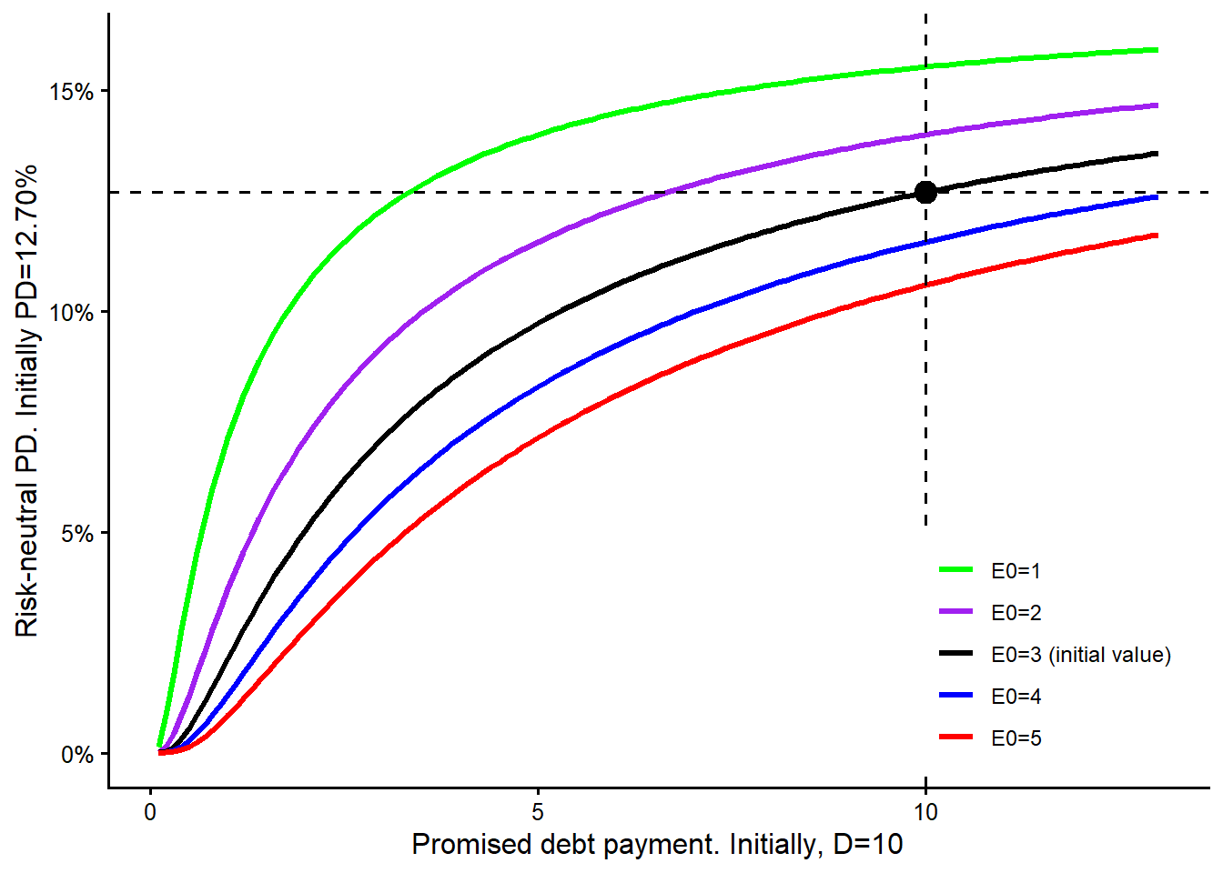
Figure 3.22 adds the two actions Daenerys is considering. Moving left from \(D=10\) to \(D=8\) represents reducing the promised debt payment while staying on the black curve because \(E_0\) remains unchanged. Moving from the black curve to the red curve at the same \(D=10\) represents increasing equity from \(E_0=3\) to \(E_0=5\). The yellow point therefore reads the debt-reduction alternative, and the red point reads the equity-injection alternative.
Code
plot_capital_structure(
  curve_data = equity_curve_data,
  color_values = colors,
  x_label = paste0("Promised debt payment. Initially, D=", fmt_num(D, 0)),
  y_label = paste0("Risk-neutral PD. Initially PD=", fmt_pct(pd_initial, 2)),
  v_lines = c(D, D - 2),
  h_lines = c(pd_initial, scenario1_reduce_D, scenario1_raise_E),
  points_data = data.frame(
    promised_debt = c(D, D, D - 2),
    risk_neutral_pd = c(pd_initial, scenario1_raise_E, scenario1_reduce_D),
    point_fill = c("black", "red", "yellow")
  )
)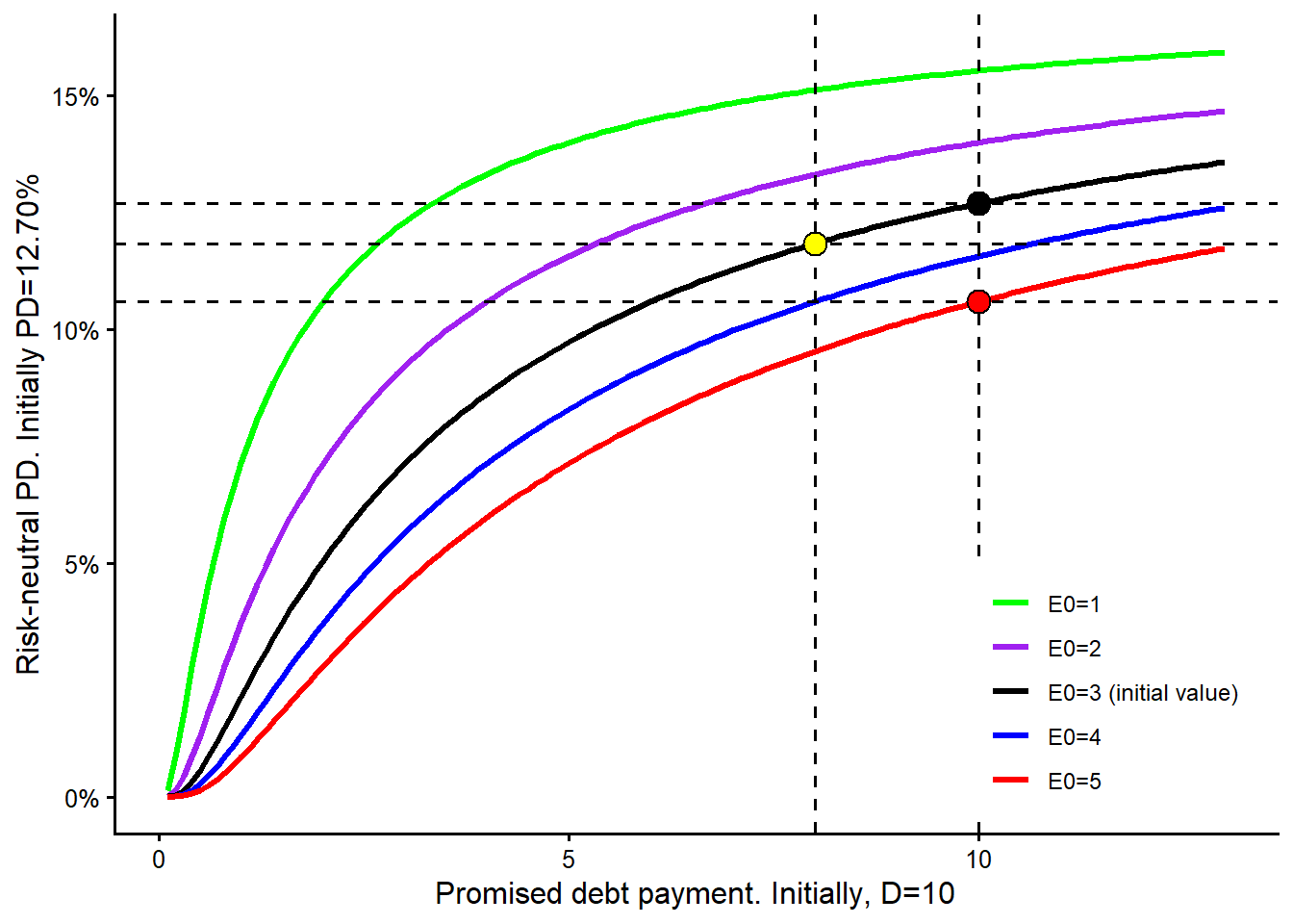
In the first scenario, reducing the promised debt payment from \(D=10\) to \(D=8\) gives a risk-neutral PD of 11.84%. Increasing the equity value from \(E_0=3\) to \(E_0=5\) gives a risk-neutral PD of 10.60%. The equity injection produces the lower PD in this starting position because it moves the firm to a lower curve. The debt reduction also helps, but here the vertical move from the black curve to the red curve is larger than the leftward move along the black curve. This statement is conditional on the Merton setup. The remaining observed inputs stay fixed, while \(V_0\) and \(\sigma_V\) are re-estimated in each alternative.
Scenario 2. A different starting balance sheet
Consider a different initial situation. Now, \(E_0=2\) and \(D=2\) while the remaining observed inputs are unchanged. In this case, the risk-neutral probability of default is 7.14%. Which action produces the lower model-implied probability of default? Should she reduce the promised debt payment \(D\) by 1, or increase the equity value \(E_0\) by 1?
Figure 3.23 repeats the same visual logic with a different starting point. The initial firm is now on the purple curve because the starting equity value is \(E_0=2\), not \(E_0=3\). The vertical dashed line marks \(D=2\), and the horizontal dashed line marks the corresponding initial PD.
Code
leg2 <- c("E0=1", "E0=2 (initial value)", "E0=3", "E0=4", "E0=5")
scenario2_colors <- setNames(unname(colors), leg2)
scenario2_curve_data <- make_capital_structure_data(
  D.seq,
  setNames(list(E1, E2, E3, E4, E5), leg2)
)
plot_capital_structure(
  curve_data = scenario2_curve_data,
  color_values = scenario2_colors,
  x_label = paste0(
    "Promised debt payment. Initially, D=",
    fmt_num(scenario2_D, 0)
  ),
  y_label = paste0(
    "Risk-neutral PD. Initially PD=",
    fmt_pct(pd_scenario_2_initial, 2)
  ),
  v_lines = scenario2_D,
  h_lines = pd_scenario_2_initial,
  points_data = data.frame(
    promised_debt = scenario2_D,
    risk_neutral_pd = pd_scenario_2_initial,
    point_fill = "purple"
  ),
  x_limits = c(0, 2.5),
  y_limits = c(0, 0.08),
  legend_text_size = 8
)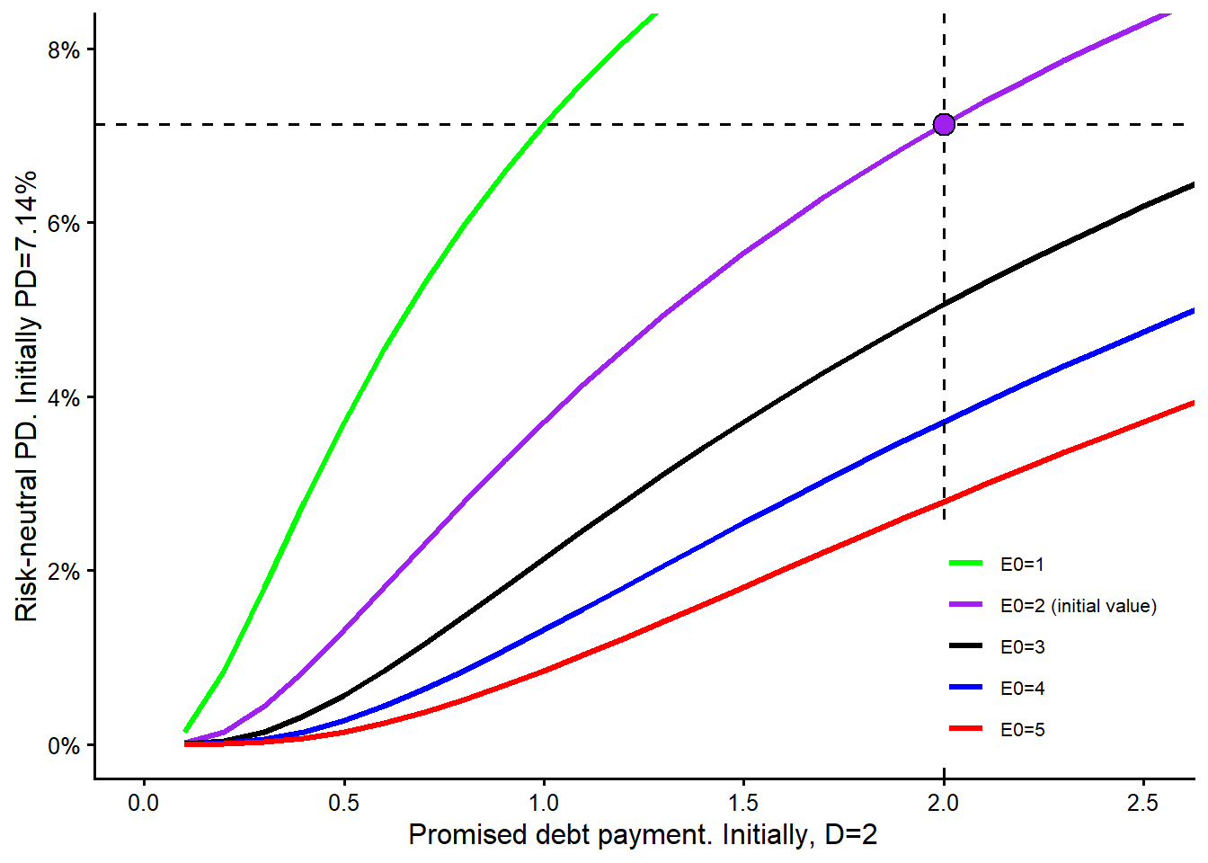
Figure 3.24 adds the two alternatives. Reducing the promised debt payment moves the firm left along the purple curve from \(D=2\) to \(D=1\), which is shown by the yellow point. Increasing equity from \(E_0=2\) to \(E_0=3\) moves the firm from the purple curve to the black curve while keeping \(D=2\), which is shown by the black point.
Code
plot_capital_structure(
  curve_data = scenario2_curve_data,
  color_values = scenario2_colors,
  x_label = paste0(
    "Promised debt payment. Initially, D=",
    fmt_num(scenario2_D, 0)
  ),
  y_label = paste0(
    "Risk-neutral PD. Initially PD=",
    fmt_pct(pd_scenario_2_initial, 2)
  ),
  v_lines = c(scenario2_D, scenario2_D - 1),
  h_lines = c(
    pd_scenario_2_initial,
    scenario2_reduce_D,
    scenario2_raise_E
  ),
  points_data = data.frame(
    promised_debt = c(scenario2_D, scenario2_D - 1, scenario2_D),
    risk_neutral_pd = c(
      pd_scenario_2_initial,
      scenario2_reduce_D,
      scenario2_raise_E
    ),
    point_fill = c("purple", "yellow", "black")
  ),
  x_limits = c(0, 2.5),
  y_limits = c(0, 0.08),
  legend_text_size = 8
)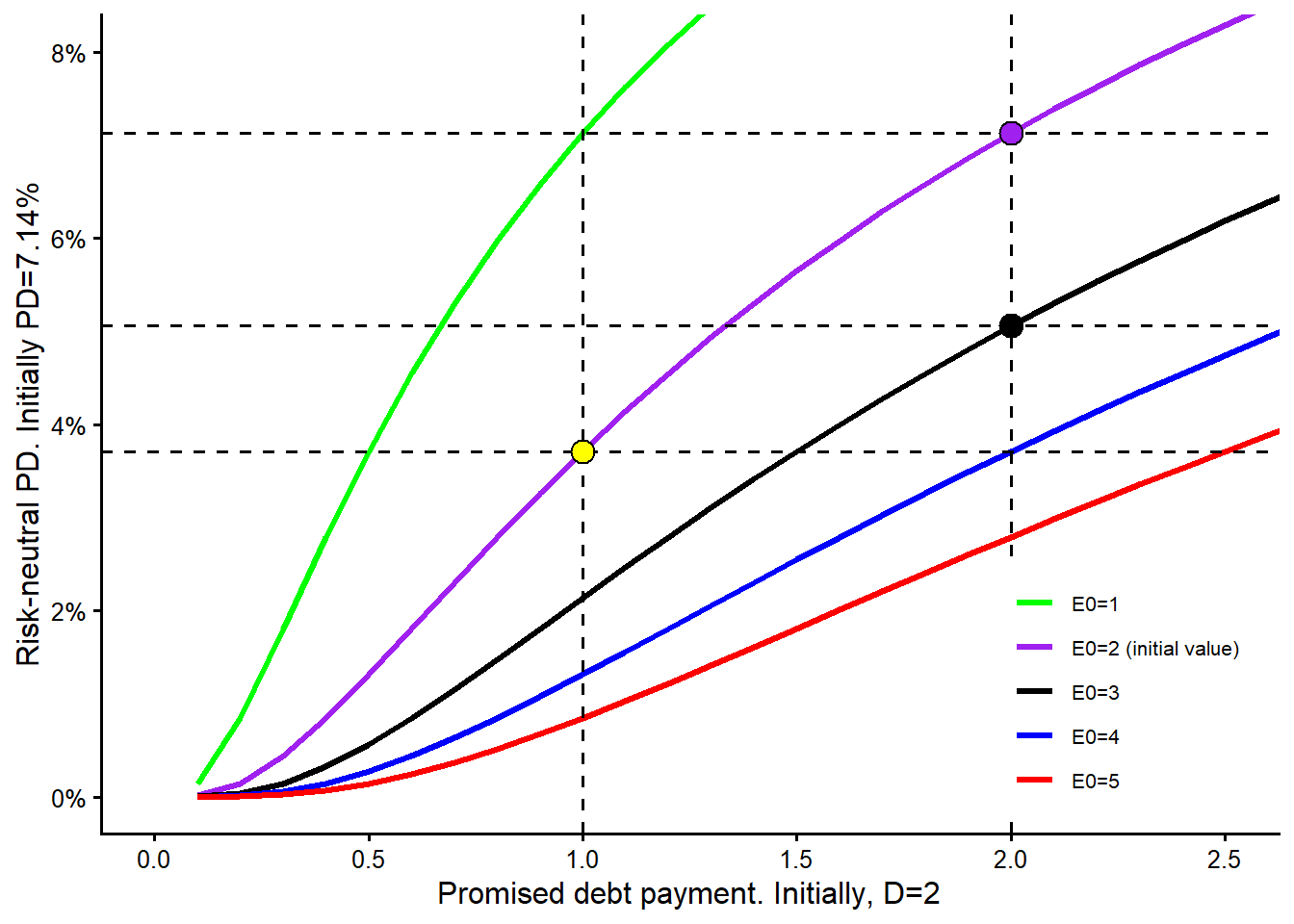
In the second scenario, reducing the promised debt payment from \(D=2\) to \(D=1\) gives a risk-neutral PD of 3.71%. Increasing the equity value from \(E_0=2\) to \(E_0=3\) gives a risk-neutral PD of 5.06%. The lower PD now comes from reducing the promised debt payment. This reverses the result from the first scenario. The reason is visible in the plot. Near this starting point, moving left along the purple curve lowers PD more than moving down to the black curve at the same debt level. The model’s nonlinear response depends on the starting capital-structure position.
Scenario 3. More debt or more time
Consider a third scenario. Daenerys Targaryen’s firm has some short-term liquidity troubles. She needs either more cash now or more time to pay the promised debt payment. In the model, more borrowing is represented as a higher promised payment \(D\) at maturity. She would like to know which alternative leads to the lowest increase in the risk-neutral probability of default. Should she increase \(D\) by 2, or ask for a half year more time to pay the promised debt payment?
Figure 3.25 changes the meaning of the colored curves. In the previous scenarios, colors represented different equity values. Here, colors represent different maturities. The black curve is the initial maturity, \(T=1.5\). The vertical dashed line marks the initial promised debt payment, \(D=6\), and the horizontal dashed line marks the initial risk-neutral PD.
Code
leg3 <- c("T=2.5", "T=2", "T=1.5", "T=1", "T=0.5")
scenario3_colors <- setNames(unname(colors), leg3)
maturity_curve_data <- make_capital_structure_data(
  D.seq,
  setNames(list(T5, T4, T3, T2, T1), leg3)
)
plot_capital_structure(
  curve_data = maturity_curve_data,
  color_values = scenario3_colors,
  x_label = paste0(
    "Promised debt payment. Initially, D=",
    fmt_num(scenario3_D, 0)
  ),
  y_label = paste0(
    "Risk-neutral PD. Initially PD=",
    fmt_pct(pd_scenario_3_initial, 2)
  ),
  v_lines = scenario3_D,
  h_lines = pd_scenario_3_initial,
  points_data = data.frame(
    promised_debt = scenario3_D,
    risk_neutral_pd = pd_scenario_3_initial,
    point_fill = "black"
  )
)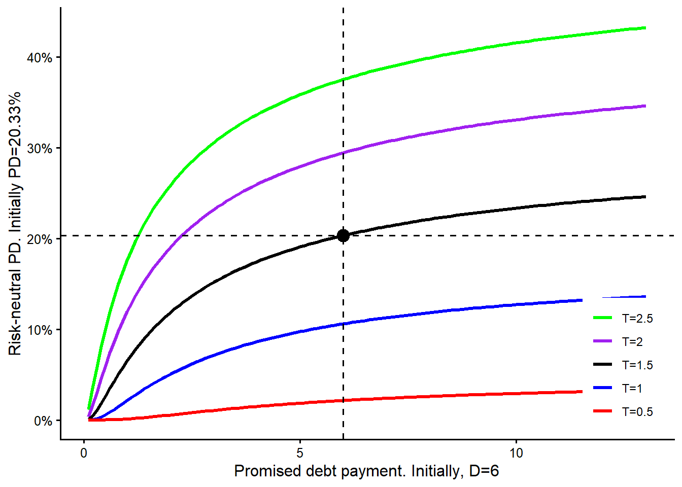
Figure 3.26 adds the two financing choices. Increasing the promised debt payment from \(D=6\) to \(D=8\) moves right along the black curve because maturity remains \(T=1.5\). Extending maturity from \(T=1.5\) to \(T=2.0\) moves from the black curve to the purple curve while keeping \(D=6\). The yellow point is therefore the additional-debt alternative, and the purple point is the longer-maturity alternative.
Code
plot_capital_structure(
  curve_data = maturity_curve_data,
  color_values = scenario3_colors,
  x_label = paste0(
    "Promised debt payment. Initially, D=",
    fmt_num(scenario3_D, 0)
  ),
  y_label = paste0(
    "Risk-neutral PD. Initially PD=",
    fmt_pct(pd_scenario_3_initial, 2)
  ),
  v_lines = c(scenario3_D, scenario3_D + 2),
  h_lines = c(
    pd_scenario_3_initial,
    scenario3_more_time,
    scenario3_more_debt
  ),
  points_data = data.frame(
    promised_debt = c(scenario3_D, scenario3_D + 2, scenario3_D),
    risk_neutral_pd = c(
      pd_scenario_3_initial,
      scenario3_more_debt,
      scenario3_more_time
    ),
    point_fill = c("black", "yellow", "purple")
  )
)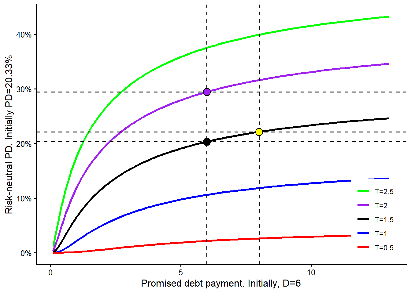
In the third scenario, increasing the promised debt payment from \(D=6\) to \(D=8\) while keeping maturity at \(T=1.5\) gives a risk-neutral PD of 22.13%. Extending maturity from \(T=1.5\) to \(T=2.0\) while keeping \(D=6\) gives a risk-neutral PD of 29.46%. Both alternatives increase the PD relative to the initial 20.33%. The smaller increase comes from increasing the promised debt payment. In this configuration, giving the assets more time to move creates a larger increase in model-implied default risk than the extra promised payment. This is a structural-model comparison. A real financing decision would also require cash-flow projections, funding spreads, covenants, and business constraints.
The summary table at the beginning of the section is the practical reading device. The figures explain the nonlinear shape of the Merton response; the table records the decision conclusion for each starting position. The same action can be best in one starting balance sheet and weaker in another because \(V_0\) and \(\sigma_V\) are re-estimated after every change.