1 Financial data
Financial modeling starts with a data question: which observations are needed, where do they come from, and how should they be transformed before any model is estimated? Finance has always been data-intensive.1 Prices, volume, interest rates, exchange rates, macroeconomic indicators, balance-sheet items, and market indexes are the raw material for valuation, trading, portfolio construction, and risk measurement.
The chapter builds the first part of the book’s workflow. It downloads market and economic data, inspects the structure of the returned objects, visualizes prices, and introduces simple indicators such as trading range, moving averages, and Bollinger Bands. The emphasis is practical: before returns, signals, beta regressions, allocation, or VaR can be computed, the data must be obtained and understood.
Some financial data is public and easy to download; other data is private, delayed, licensed, incomplete, or available only as summaries. That distinction matters because a model inherits the limitations of its data source. In this chapter, we work with public examples that can be reproduced directly in R.
1.1 Stock prices and other financial data
Financial markets facilitate transactions between buyers and sellers and generate a rich source of financial data. The examples below show how R can download and organize stock price data for analysis. The goal at this stage is modest and important: create clean objects whose dates, variables, units, and source can be checked before any return or model is calculated.
Packages such as quantmod and tidyquant reduce the friction of downloading market data. quantmod provides classic tools for quantitative financial analysis, while tidyquant connects financial data retrieval with tidy data structures. The chapter uses both packages as data-access tools, leaving model evaluation and strategy testing for later chapters.
The following optional resource shows the mechanics of installing packages in R.
In the past, financial analysis often required visiting a market-data site, downloading files in Excel or text format, and converting them into a compatible structure. Earlier workflows relied on printed sources. R packages now make this process faster, reproducible, and easier to document.
The first market-data example downloads Apple stock prices in one step with the tq_get() function from tidyquant.
The object aapl_stock_prices now contains Apple prices and related market information. The call to tq_get() comes from tidyquant, connects to the selected data provider, retrieves the “AAPL” symbol, and stores the result in a reproducible R object.
The structure of the object shows the available variables and their data types.
tibble [2,618 × 8] (S3: tbl_df/tbl/data.frame)
 $ symbol  : chr [1:2618] "AAPL" "AAPL" "AAPL" "AAPL" ...
 $ date    : Date[1:2618], format: "2016-01-04" "2016-01-05" ...
 $ open    : num [1:2618] 25.7 26.4 25.1 24.7 24.6 ...
 $ high    : num [1:2618] 26.3 26.5 25.6 25 24.8 ...
 $ low     : num [1:2618] 25.5 25.6 25 24.1 24.2 ...
 $ close   : num [1:2618] 26.3 25.7 25.2 24.1 24.2 ...
 $ volume  : num [1:2618] 2.71e+08 2.23e+08 2.74e+08 3.24e+08 2.83e+08 ...
 $ adjusted: num [1:2618] 23.7 23.1 22.7 21.7 21.8 ...
According to the str() output, aapl_stock_prices contains daily observations and 7 variables. The object includes prices and volume. A compact inspection of the first and last rows helps verify the date range and the available columns.
The first rows show how the time series begins.
# A tibble: 6 × 8
  symbol date        open  high   low close    volume adjusted
  <chr>  <date>     <dbl> <dbl> <dbl> <dbl>     <dbl>    <dbl>
1 AAPL   2016-01-04  25.7  26.3  25.5  26.3 270597600     23.7
2 AAPL   2016-01-05  26.4  26.5  25.6  25.7 223164000     23.1
3 AAPL   2016-01-06  25.1  25.6  25.0  25.2 273829600     22.7
4 AAPL   2016-01-07  24.7  25.0  24.1  24.1 324377600     21.7
5 AAPL   2016-01-08  24.6  24.8  24.2  24.2 283192000     21.8
6 AAPL   2016-01-11  24.7  24.8  24.3  24.6 198957600     22.2
The last rows show the most recent observations retrieved by the data provider.
# A tibble: 6 × 8
  symbol date        open  high   low close   volume adjusted
  <chr>  <date>     <dbl> <dbl> <dbl> <dbl>    <dbl>    <dbl>
1 AAPL   2026-05-26  310.  312.  308.  308. 48000500     308.
2 AAPL   2026-05-27  308.  313.  308.  311. 50430900     311.
3 AAPL   2026-05-28  311.  313.  310.  313. 48220400     313.
4 AAPL   2026-05-29  312.  315   310.  312. 70026800     312.
5 AAPL   2026-06-01  310.  311.  305.  306. 48849900     306.
6 AAPL   2026-06-02  307.  315.  307.  315. 44416900     315.
By default, the tq_get() function downloads the latest set of data available. The last date of aapl_stock_prices should approximately correspond to the date when the code is executed. Differences can occur when the market is closed, when the code is run during a weekend, or when the data provider updates with a delay.
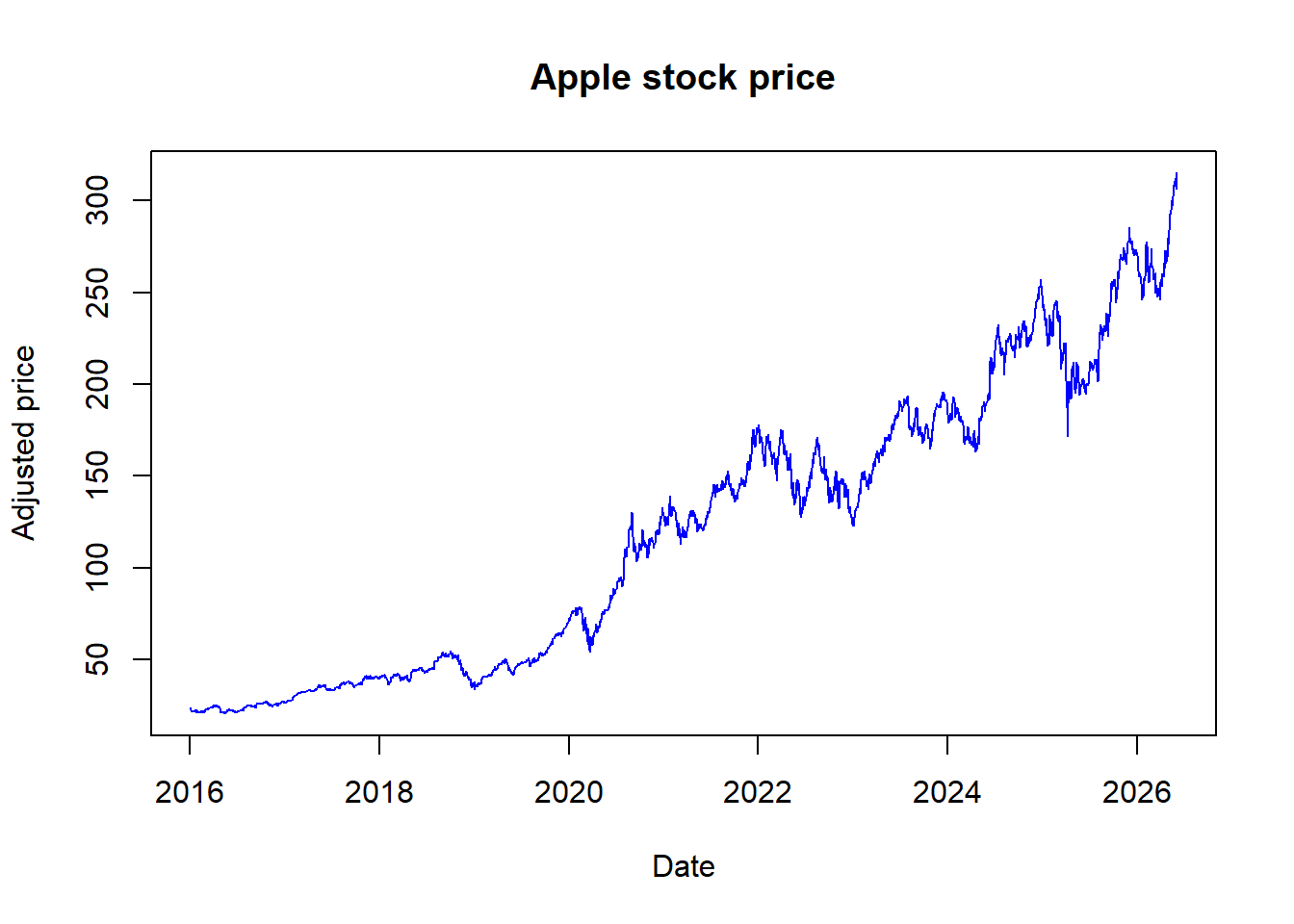
The same data can be inspected graphically. A price plot is usually the first diagnostic check: it reveals the date span, large splits or jumps, missing segments, and long-run price scale.
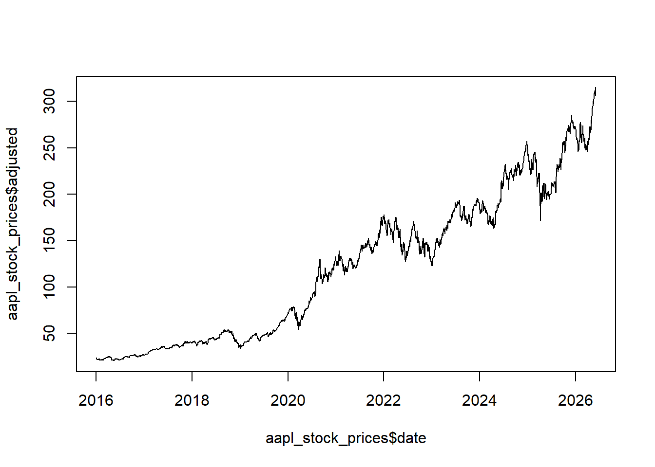
Adding labels, a title, and a line color makes the plot easier to read.
Code
Apple can also be compared with a broad market index such as the S&P 500. The comparison is useful because individual stock prices are often interpreted relative to a broad market benchmark.
The two series are plotted together with separate vertical axes because Apple and the S&P 500 are measured on different price scales. Later chapters use indexed prices and returns to make comparisons more systematic.
Code
par(mar = c(5, 5, 2, 5))
plot(SP$date, SP$adjusted, type = "l", col = "red",
     ylab = "Standard and Poors 500 index",
     xlab = "Date")
par(new = T)
plot(aapl_stock_prices$date, aapl_stock_prices$adjusted,
     type = "l", axes = F, xlab = NA, ylab = NA, cex = 1.2)
axis(side = 4)
mtext(side = 4, line = 3, "Apple stock price")
legend("topleft",
       legend=c("SP500", "Apple"),
       lty = 1, col = c("red", "black"))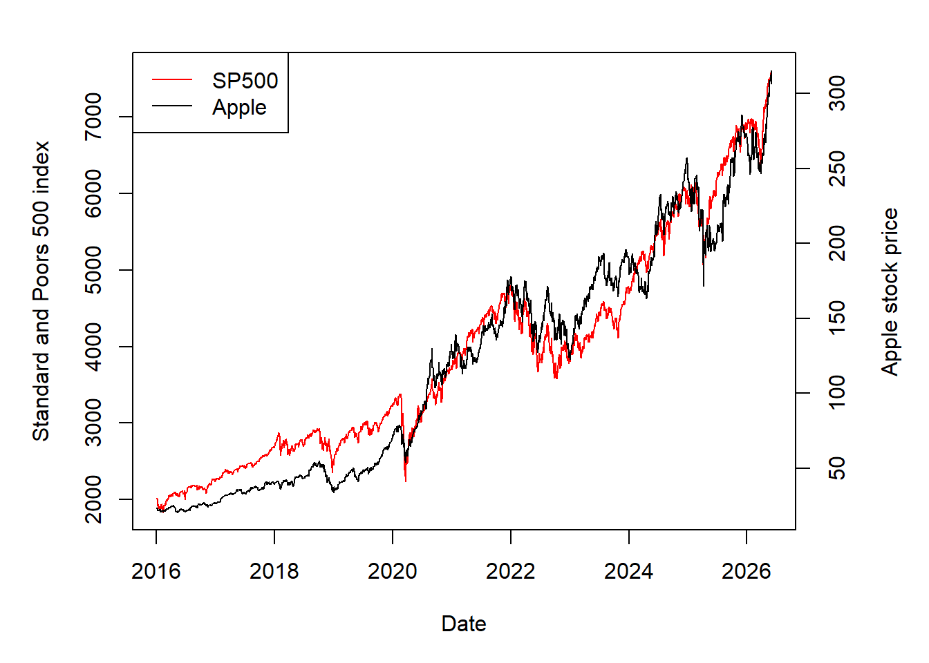
The Apple example can also be used to study intraday variation. Stock prices change throughout the trading day, so the open, high, low, and close prices summarize different pieces of the trading session. For day \(t\), the intraday range is
\[ \Delta_t = \text{High}_t - \text{Low}_t. \]
The code creates aapl_diff, the daily high-low range.
The daily range can be plotted directly.
Code
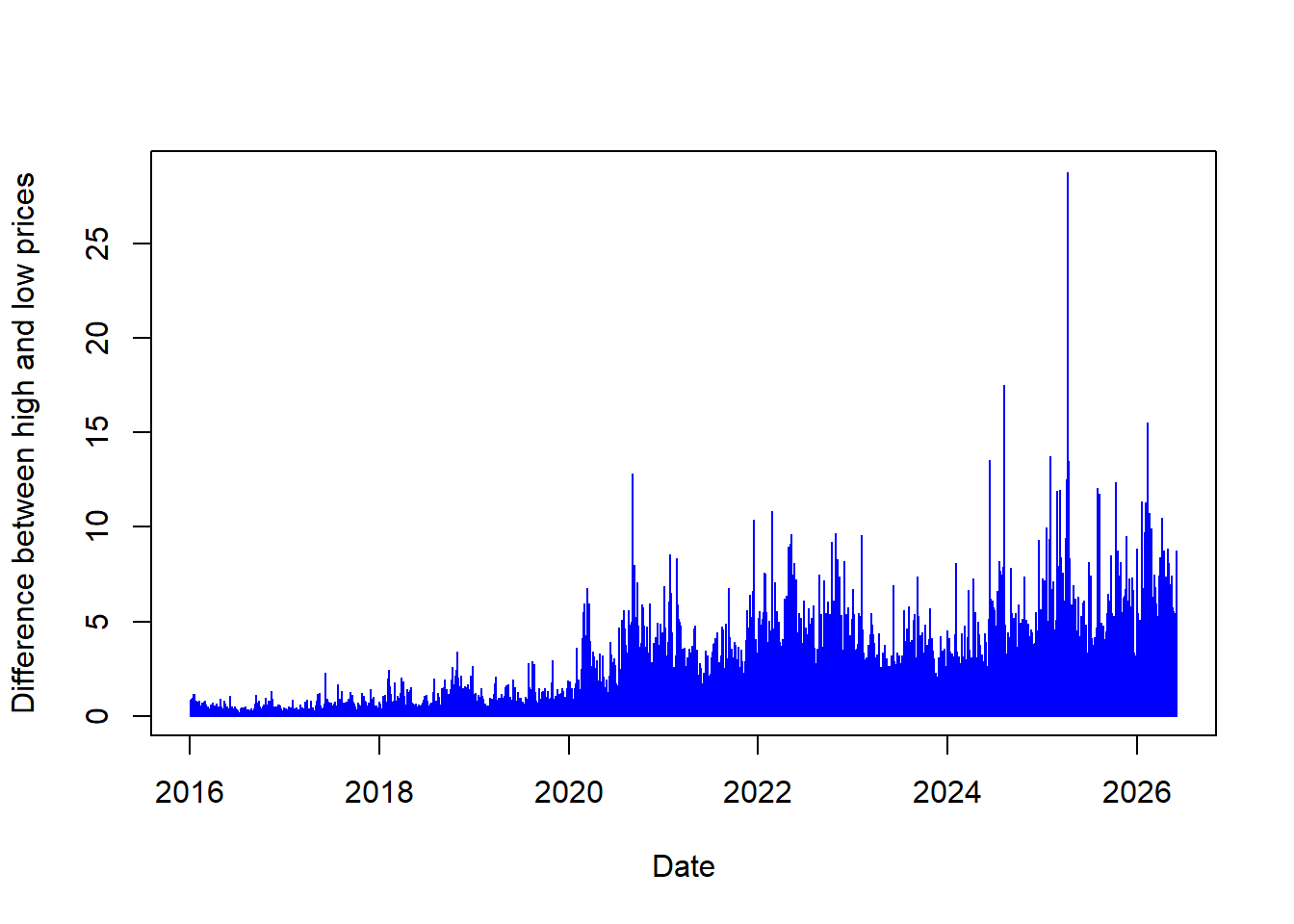
The difference between high and low prices shows that the stock price changes during a trading day. Larger bars identify days with wider intraday movement. The next calculation locates the date with the largest high-low range without sorting the full data set.
Mathematically, the task is to find the observation index where the daily range is largest.
\[ t^{\star}=\operatorname*{arg\,max}_{t}\Delta_t. \]
The value of highest_change is the row index containing the highest aapl_diff value. This index extracts the corresponding date and range value.
The date and the actual value of aapl_diff are extracted from the same row index.
Code
[1] "2025-04-09"The output above identifies the date when Apple had its largest daily high-low range top. These values can be added to the plot.
Code

So far, the examples have used default download options. A call such as tq_get("AAPL") returns the default historical range available through the data source. The next example changes the start date to request a longer Apple history, following examples developed by Matt Dancho, the author of tidyquant.
The call below requests Apple stock prices starting in 1990.
Code
# A tibble: 9,171 × 8
   symbol date        open  high   low close    volume adjusted
   <chr>  <date>     <dbl> <dbl> <dbl> <dbl>     <dbl>    <dbl>
 1 AAPL   1990-01-02 0.315 0.335 0.312 0.333 183198400    0.260
 2 AAPL   1990-01-03 0.339 0.339 0.335 0.335 207995200    0.262
 3 AAPL   1990-01-04 0.342 0.346 0.333 0.336 221513600    0.263
 4 AAPL   1990-01-05 0.337 0.342 0.330 0.337 123312000    0.264
 5 AAPL   1990-01-08 0.335 0.339 0.330 0.339 101572800    0.266
 6 AAPL   1990-01-09 0.339 0.339 0.330 0.336  86139200    0.263
 7 AAPL   1990-01-10 0.336 0.336 0.319 0.321 199718400    0.252
 8 AAPL   1990-01-11 0.324 0.324 0.308 0.308 211052800    0.241
 9 AAPL   1990-01-12 0.306 0.310 0.301 0.308 171897600    0.241
10 AAPL   1990-01-15 0.308 0.319 0.306 0.306 161739200    0.239
# ℹ 9,161 more rows
Sometimes the analysis requires aggregation from daily to monthly frequency. Aggregating from a higher-frequency series to a lower-frequency series is straightforward; the reverse direction would require additional assumptions. FANG is a dataset containing the daily historical stock prices for the FANG tech stocks, META, AMZN, NFLX, and GOOG, spanning from the beginning of 2013 through the end of 2016.
For month \(m\), the monthly adjusted price used here is the last available adjusted price in that month:
\[ P_m^{monthly}=P_{\max(t \in m)}^{adjusted}. \]
The pre-loaded data are then aggregated from daily to monthly frequency.
Code
# A tibble: 192 × 3
# Groups:   symbol [4]
   symbol date       adjusted
   <chr>  <date>        <dbl>
 1 META   2013-01-31     31.0
 2 META   2013-02-28     27.2
 3 META   2013-03-31     25.6
 4 META   2013-04-30     27.8
 5 META   2013-05-31     24.4
 6 META   2013-06-30     24.9
 7 META   2013-07-31     36.8
 8 META   2013-08-31     41.3
 9 META   2013-09-30     50.2
10 META   2013-10-31     50.2
# ℹ 182 more rows
The tidyquant package can also access other kinds of data from sources such as Federal Reserve Economic Data (FRED). FRED is maintained by the Research division of the Federal Reserve Bank of St. Louis and contains US and international time series. The next example uses WTI crude oil prices to show that economic data can contain unusual market episodes.
The call below downloads WTI oil prices from FRED. For reproducibility, the code also includes a compact stored FRED excerpt around the April 2020 episode, which keeps the example executable when the data provider is temporarily unavailable during rendering.
Code
# See https://fred.stlouisfed.org/series/DCOILWTICO
wti_price_usd <- tryCatch({
  wti_price_raw <- quantmod::getSymbols("DCOILWTICO",
                                        src = "FRED",
                                        auto.assign = FALSE)

  data.frame(
    date = as.Date(rownames(as.data.frame(wti_price_raw))),
    price = as.numeric(wti_price_raw[, 1])
  )
}, error = function(e) {
  # Stored excerpt from FRED/ALFRED DCOILWTICO around April 2020.
  read.csv(text = "date,price
2020-02-21,53.36
2020-02-24,51.36
2020-02-25,49.78
2020-02-26,48.67
2020-02-27,47.17
2020-02-28,44.83
2020-03-02,46.78
2020-03-03,47.27
2020-03-04,46.78
2020-03-05,45.90
2020-03-06,41.14
2020-03-09,31.05
2020-03-10,34.47
2020-03-11,33.13
2020-03-12,31.56
2020-03-13,31.72
2020-03-16,28.96
2020-03-17,26.96
2020-03-18,20.48
2020-03-19,25.09
2020-03-20,19.48
2020-03-23,23.33
2020-03-24,21.03
2020-03-25,20.75
2020-03-26,16.60
2020-03-27,15.48
2020-03-30,14.10
2020-03-31,20.51
2020-04-01,20.28
2020-04-02,25.18
2020-04-03,28.36
2020-04-06,26.21
2020-04-07,23.54
2020-04-08,24.97
2020-04-09,22.90
2020-04-13,22.36
2020-04-14,20.15
2020-04-15,19.96
2020-04-16,19.82
2020-04-17,18.31
2020-04-20,-36.98
2020-04-21,8.91
2020-04-22,13.64
2020-04-23,15.06
2020-04-24,15.99
2020-04-27,12.17
2020-04-28,12.40
2020-04-29,15.04
2020-04-30,19.23
2020-05-01,19.72
2020-05-04,20.47
2020-05-05,24.56
2020-05-06,23.88
2020-05-07,23.68
2020-05-08,24.73
2020-05-11,24.02
2020-05-12,25.76
2020-05-13,25.37
2020-05-14,27.40
2020-05-15,29.44
2020-05-18,31.83")
})

wti_price_usd$date <- as.Date(wti_price_usd$date)
wti_price_usd <- wti_price_usd[complete.cases(wti_price_usd), ]
# Show results.
wti_price_usd
date price
1 2020-02-21 53.36
2 2020-02-24 51.36
3 2020-02-25 49.78
4 2020-02-26 48.67
5 2020-02-27 47.17
6 2020-02-28 44.83
7 2020-03-02 46.78
8 2020-03-03 47.27
9 2020-03-04 46.78
10 2020-03-05 45.90
11 2020-03-06 41.14
12 2020-03-09 31.05
13 2020-03-10 34.47
14 2020-03-11 33.13
15 2020-03-12 31.56
16 2020-03-13 31.72
17 2020-03-16 28.96
18 2020-03-17 26.96
19 2020-03-18 20.48
20 2020-03-19 25.09
21 2020-03-20 19.48
22 2020-03-23 23.33
23 2020-03-24 21.03
24 2020-03-25 20.75
25 2020-03-26 16.60
26 2020-03-27 15.48
27 2020-03-30 14.10
28 2020-03-31 20.51
29 2020-04-01 20.28
30 2020-04-02 25.18
31 2020-04-03 28.36
32 2020-04-06 26.21
33 2020-04-07 23.54
34 2020-04-08 24.97
35 2020-04-09 22.90
36 2020-04-13 22.36
37 2020-04-14 20.15
38 2020-04-15 19.96
39 2020-04-16 19.82
40 2020-04-17 18.31
41 2020-04-20 -36.98
42 2020-04-21 8.91
43 2020-04-22 13.64
44 2020-04-23 15.06
45 2020-04-24 15.99
46 2020-04-27 12.17
47 2020-04-28 12.40
48 2020-04-29 15.04
49 2020-04-30 19.23
50 2020-05-01 19.72
51 2020-05-04 20.47
52 2020-05-05 24.56
53 2020-05-06 23.88
54 2020-05-07 23.68
55 2020-05-08 24.73
56 2020-05-11 24.02
57 2020-05-12 25.76
58 2020-05-13 25.37
59 2020-05-14 27.40
60 2020-05-15 29.44
61 2020-05-18 31.83Oil prices can be plotted directly after the data are retrieved. The series includes the unusual episode of negative oil prices, a rare event that can occur in commodity markets under extreme storage and delivery pressure.
The line plot shows the evolution of oil prices through time.
Code
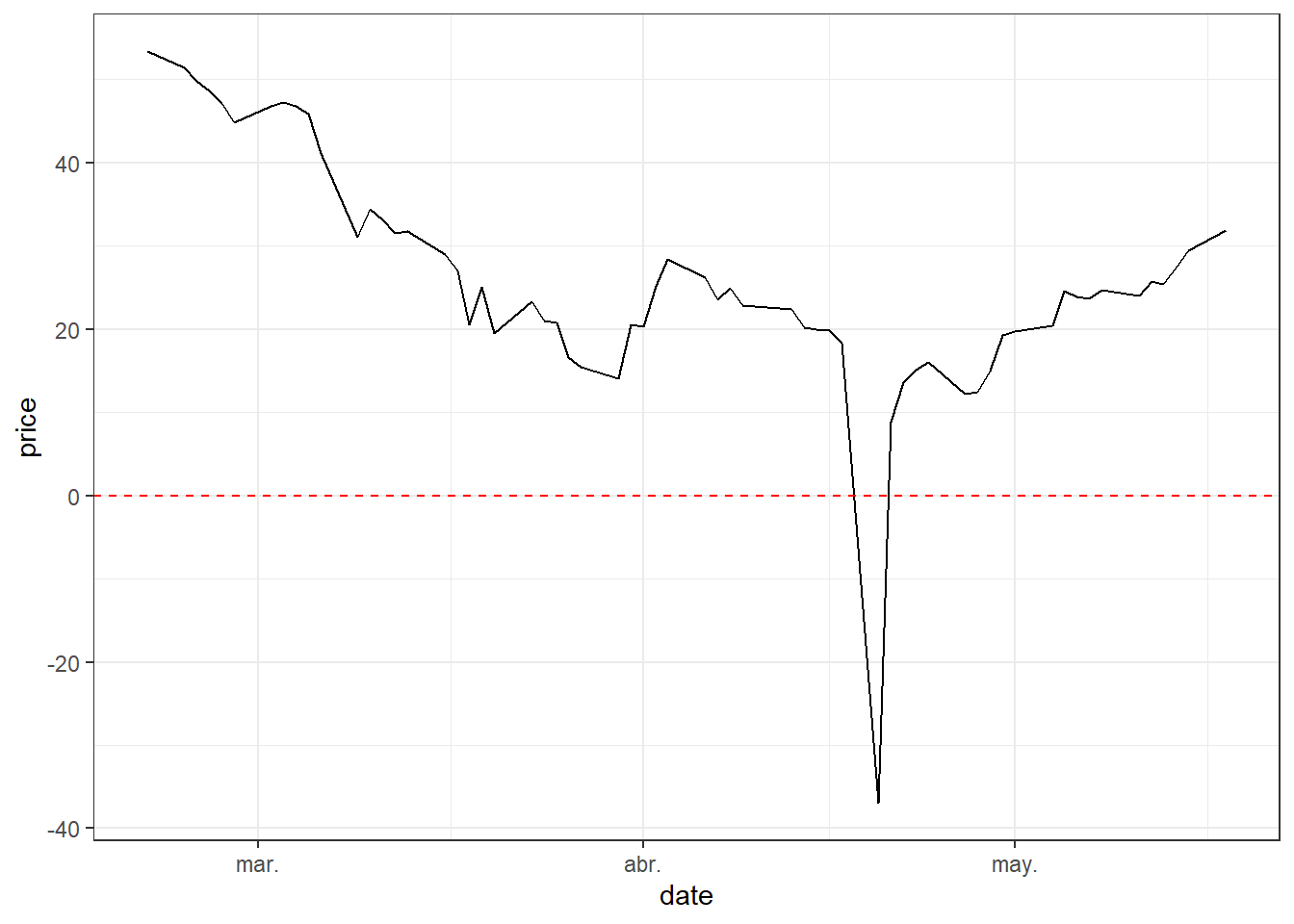
The exact day with a negative oil price is found by filtering observations that satisfy:
\[ Price_t < 0. \]
Without going into technical arguments, negative prices can be interpreted through storage pressure and contract delivery. Imagine, as it actually happened, that storing oil is expensive and producers have no further physical space to store production. At the same time, buyers see weak economic conditions and expect lower demand for fuel. Producers want to sell, while many buyers already have enough inventory or lack storage capacity. Under extreme pressure, producers may be willing to pay others to take oil delivery. This is why commodity prices can be negative.
There are other explanations, for example one related to the maturity of oil futures contracts. The price that went negative on Monday 2020-04-20 was for futures contracts to be delivered in May. Those contracts expired on Tuesday 2020-04-21. Upon expiration of the futures contract, the clearinghouse matches the holder of a long contract against the holder of a short position. The short position delivers the underlying asset to the long position. So, on Monday, traders — who were not equipped to take physical deliveries — were rushing to sell them to buyers who have booked storage.
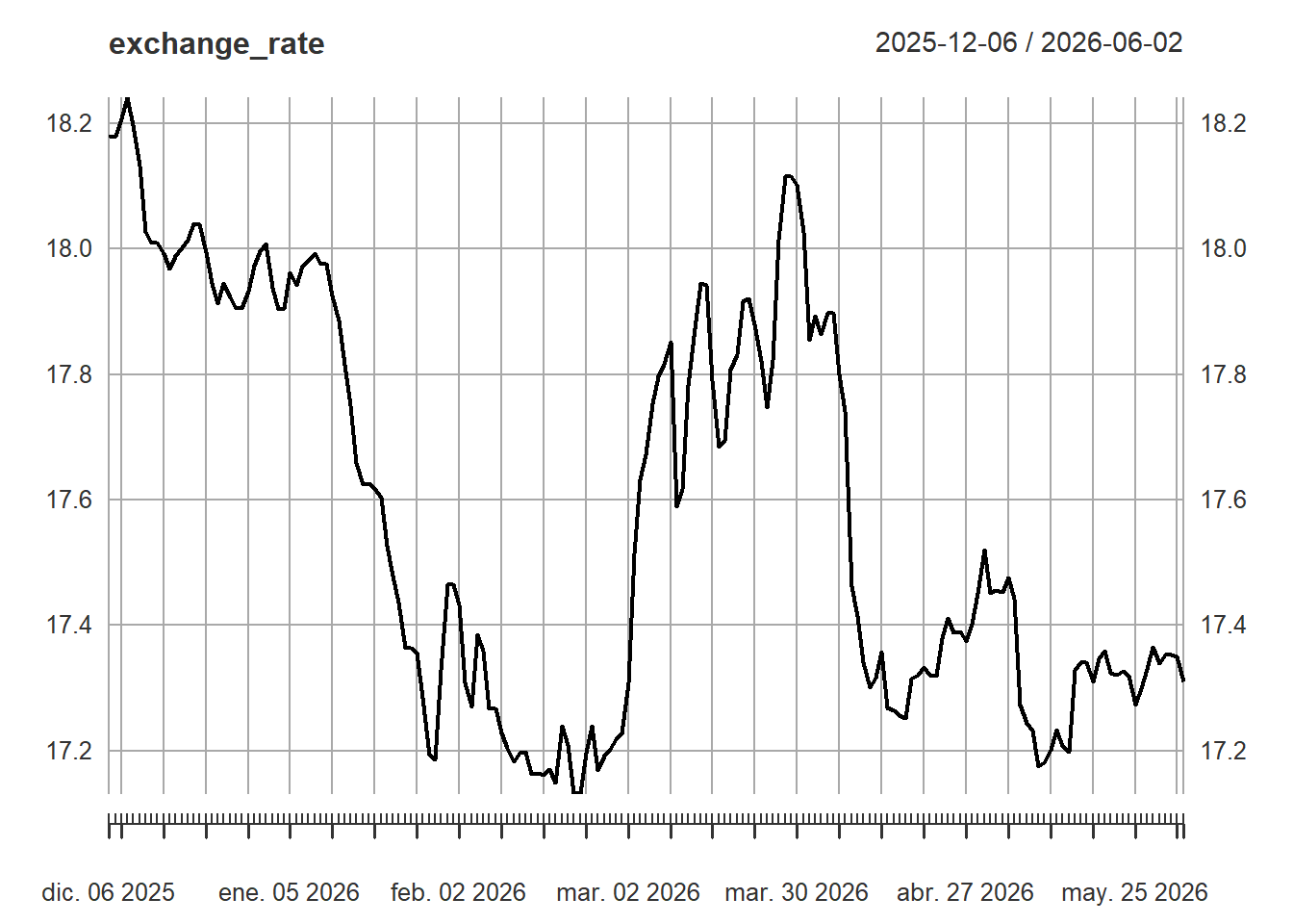
Exchange rates are another core data type in financial modeling because foreign assets must often be converted into a common currency before returns, portfolio values, or risk measures are computed. The quantmod package can retrieve exchange rates as well.
Code
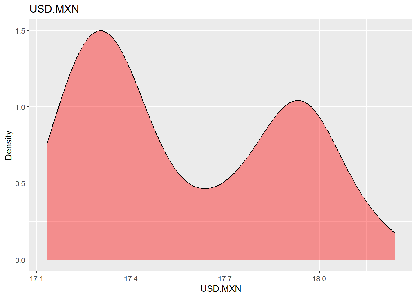
The same exchange-rate series can be summarized with a density plot. The density shows where the exchange rate has spent more time historically and gives a compact view of the empirical distribution.
Code
Macroeconomic series provide context for financial analysis because asset prices react to economic conditions, policy expectations, and business-cycle risk. The next example visualizes US employment together with NBER recession periods shown as shaded areas. Employment growth is computed as a three-period percentage change:
\[ g_t^{(3)} = 100\left(\frac{E_t}{E_{t-3}}-1\right). \]
The code below prepares the recession shading and the employment series.
Code
# US nonfarm payroll employment
df <- tq_get("PAYEMS", get = "economic.data", from = "1948-01-01")
# recession df (for plotting)
recessions.df = read.table(textConnection(
  "Peak, Trough
  1945-02-01, 1945-10-01
  1948-11-01, 1949-10-01
  1953-07-01, 1954-05-01
  1957-08-01, 1958-04-01
  1960-04-01, 1961-02-01
  1969-12-01, 1970-11-01
  1973-11-01, 1975-03-01
  1980-01-01, 1980-07-01
  1981-07-01, 1982-11-01
  1990-07-01, 1991-03-01
  2001-03-01, 2001-11-01
  2007-12-01, 2009-06-01
  2020-02-01, 2021-04-30"), sep = ',',
  colClasses = c('Date', 'Date'), header = TRUE)
rec3 <- filter(df, df$symbol == "PAYEMS")
my_trans <- function(in.data,transform = "pctdiff3") {
  switch(transform, logdiff  = c(NA, diff(log(in.data))),
         pctdiff3 = 100 * Delt(in.data, k = 3),
        logdiff3 = c(rep(NA, 3), diff(log(in.data), 3)))
}

df41 <- df |>
  transmute(date, PAYEMS = my_trans(price)) |>
  filter(year(date) > 1945)
With the data prepared, employment growth can be plotted together with recession periods.
Code
ggplot(data = df41, aes(x = date, y = PAYEMS)) +
  geom_rect(data = recessions.df, inherit.aes = FALSE,
            aes(xmin = Peak, xmax = Trough,
                ymin = -Inf, ymax = +Inf),
            fill = 'black', alpha = 0.3) +
  theme_minimal() +
  geom_line(color = "red", size = 1, alpha = 0.8) +
  labs(x = "", y = "",
       title = "US employment growth and recessions",
       subtitle = "Shaded areas are NBER recessions",
       caption = "Source: US Bureau of Labor Statistics.
       \nRetrieved from FRED, Federal Reserve Bank of St. Louis.") +
  geom_hline(yintercept = 0) +
  theme(plot.caption = element_text(hjust = 0),
        plot.subtitle = element_text(face = "italic", size = 9),
        plot.title = element_text(face = "bold", size = 14))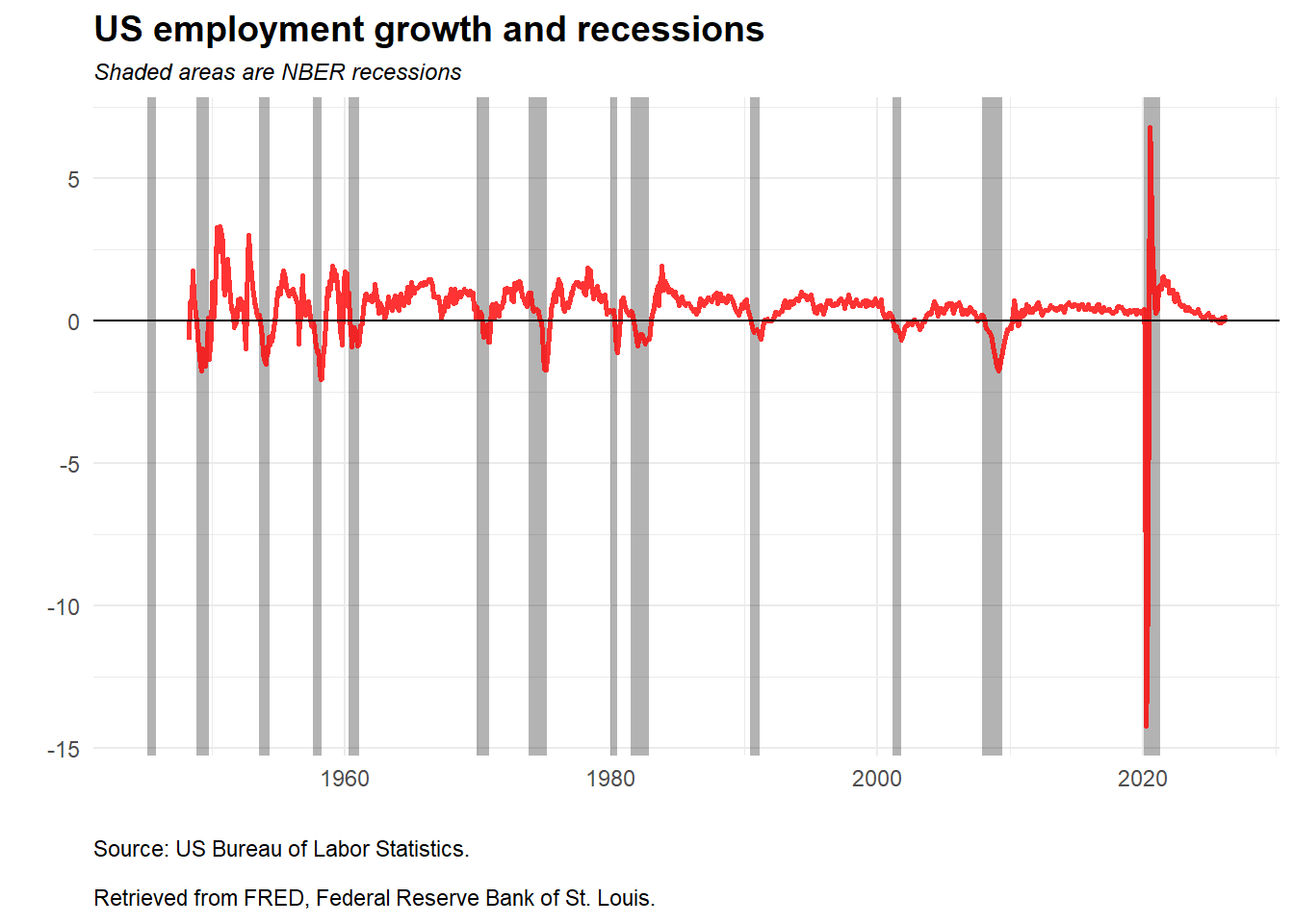
The shaded areas identify NBER recession periods, and the red line shows employment growth. The plot makes the economic-data workflow useful: a time series becomes more informative when it is aligned with an external event indicator. Recessions are associated with visible pressure on employment growth, although the magnitude and timing differ across episodes.
Access to financial and economic data is only the first step. The analyst also has to align dates, check definitions, transform units, and communicate the result in a way that supports a financial or economic question. The same discipline will be used in later chapters when prices become returns, returns become signals, and portfolio returns become risk measures.
1.2 Technical analysis
Technical analysis studies price and volume patterns in an attempt to describe trend, momentum, and possible turning points. It can be applied to stocks, indexes, commodities, futures, and other traded instruments. The approach is useful in this book for a specific reason: it converts raw prices into indicators, and those indicators can later become inputs for explicit trading rules. Its limitations should remain visible. A chart pattern does not control for fundamentals, macroeconomic shocks, liquidity, transaction costs, or model validation.
The chapter now returns to stock prices and builds a few basic indicators.
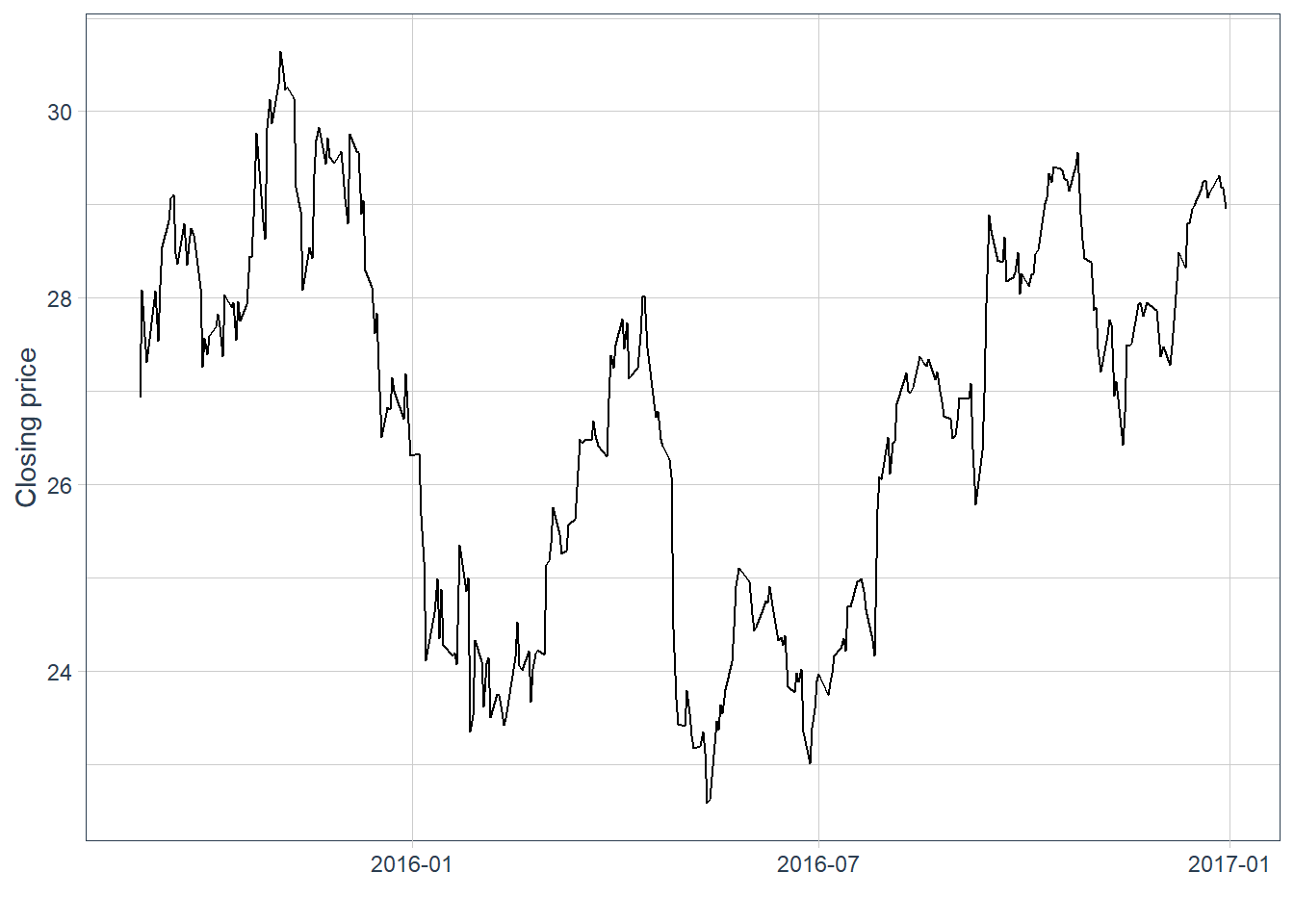
The first plot shows Apple closing prices. This line chart is the baseline against which the later indicators will be compared.
Code
The previous plot represents closing prices. The data also contain open, high, low, and close prices for each day. A candlestick chart uses that information in a compact format: the vertical range shows the daily high and low, while the body summarizes the open-close movement. Blue candles indicate days when the close is above the open, and red candles indicate days when the close is below the open.
Code
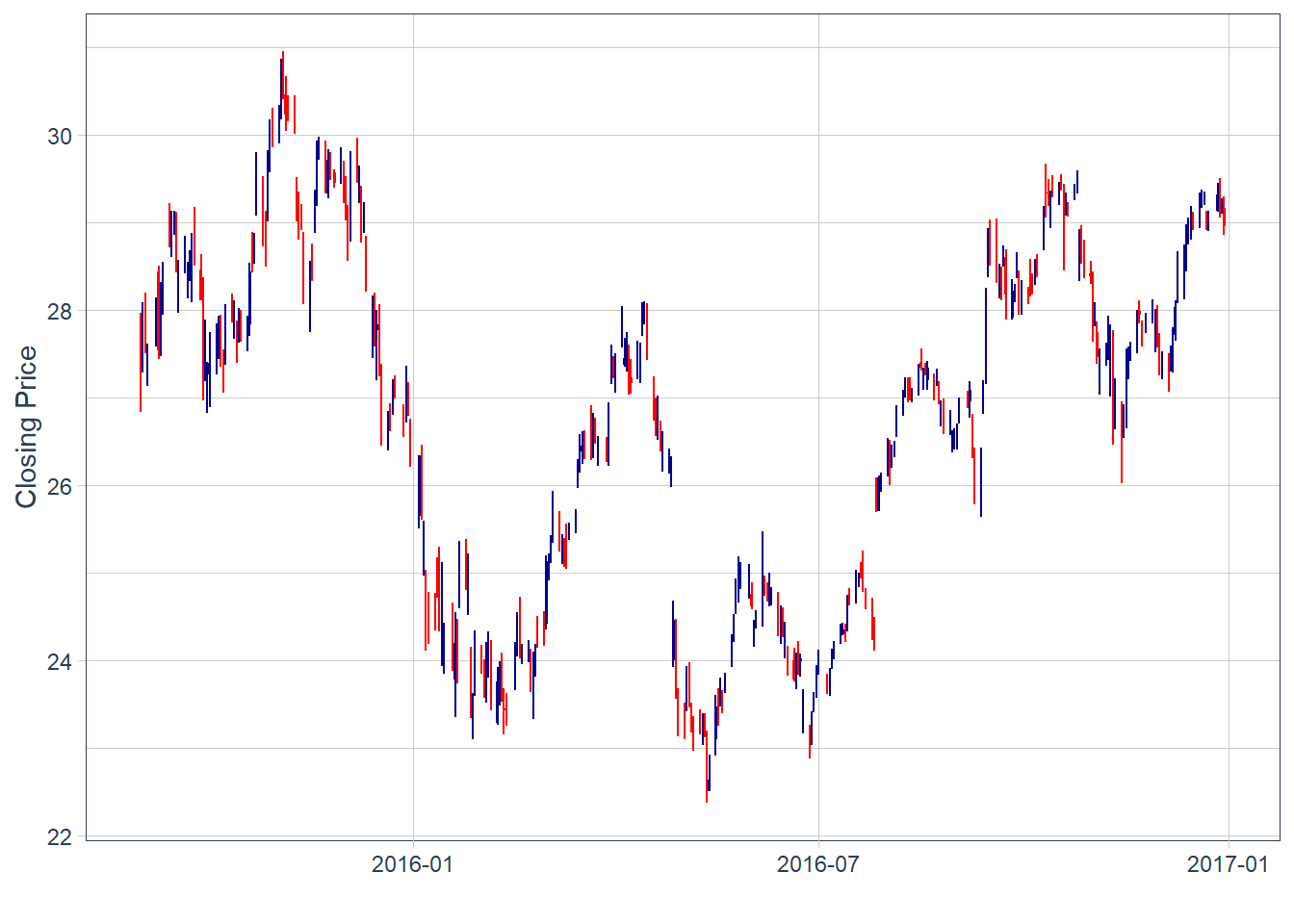
There are some blank spaces. This is simply because the close price of yesterday is not always exactly the same as the open price of today. Local stock markets close on weekends and holidays.
These charts are difficult to read when there are many observations. A zoomed view helps inspect the recent pattern.
Code
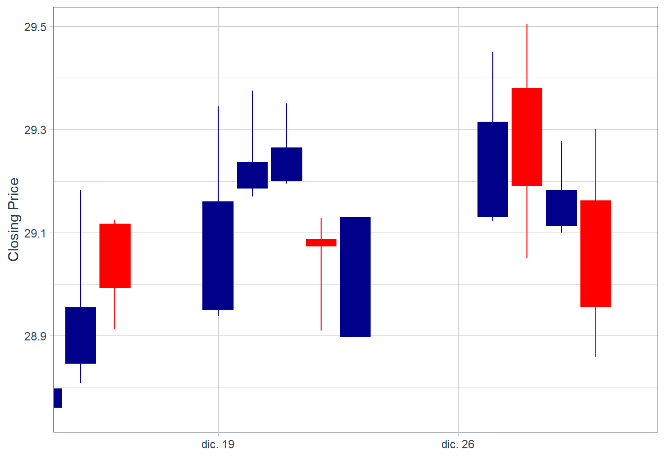
Candlesticks are descriptive signals. A sequence of large blue candles followed by smaller blue candles may suggest fading upward momentum, while a sequence of large red candles followed by smaller red candles may suggest fading downward pressure.2 These readings are useful for organizing visual evidence, but they require formal validation before becoming a trading rule.
A short sequence of alternating blue and red bars is difficult to convert into a reliable forecast. This indicator alone, without complementary analysis, does not deliver a clear trading signal.
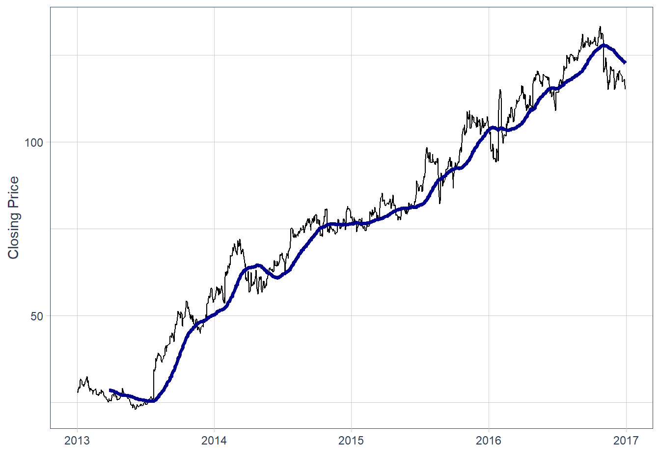
Moving averages are often used as trend-following indicators. The black line is the original price series, and the blue line is the moving average. In this case, the indicator is a 30-day simple moving average, calculated as the average of the last 30 closing prices:
\[ SMA_{t,n}=\frac{1}{n}\sum_{j=0}^{n-1}P_{t-j}. \]
In the code below, this value is easily modified by changing the value of \(n\), in this case \(n=30\). A crossover can be read as a possible change in momentum, but it is a heuristic signal and can generate false positives.
If the black line crosses the blue line from below, the chart suggests a possible increase in momentum. If it crosses from above, the chart suggests weakening momentum. In practice, the value of \(n\) should be calibrated and validated with historical data before using the indicator as part of a trading rule.
Code
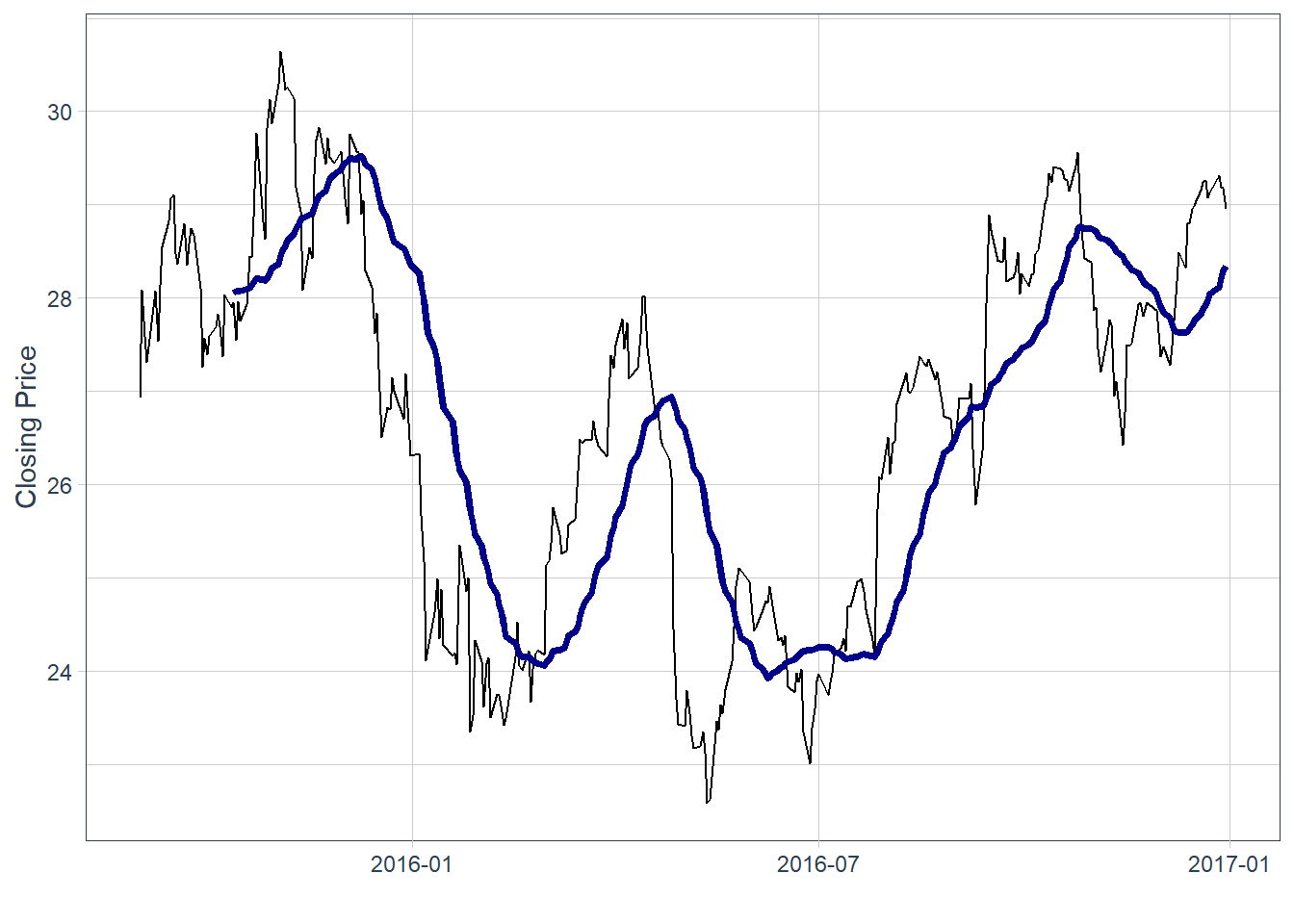
In this historical window, some price declines occurred after the price crossed below the moving average, and some increases occurred after the reverse pattern. This is an ex-post reading of the chart. It does not establish forecasting power by itself. The period around July 2016 is less clear. By the end of the time-series, the black line is above the blue, which suggests recent upward momentum.
Code
# A tibble: 8 × 8
  symbol date        open  high   low close    volume adjusted
  <chr>  <date>     <dbl> <dbl> <dbl> <dbl>     <dbl>    <dbl>
1 AAPL   2016-12-30  29.2  29.3  28.9  29.0 122345200     26.6
2 AAPL   2017-01-03  29.0  29.1  28.7  29.0 115127600     26.7
3 AAPL   2017-01-04  29.0  29.1  28.9  29.0  84472400     26.7
4 AAPL   2017-01-05  29.0  29.2  29.0  29.2  88774400     26.8
5 AAPL   2017-01-06  29.2  29.5  29.1  29.5 127007600     27.1
6 AAPL   2017-01-09  29.5  29.9  29.5  29.7 134247600     27.4
7 AAPL   2017-01-10  29.7  29.8  29.6  29.8  97848400     27.4
8 AAPL   2017-01-11  29.7  30.0  29.6  29.9 110354400     27.5
Bollinger Bands are envelopes plotted at a standard deviation level above and below a simple moving average of the price. Because the distance of the bands is based on standard deviation, they adjust to volatility swings in the underlying price. With \(k=2\) and a rolling standard deviation \(s_{t,n}\), the bands are:
\[ Upper_{t,n}=SMA_{t,n}+k s_{t,n}, \qquad Lower_{t,n}=SMA_{t,n}-k s_{t,n}. \]
Wider bands indicate a wider recent volatility envelope. Narrower bands indicate a quieter recent price range. The indicator describes the size of recent price fluctuations and should be tested before being interpreted as a forecast.
Code
AAPL |>
  ggplot(aes(x = date, y = close, open = open,
             high = high, low = low, close = close)) +
  geom_line() +
  geom_bbands(ma_fun = SMA, sd = 2, n = 30,
              linetype = 2, size = 0.5, alpha = 0.2,
              fill        = palette_light()[[1]],
              color_bands = palette_light()[[1]],
              color_ma    = palette_light()[[2]]) +
  labs(y = "Closing Price", x = "") +
  theme_tq()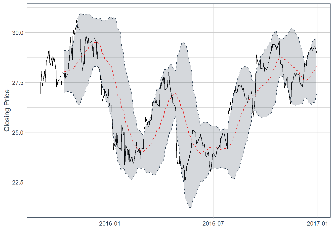
The last observation has the price line above the moving average, now shown as a red dotted line. The last price sits above the moving average and near the upper band. This suggests recent upward momentum and a price near the upper part of its rolling volatility envelope. The bands are descriptive; using them as a trading rule would require formal backtesting.
The lesson is methodological. Technical indicators can be useful descriptive tools, but a visual reading is fragile when it depends on one or two signals by eye. A stronger workflow defines the signal, fixes the timing, evaluates the rule on historical data, and accounts for trading costs. Packages such as quantstrat provide infrastructure for formal backtesting of signal-based strategies.
The simple moving average for Meta is computed in the same way.
Code
This produces a bearish-looking moving-average signal. The realized price path can be compared with the signal as an ex-post check.
# A tibble: 21 × 8
   symbol date        open  high   low close   volume adjusted
   <chr>  <date>     <dbl> <dbl> <dbl> <dbl>    <dbl>    <dbl>
 1 META   2014-01-02  54.8  55.2  54.2  54.7 43195500     54.7
 2 META   2014-01-03  55.0  55.7  54.5  54.6 38246200     54.6
 3 META   2014-01-06  54.4  57.3  54.0  57.2 68852600     57.2
 4 META   2014-01-07  57.7  58.5  57.2  57.9 77207400     57.9
 5 META   2014-01-08  57.6  58.4  57.2  58.2 56682400     58.2
 6 META   2014-01-09  58.7  59.0  56.7  57.2 92253300     57.2
 7 META   2014-01-10  57.1  58.3  57.1  57.9 42449500     57.9
 8 META   2014-01-13  57.9  58.2  55.4  55.9 63010900     55.9
 9 META   2014-01-14  56.5  57.8  56.1  57.7 37503600     57.7
10 META   2014-01-15  58.0  58.6  57.3  57.6 33663400     57.6
# ℹ 11 more rows
In this historical example, the realized price path moved in the direction suggested by the moving-average signal. The next chapter turns this idea into an explicit trading workflow: prices are transformed into indicators, indicators become predictors, and predictions are evaluated as trading positions.
According to market intelligence company IDC, the ‘Global Datasphere’ in 2018 reached 18 zettabytes. The vast majority of the world’s data has been created in the last few years and this astonishing growth of data shows no sign of slowing down. In fact, IDC predicts the world’s data will grow to 175 zettabytes in 2025. One zettabyte is 1000000000000000000000 bytes. In scientific notation this is 1e+21, or 1 with 21 zeros at the right, also called one sextillion.↩︎
The analogy is similar to flatten the curve in the context of the 2020 pandemic. As the curve increases, the high speed of increase is captured by big vertical blue bars. A slowdown appears as smaller vertical blue bars before the curve becomes flat and eventually decreases.↩︎