[1] 0.09531018[1] 0.1823216An asset is any resource owned by a business or an economic entity that can produce value in the future. In this book, stocks are the main working example, but the same return logic can be applied to commodities, currencies, bonds, derivatives, and portfolio values.
This chapter is the bridge between raw financial data and the modeling chapters that follow. The previous chapter showed how to obtain and visualize prices. This chapter converts those prices into returns, cumulative values, distributional summaries, and risk-return indicators. These objects become the inputs for trading rules, beta regressions, portfolio allocation, and Value at Risk.
A return is the percentage change of an asset price. Returns allow assets with different price levels to be compared on the same scale. For example, buying at $100 and selling at $110 produces a $10 gain and a 10% return. Buying at $10 and selling at $12 produces a $2 gain and a 20% return. The dollar gain is larger in the first case; the relative performance is larger in the second case.
The previous returns were calculated as simple percentage changes, \(\frac{\$110-\$100}{\$100}\) and \(\frac{\$12-\$10}{\$10}\) respectively. Log-returns are another common transformation.
\[ r_t=\log\left(\frac{P_t}{P_{t-1}}\right). \]
Log-returns are close to simple returns for small price changes, and they are especially useful because multi-period log-returns add over time. For larger price changes, simple and log returns differ.
In this case the log-returns are \(\log\left(\frac{\$110}{\$100}\right)\) and \(\log\left(\frac{\$12}{\$10}\right)\) which are 9.53% and 18.23% respectively.
Both absolute and relative valuations ($10 versus $2, and 10% versus 20%) are valid depending on the reporting question. The relative approach is especially useful because percentages place different assets on a common scale. Returns also have statistical properties that make them more convenient than prices in many quantitative finance and econometrics models.
Returns can also be expressed relative to risk. If two assets have the same expected return of 5%, but the first has risk of 5% and the second has risk of 10%, the first asset has 1 unit of return per unit of risk and the second has 0.5. This is the logic behind many risk-return comparisons in the rest of the book.
There are several ways to measure and report asset returns: daily, monthly, yearly, simple, log, cumulative, and compounded. The chapter introduces the versions needed for the later modeling workflow.
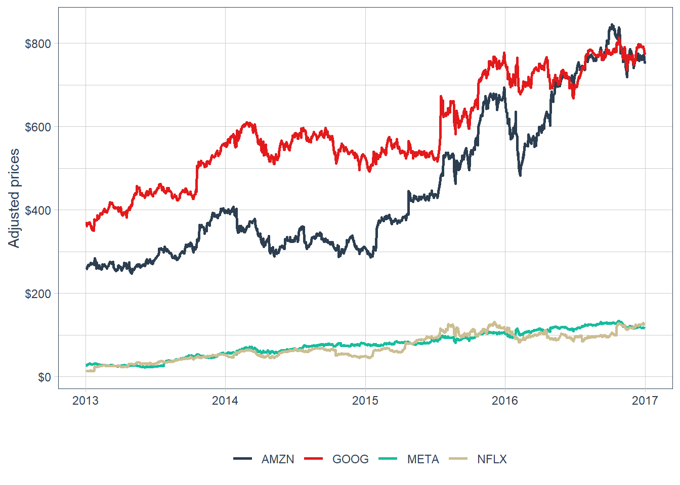
Time series of asset prices are the input needed to calculate time series of asset returns. The first plot shows daily adjusted prices in the FANG database.

The stocks fluctuate in different price ranges. A higher price level does not imply a better investment opportunity: Amazon or Google can trade at larger dollar prices than Meta or Netflix while still offering a weaker return-risk profile. The shared vertical axis also compresses some series, making the individual price paths difficult to inspect. For performance evaluation, the next step is to transform prices into returns and compare risk together with return.
A faceted view makes the individual price paths easier to inspect.
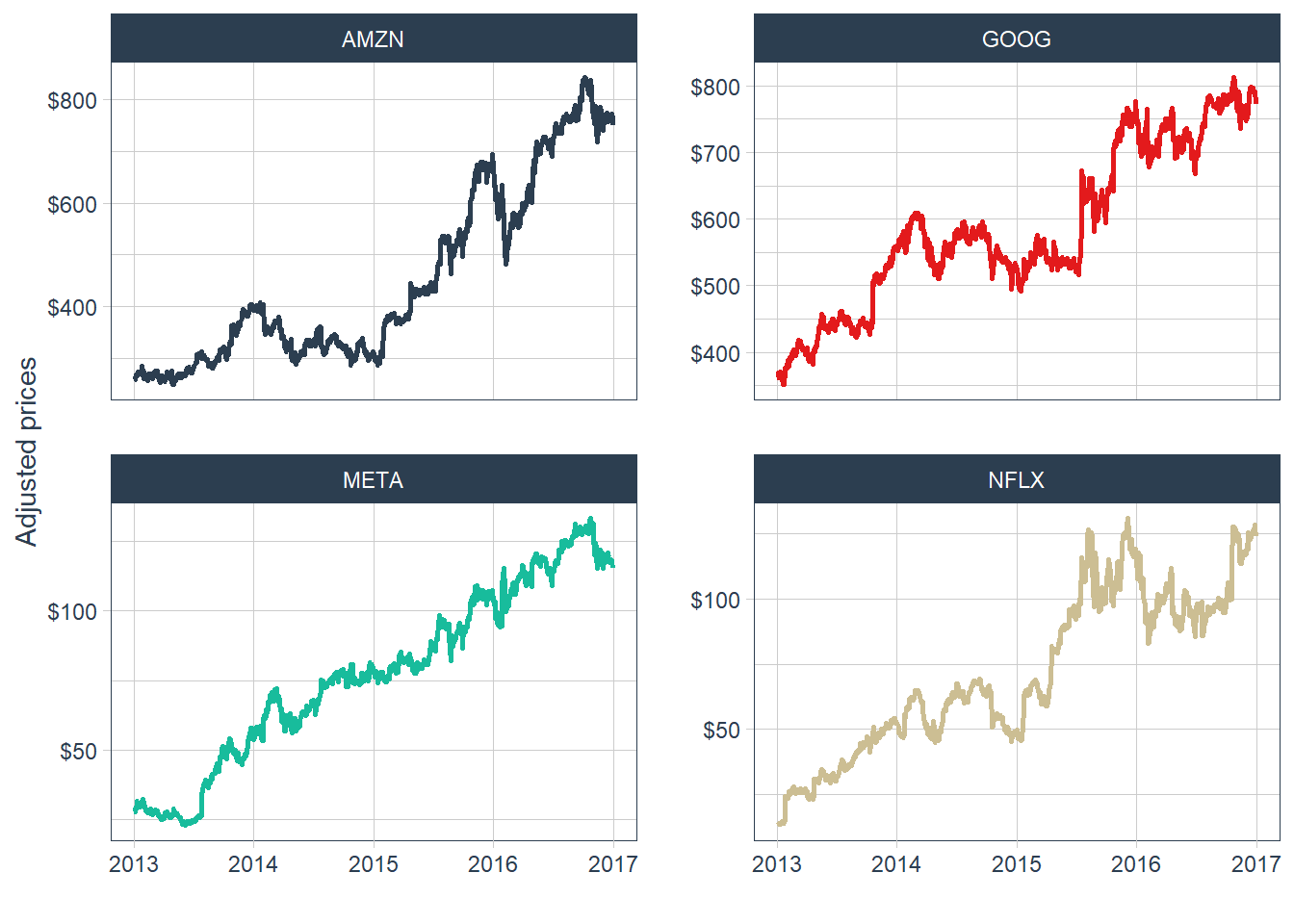
The faceted plot shows positive price trends over the full period, while also revealing important differences by year. Prices declined around 2014 for Amazon, Google, and Netflix, and then Amazon and Google recovered strongly in 2015. This visualization helps compare each stock’s price path, but the analysis is still based on prices. The next step is to transform prices into returns.
Adjusted prices are selected first and then transformed into yearly returns. For an asset with adjusted price \(P_t\), the simple return over one period is defined below.
\[ R_t = \frac{P_t}{P_{t-1}} - 1. \]
The code below applies the same expression after grouping the data by stock and changing the periodicity to yearly.
# A tibble: 16 × 3
# Groups:   symbol [4]
   symbol date       yearly.returns
   <chr>  <date>              <dbl>
 1 META   2013-12-31         0.952
 2 META   2014-12-31         0.428
 3 META   2015-12-31         0.341
 4 META   2016-12-30         0.0993
 5 AMZN   2013-12-31         0.550
 6 AMZN   2014-12-31        -0.222
 7 AMZN   2015-12-31         1.18
 8 AMZN   2016-12-30         0.109
 9 NFLX   2013-12-31         3.00
10 NFLX   2014-12-31        -0.0721
11 NFLX   2015-12-31         1.34
12 NFLX   2016-12-30         0.0824
13 GOOG   2013-12-31         0.550
14 GOOG   2014-12-31        -0.0597
15 GOOG   2015-12-31         0.442
16 GOOG   2016-12-30         0.0171
The output follows the tidy-data convention: each variable forms a column, each observation forms a row, and each type of observational unit forms a table. These yearly returns are expressed in decimal notation. A value such as 0.95 corresponds to 95%.
The annual-return plot visualizes period-by-period performance by stock.
FANG_annual_returns |>
  ggplot(aes(x = date-365, y = yearly.returns, fill = symbol)) +
  geom_col() +
  geom_hline(yintercept = 0, color = "black") +
  scale_y_continuous(labels = scales::percent) +
  labs(y = "Annual returns", x = "") +
  facet_wrap(~ symbol, ncol = 2, scales = "free_y") +
  theme_tq() +
  scale_fill_tq() +
  theme(legend.position = "none", legend.title = element_blank())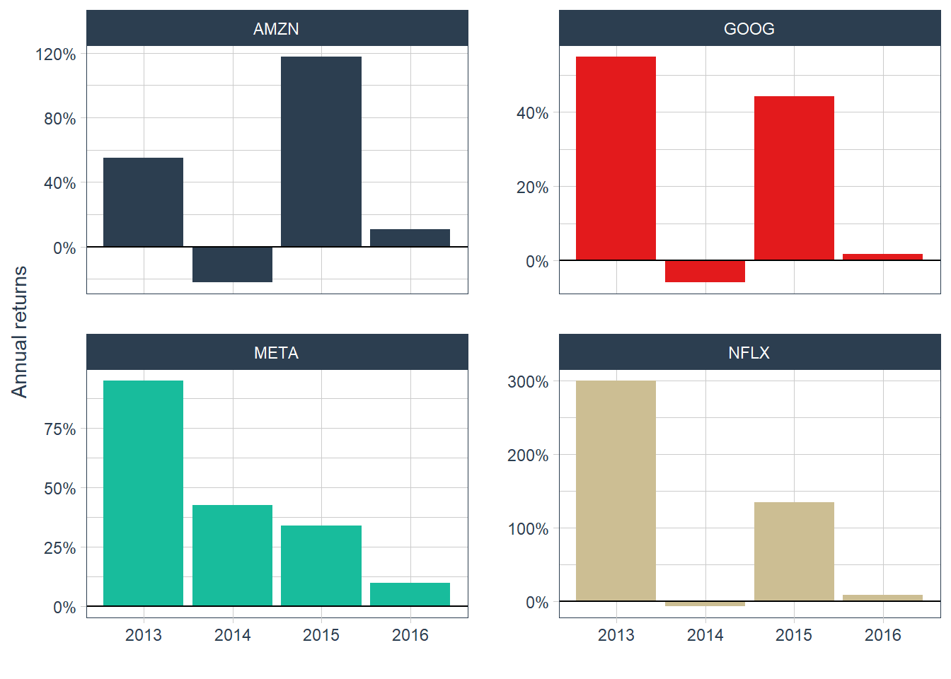
These stocks are risky because their returns change substantially over time. The annual-return plot confirms the message from the price chart: 2014 produced negative returns for Amazon, Google, and Netflix, while 2015 was strong for Amazon and Google.
The next comparison evaluates a $100 investment in each stock from the first day of 2013 to the last day of 2016. Yearly returns show period-by-period performance, while cumulative returns show the full investment path over the sample.
Working with cumulative percentage changes requires multiplying growth factors. If an initial value is $100 and it increases by 5%, the new value is \(\$100 \times (1+0.05) = \$105\). If the value later falls by 20%, the current value is \(\$100 \times (1+0.05) \times (1-0.2) = \$84\).
Now consider a $100 investment in Amazon over this period. The value of the investment is calculated by compounding the four yearly returns listed above. Amazon’s yearly returns from 2013 to 2016 are: 54.98%, -22.18%, 117.78%, 10.95% in that order.
# Investment in USD.
investment = 100
# Amazon's cumulative return in percentage.
AMZN_cum_percentage = (1 + 0.54984265) * (1 - 0.22177086) *
  (1 + 1.17783149) * (1 + 0.10945565) - 1
# Amazon's cumulative return in USD.
AMZN_cum_usd = investment * (1 + AMZN_cum_percentage)
# Show results.
AMZN_cum_percentage
[1] 1.914267[1] 291.4267The dollar value of $100 invested in Amazon at the end of the 4 years is $291.4267. The cumulative return is 191.4267%. A direct check applies this return over the $100 investment: \(\$100 \times (1+1.914267) = \$291.4267\).
The 191.4267% cumulative return accumulates four years of performance. A separate summary is the mean yearly return. For yearly returns \(R_1,\ldots,R_n\), the arithmetic mean is defined as follows.
\[ \bar{R}_{arith}=\frac{1}{n}\sum_{t=1}^{n}R_t. \]
[1] 0.4038397The arithmetic mean can be misleading when it is used as if it were a compounded growth rate. In this example, the arithmetic mean return is 40.38397% per year. Applying that value as a constant annual growth rate gives the following result.
The repeated-multiplication calculation gives the same type of compounded value.
[1] 388.3919The equivalent power notation gives the same calculation more compactly.
The result is inconsistent with the actual compounded value. The dollar value of $100 invested in Amazon at the end of the 4 years is $291.4267, while applying the arithmetic mean as a growth rate gives $388.3919. The arithmetic mean is useful as a sample summary, but it should be distinguished from the rate that reproduces the multi-period investment value.
The difference is reconciled with the geometric mean return. For gross returns \((1+R_t)\), the geometric mean return is defined as follows.
\[ \bar{R}_{geom}=\left(\prod_{t=1}^{n}(1+R_t)\right)^{1/n}-1. \]
[1] 0.3065689The geometric mean return of 30.65689% per year reproduces the compounded investment value: $100 grows to $291.4267 by the end of the fourth year. The calculation can be checked in two equivalent ways.
The repeated-multiplication calculation gives the compounded value.
[1] 291.4267The equivalent power notation gives the same compounded value more compactly.
This phenomenon is an example of a result that is well known in mathematics. For positive gross returns, the geometric mean is less than or equal to the arithmetic mean (30.6 < 40.3). The arithmetic mean return of 40.38397% overstates the constant annual growth rate that reproduces the investment value. Fund-performance reporting therefore needs to distinguish between average period returns and compounded growth rates.
For now, the examples use arithmetic returns. The next plot shows how a $100 investment grows each year for each stock. The plotted values are in USD, and each series starts from the same initial investment.
# Yearly returns.
FANG_annual_returns <- FANG |>
    group_by(symbol) |>
    tq_transmute(select     = adjusted,
                 mutate_fun = periodReturn,
                 period     = "yearly",
                 type       = "arithmetic")
# Cumulative returns.
FANG_annual_cum_returns <- FANG_annual_returns |>
  mutate(cr = 100*cumprod(1 + yearly.returns)) |>
  bind_rows(
    FANG_annual_returns |>
      distinct(symbol) |>
      mutate(date = as.Date("2012-12-31"),
             yearly.returns = 0,
             cr = 100)
  ) |>
  arrange(symbol, date) |>
# Plot the results.
  ggplot(aes(x = date, y = cr, fill = symbol)) + geom_col() +
  labs(subtitle = "100 USD investment growth from 2013-01-01 to 2016-12-31.",
  x = "", y = "USD value at the end of the year", color = "") +
  scale_y_continuous(labels = scales::dollar) +
  facet_wrap(~ symbol, ncol = 2, scales = "free_y") +
  theme_tq() +
  scale_color_tq() +
  theme(legend.position = "none", legend.title = element_blank())

FANG_annual_cum_returns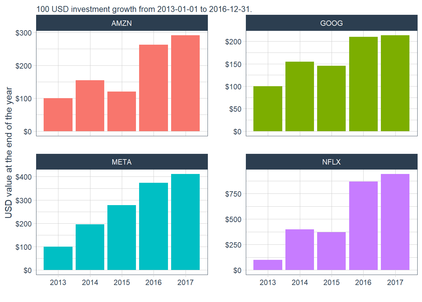
The Amazon path in the plot matches the calculation above: $100 invested at the start of the period ends at $291.4267. The common base value makes terminal differences easier to interpret.
The same transformation can be applied at monthly frequency.
# Monthly returns.
FANG_monthly_returns <- FANG |>
    group_by(symbol) |>
    tq_transmute(select     = adjusted,
                 mutate_fun = periodReturn,
                 period     = "monthly",
                 type       = "arithmetic")
# Plot the results.
ggplot(FANG_monthly_returns, aes(x = date-12,
       y = monthly.returns, fill = symbol)) +
  geom_col() +
  geom_hline(yintercept = 0, color = "black") +
  scale_y_continuous(labels = scales::percent) +
  labs(y = "Monthly returns", x = "") +
  facet_wrap(~ symbol, ncol = 2, scales = "free_y") +
  theme_tq() +
  scale_fill_tq() +
  theme(legend.position = "none", legend.title = element_blank())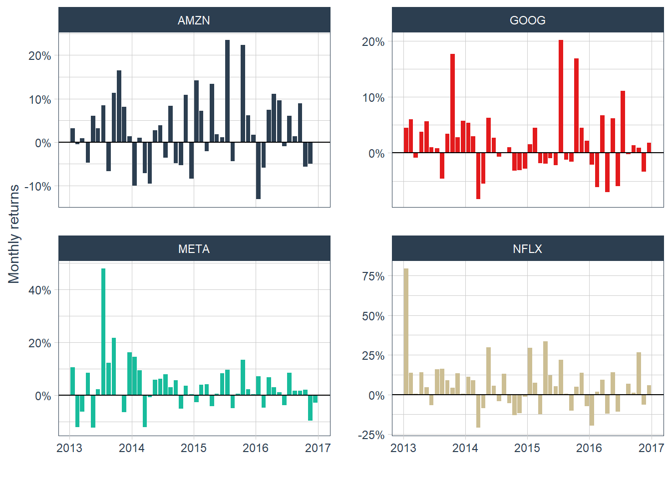
Moving from yearly to monthly returns gives 12 observations per year. The monthly plot reveals more short-run volatility: GOOG has a negative month immediately after a positive return above 20%. The frequent movement between positive and negative returns shows why short-horizon prediction is difficult.
Monthly returns allow a finer view of the same $100 investment example. If the initial investment is \(V_0=100\), the investment value after \(t\) monthly returns follows the compounding expression below.
\[ V_t = 100 \prod_{j=1}^{t}(1+R_j). \]
The code inserts the initial value \(V_0=100\) for every stock and then appends the cumulative monthly values. This makes the comparison start from the same dollar base for all four assets.
# Calculate monthly cumulative returns.
FANG_monthly_cum_returns <- FANG_monthly_returns |>
  group_by(symbol) |>
  mutate(cr = 100 * cumprod(1 + monthly.returns))
FANG_monthly_cum_returns <- bind_rows(
  FANG_monthly_returns |>
    distinct(symbol) |>
    mutate(date = as.Date("2012-12-31"),
           monthly.returns = 0,
           cr = 100),
  FANG_monthly_cum_returns
) |>
  arrange(symbol, date)
# Plot results.
FANG_monthly_all <- FANG_monthly_cum_returns |>
ggplot(aes(x = date, y = cr, color = symbol)) +
  geom_line(size = 1) +
  geom_point(data = FANG_monthly_cum_returns |>
               filter(date == as.Date("2012-12-31")),
             size = 4, col = "black", alpha = 0.5) +
  labs(subtitle = "100 USD investment growth from 2013-01-01 to 2016-12-31.",
         x = "", y = "USD value at the end of the month", color = "") +
  scale_y_continuous(labels = scales::dollar) +
  theme_tq() +
  scale_color_tq()

FANG_monthly_all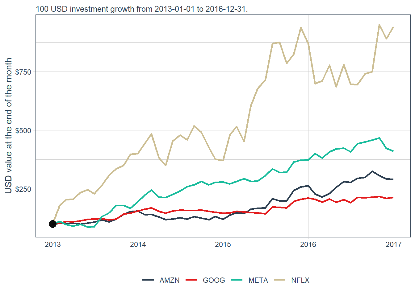
Each stock now begins at the same $100 base value. The plot shows that a common starting investment can lead to very different terminal values, even when the original price series have different price levels.
A faceted version separates the four stocks and makes the comparison easier to read.
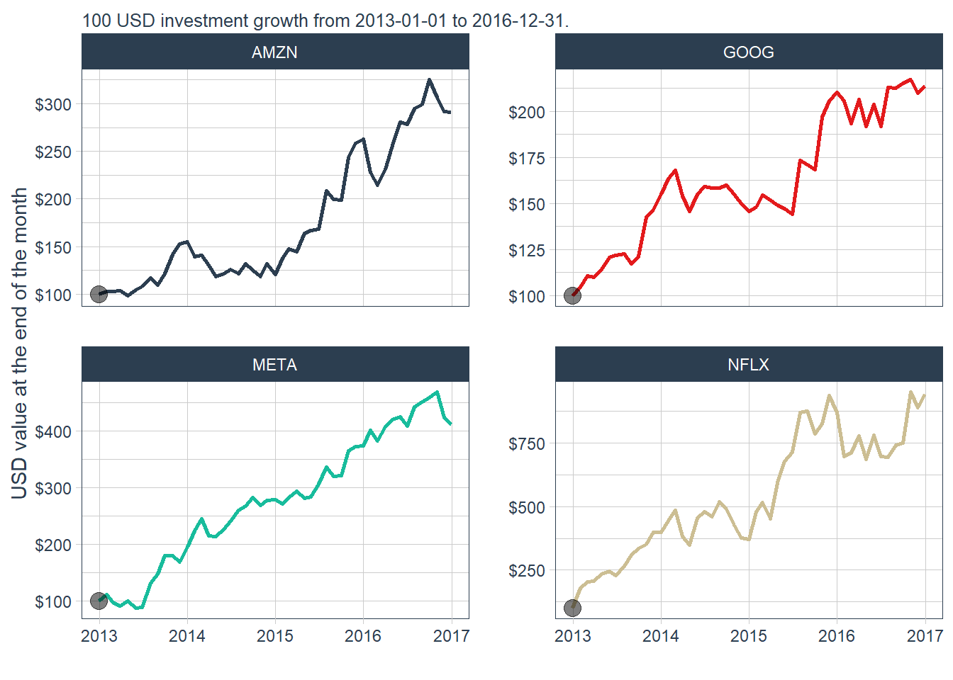
The dollar value of $100 invested in Amazon at the end of the 4 years is again $291.4267. The monthly view shows the path of the investment value through time. The faceted view confirms the same message with cleaner scales: every panel starts at $100, and Netflix reaches the largest terminal value in this historical window.
Return to the original price plot.
Netflix looks low in the original price chart because its dollar price is plotted on the same scale as higher-priced stocks. A $100 investment in Netflix during these four years would nevertheless produce the highest terminal value, close to $1,000. This contrast motivates the return-based analysis used in the rest of the book.
Plotting prices and returns over time helps connect financial performance with specific dates. A deeper analysis could investigate the events around 2014 for Amazon and Google and connect firm-level news, market conditions, and investor expectations with the observed returns.
Time series plots are useful for financial analysis because they preserve chronology. Density plots provide a complementary view: they remove time and show the distribution of return values. The vertical axis is density. Areas under the curve represent probability mass, so taller regions indicate where returns are more concentrated. This approach helps compare typical returns, unusual outcomes, and dispersion across assets.
The next figure uses density plots to compare the distribution of monthly returns in the FANG data.
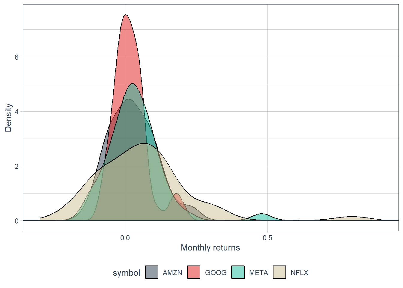
Monthly returns around zero are frequent, whereas monthly returns above 50% are rare in this sample. The density plot also shows that Netflix has the widest dispersion among the four stocks. A faceted version separates the distributions and makes the comparison easier to read.
# Density plots.
ggplot(FANG_monthly_returns, aes(x = monthly.returns, fill = symbol)) +
  geom_density(alpha = 0.5) +
  geom_hline(yintercept = 0, color = "black") +
  labs(x = "Monthly returns", y = "Density") +
  xlim(-0.3, 0.9) +
  theme_tq() +
  scale_fill_tq() +
  facet_wrap(~ symbol, ncol = 2) +
  theme(legend.position = "none", legend.title = element_blank())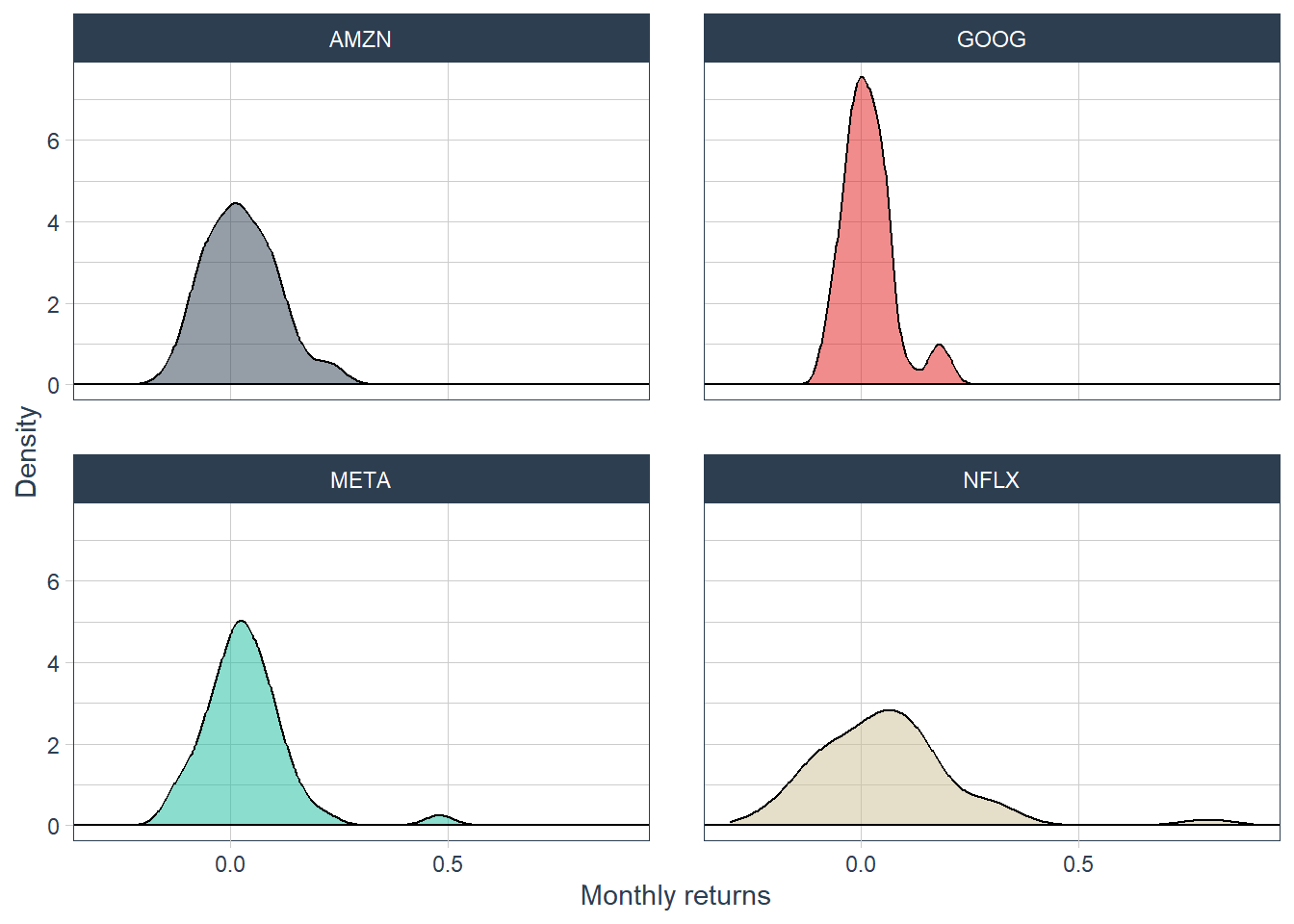
The faceted density plot separates the four stocks and makes dispersion easier to compare.
Density distributions summarize the shape of the returns, but this example has only 48 monthly observations for each stock. That is enough for illustration and too small for strong conclusions about long-run distributional behavior.
Monthly returns can also be grouped by calendar year to compare within-year dispersion.
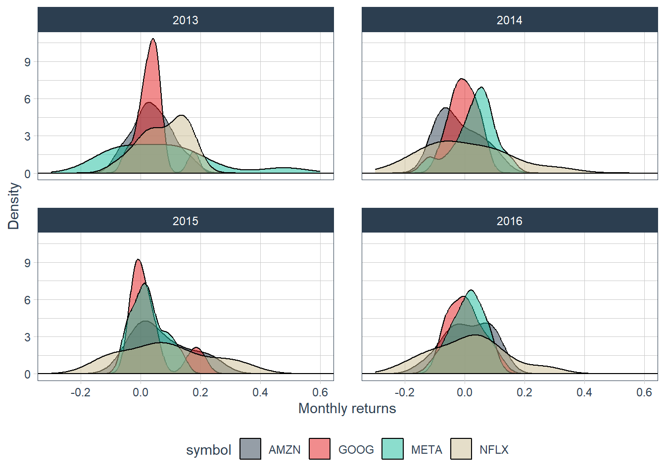
This view shows that return dispersion changes across years. Netflix contributes several extreme monthly observations, whereas Google remains comparatively concentrated around zero in this sample.
Statistical indicators complement the previous graphical analysis.
For a sample of returns \(R_1,\ldots,R_n\), the statistics used below are defined as follows.
\[ \bar{R}=\frac{1}{n}\sum_{t=1}^{n}R_t, \qquad s_R=\sqrt{\frac{1}{n-1}\sum_{t=1}^{n}(R_t-\bar{R})^2}, \qquad sr=\frac{\bar{R}}{s_R}. \]
The interquartile range is \(IQR=Q_{0.75}-Q_{0.25}\).
# A tibble: 4 × 5
  symbol   mean     sd    sr    iqr
  <chr>   <dbl>  <dbl> <dbl>  <dbl>
1 AMZN   0.0257 0.0817 0.314 0.126
2 GOOG   0.0176 0.0594 0.296 0.0646
3 META   0.0341 0.0989 0.345 0.108
4 NFLX   0.0592 0.167  0.355 0.193
The sample mean estimates expected return in this historical window. GOOG has the lowest mean and NFLX has the highest. The standard deviation sd measures dispersion around the mean and is used here as a simple risk proxy. GOOG has the lowest standard deviation and NFLX has the highest. The interquartile range IQR measures the distance between the 75th and 25th percentiles, adding a robust view of dispersion.
Comparing return and risk, or mean and standard deviation of stock returns can be troublesome. This is because the relationship between risk and return is not perfectly proportional.
The risk-return comparison can also be shown graphically.
# Mean variance plot.
FANG_stats |>
  ggplot(aes(x = sd, y = mean, color = symbol)) +
  geom_point(size = 5) +
  geom_text(aes(label = paste0(round(sr, 3))),
            vjust = 2, color = "black", size = 3.5) +
  xlim(0.04, 0.18) +
  ylim(0.01, 0.06) +
  labs(subtitle = "Numerical values represent return per unit of risk.",
       x = "Risk", y = "Expected return") +
  theme_tq()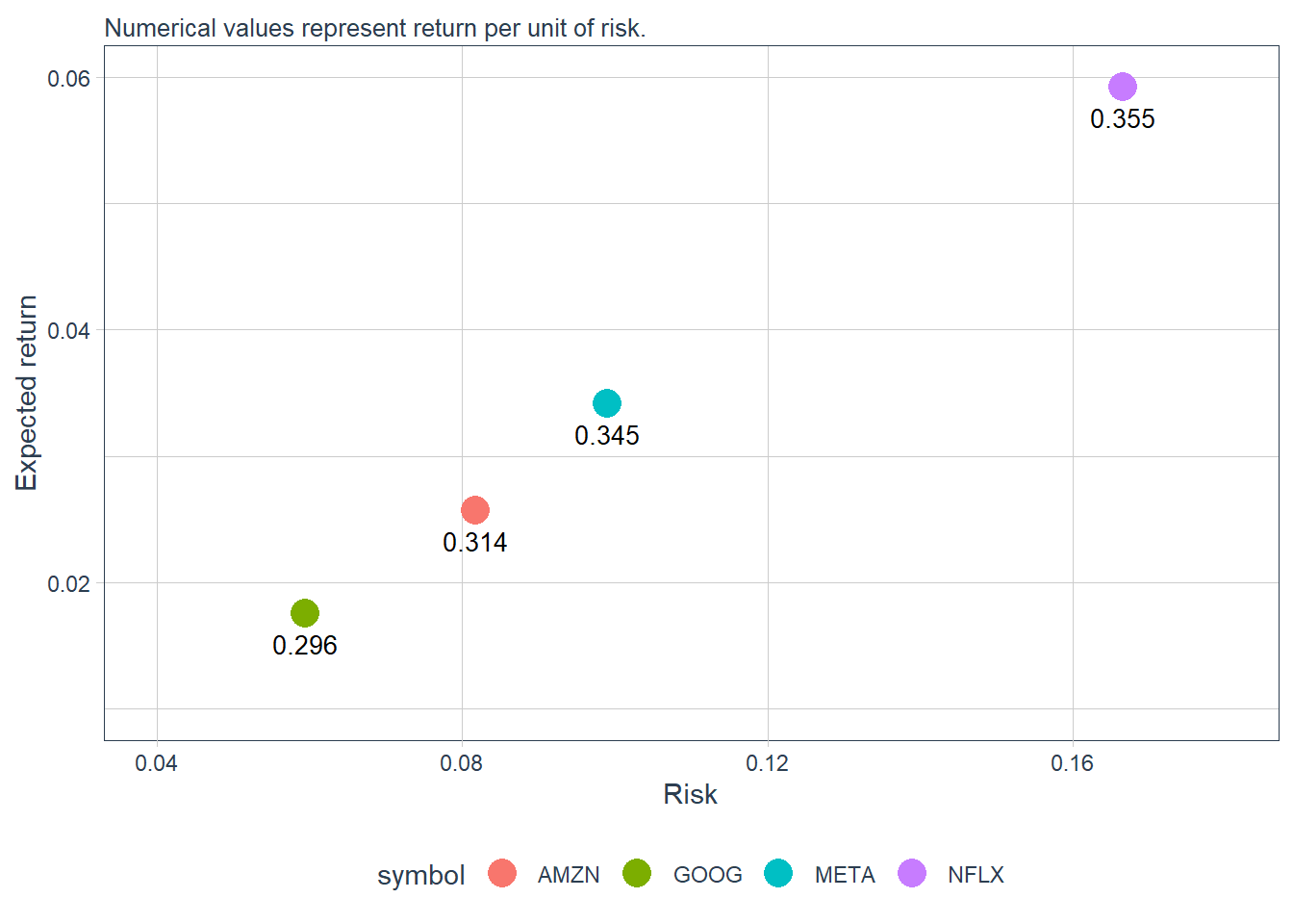
According to these estimates, Netflix is the stock with the highest return and risk. Return per unit of risk is calculated by dividing the mean by the standard deviation. This indicator is called sr in the table above. Under this metric, Netflix also has the highest return per unit of risk among the four stocks, which is consistent with the cumulative-return comparison.
The plot above measures returns on the vertical axis and risk on the horizontal axis. In finance, this is a mean-variance view: the mean summarizes return, and the variance or standard deviation summarizes risk. The mean-variance approach was a breakthrough because it organized investment comparisons around the joint behavior of risk and return.
Suppose stock 1 has a return of 5% and a risk of 4%, whereas stock 2 has a return of 6% and a risk of 8%. Stock 1 has 1.25 units of return per unit of risk (5/4), while stock 2 has 0.75. The relative comparison favors stock 1 even though stock 2 has the higher raw return.
Return distributions help separate lower-risk and higher-risk assets. The next example simulates two artificial return series with the same expected return of 0% and different volatility levels.
\[ R^{low}_t \sim N(0,0.01^2), \qquad R^{high}_t \sim N(0,0.02^2). \]
# Create random assets.
set.seed(13)
less_risky <- data.frame(return = rnorm(10000, 0, 0.01))
more_risky <- data.frame(return = rnorm(10000, 0, 0.02))
# Name random assets.
less_risky$asset <- 'Less risky asset'
more_risky$asset <- 'Riskier asset'
assets <- rbind(less_risky, more_risky)
# Plot the assets.
ggplot(assets, aes(return, fill = asset)) +
  geom_density(alpha = 0.5, adjust = 3) +
  geom_hline(yintercept = 0) +
  scale_x_continuous(labels = scales::percent) +
  labs(x = "Simulated return", y = "Density")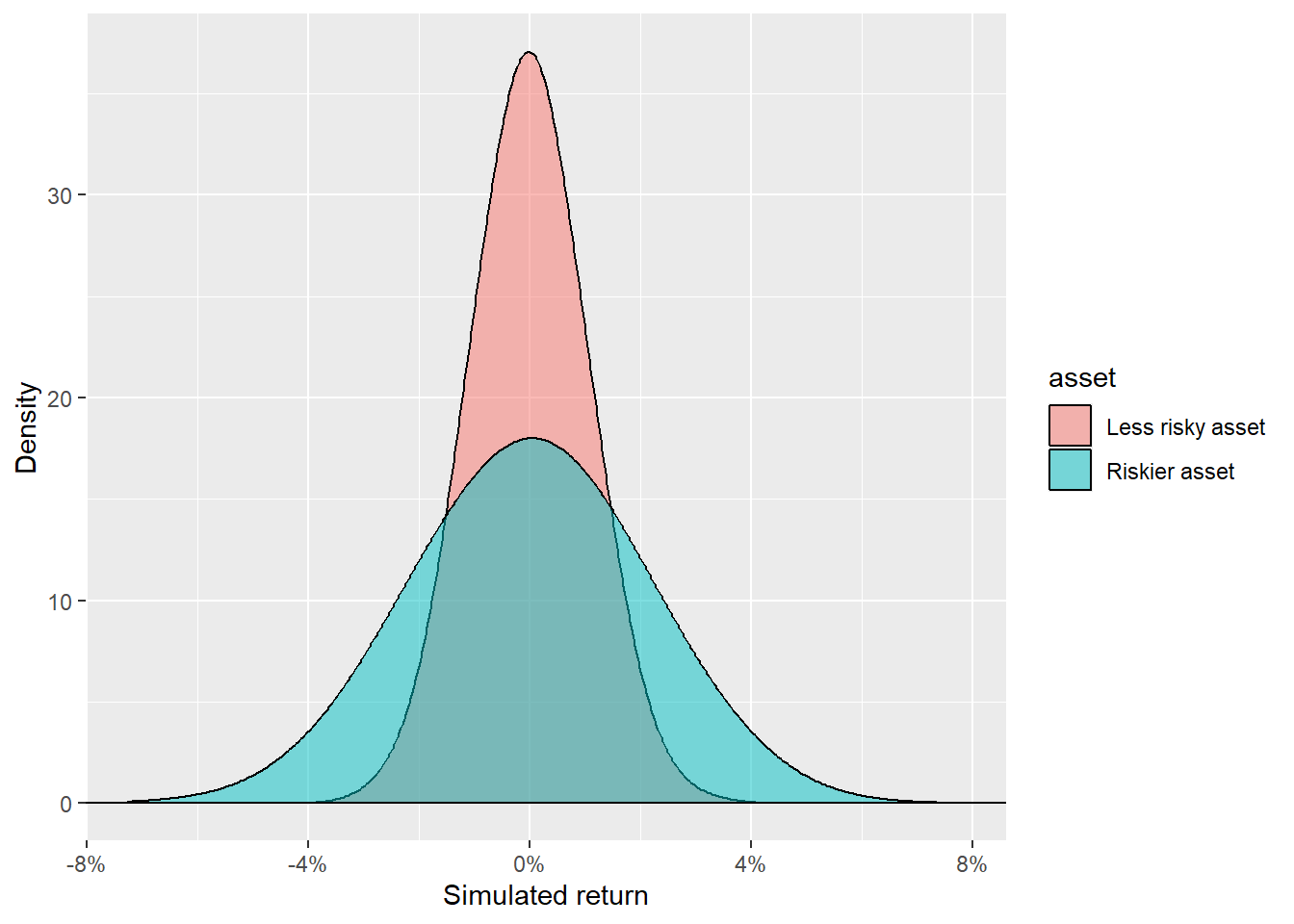
The riskier asset can take a wider range of returns. Most simulated observations for the less risky asset are closer to zero; the riskier asset has wider tails. The code generates 10,000 random values following a normal distribution with mean zero, and standard deviations of 1% and 2% for the less risky and riskier asset respectively.
The next chapter uses this same return language in a trading workflow. The book moves from describing return distributions to building lagged indicators that become inputs for a simple robo trader. The goal is to see how prices and returns can be transformed into trading signals while keeping the timing of the information explicit.