4 Return co-movement and beta
The previous chapter used prices, returns, indicators, and a classifier to build a simple trading rule. This chapter changes the modeling question. The focus is return co-movement: how one asset’s returns move with related firms and with a broad market benchmark.
Asset-pricing theory connects expected returns with the risks investors bear. This chapter takes a narrower applied route. The practical question is how much of an asset’s return moves with a broader market or risk factor, and how much remains specific to the asset. The chapter introduces that question with pairs of related stocks, then moves to a single-index model in which each stock return is compared with a market return.
The models are simplifications. Many risk factors have been proposed in the literature, and no short example can explain all observed prices or returns. The goal here is to estimate exposures, read beta as a sensitivity measure, and use those estimates as inputs for portfolio thinking.
4.1 Drivers of asset return changes
Stock returns change as expectations change. New information about the firm, the industry, the economy, liquidity, interest rates, or market risk can affect demand and supply for the stock. The modeling question is to identify which sources of variation are broad enough to be treated as risk factors and how strongly each asset responds to them.
Risk factors are useful because they organize return variation. Industry exposure, market exposure, firm size, valuation ratios, liquidity, and macroeconomic conditions can all affect expected returns. This applied chapter begins with a simple version of that idea: related firms often share risk factors, and their returns may move together.
Mastercard and Visa provide a natural starting point. They operate in the same broad payments industry and are exposed to similar payment volumes, consumer spending, regulation, technology, and market conditions. If the firms share important risk factors, their stock returns should show a positive relationship. The chapter starts there before moving to the broader market model.
The first comparison uses cumulative returns and the same wealth-index logic introduced earlier in the book.
The prices are then transformed into cumulative returns and plotted. With log returns \(r_t=\log(P_t/P_{t-1})\), the wealth index used in the plot is defined below.
\[ W_t = 100 \exp\left(\sum_{j=1}^{t}r_j\right). \]
This is the log-return version of the same compounding idea used elsewhere in the book.
Code
# Transform prices into log returns.
stock_cumret_MA_V <- stock_prices_MA_V |>
    tq_transmute(adjusted,
                 periodReturn,
                 period = "daily",
                 type = "log",
                 col_rename = "returns") |>
# Create the wealth index.
    mutate(wealth.index = 100 * exp(cumsum(returns)))
# Visualize the wealth index.
ggplot(stock_cumret_MA_V, aes(x = date, y = wealth.index, color = symbol)) +
  geom_line(size = 1, alpha = 0.7) +
    geom_point(aes(x = as.Date("2015-01-01"), y = 100),
             size = 4, col = "black", alpha = 0.5) +
  labs(subtitle = "100 USD investment growth from 2015-01-01 to 2016-12-31.") +
  theme_tq() +
  scale_color_tq() +
  scale_y_continuous(labels = scales::dollar)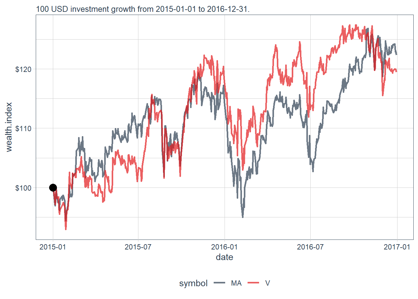
The two wealth-index paths move closely together. Their upward and downward movements are similar over this period, which suggests strong co-movement before any formal model is estimated. The final values provide a numerical check.
Code
# A tibble: 6 × 3
  date          MA     V
  <date>     <dbl> <dbl>
1 2016-12-22  124.  119.
2 2016-12-23  124.  120.
3 2016-12-27  124.  120.
4 2016-12-28  123.  120.
5 2016-12-29  123.  120.
6 2016-12-30  122.  119.
The 100 USD investment growth is almost the same in both assets by the end of the investment period.
Daily returns provide a more direct way to evaluate whether both stocks move together.
Code
# Show the return relationship.
stock_ret_MA_V <- stock_prices_MA_V |>
    tq_transmute(select     = adjusted,
                 mutate_fun = periodReturn,
                 period     = "daily",
                 type       = "log",
                 col_rename = "returns")

ggplot(stock_ret_MA_V, aes(x = date, y = returns, group = symbol)) +
  geom_line(aes(color = symbol), alpha = 0.6) +
  labs(subtitle = "The time-series overlay hides the cross-asset relationship.") +
  theme_tq()+
  scale_y_continuous(labels = scales::percent)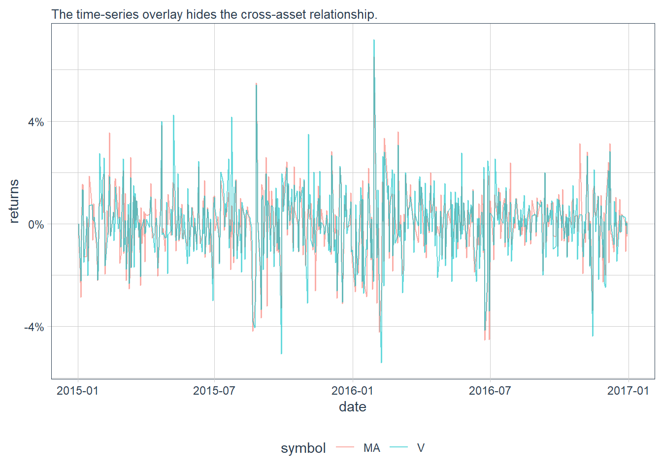
The time-series overlay is useful for chronology, but it hides the cross-asset relationship. A scatter plot of Visa returns against Mastercard returns shows the co-movement more clearly.
Code
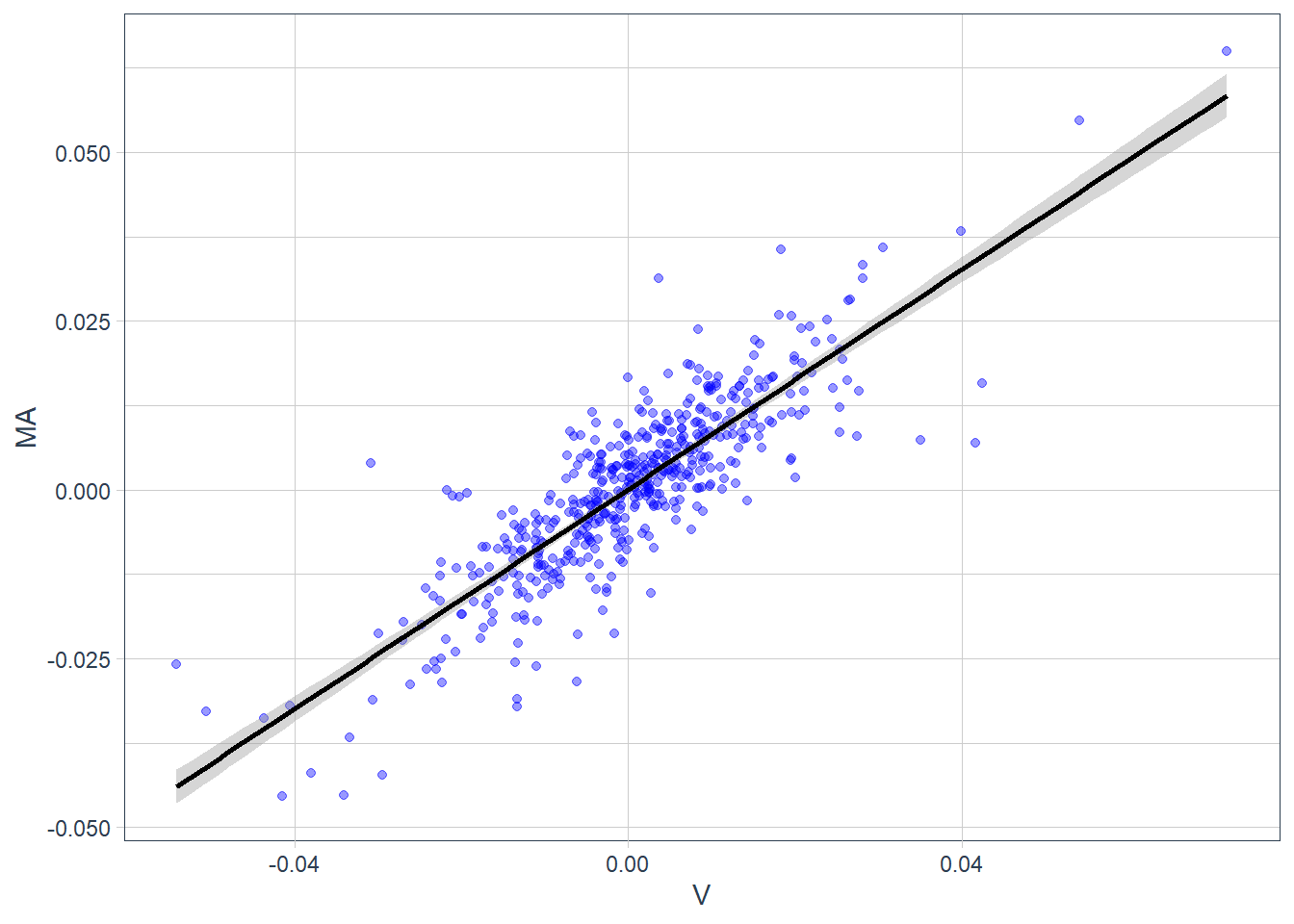
The scatter plot removes time from the display and focuses on paired daily returns. Each point represents one trading day, with Visa’s return on the horizontal axis and Mastercard’s return on the vertical axis. Low Visa returns tend to appear with low Mastercard returns, and high Visa returns tend to appear with high Mastercard returns. The positive relationship looks strong and approximately linear, so a fitted line can summarize the co-movement across the 504 daily pairs.
The fitted line summarizes the relationship because most points lie close to it. The general equation of a straight line is \(y = a + bx\), where \(a\) is the intercept and \(b\) is the slope. The slope measures the change in \(y\) associated with a one-unit change in \(x\). A slope of zero would indicate no linear relationship, while a slope of 1 would indicate a one-for-one movement. The sign of \(b\) indicates whether the relationship is positive or negative. The plot suggests that \(b\) is positive and close to 1.
In this case, the general model is \(MA_i = \alpha+\beta V_i\), where \(i=1,...,504\) because the sample contains 504 paired observations of Mastercard and Visa returns. A simple linear regression estimates the values of \(\alpha\) and \(\beta\) that best summarize the observed linear relationship between \(MA\) and \(V\).
Code
Call:
lm(formula = MA ~ V, data = reg)

Residuals:
       Min         1Q     Median         3Q        Max
-0.0269577 -0.0039656  0.0002149  0.0039650  0.0289466

Coefficients:
             Estimate Std. Error t value Pr(>|t|)
(Intercept) 0.0001130  0.0003097   0.365    0.715
V           0.8133647  0.0226393  35.927   <2e-16 ***
---
Signif. codes:  0 '***' 0.001 '**' 0.01 '*' 0.05 '.' 0.1 ' ' 1

Residual standard error: 0.00695 on 502 degrees of freedom
Multiple R-squared:   0.72, Adjusted R-squared:  0.7194
F-statistic:  1291 on 1 and 502 DF,  p-value: < 2.2e-16
The estimated model is \(MA_i = 0.0001130+0.8133658 V_i\). In this sample, a 1% return on Visa is associated with a 0.8133658% return in Mastercard under the fitted linear model. The fit is strong for a two-stock daily-return regression. The reading is co-movement, and causal interpretation would require a different research design.
The following observation gives a concrete numerical example.
# A tibble: 1 × 3
  date           MA      V
  <date>      <dbl>  <dbl>
1 2015-04-22 0.0383 0.0399
Consider the observation pair \(V=0.03989731\), \(MA=0.03833513\). According to the regression line, the value of \(MA\) at \(V=0.03989731\) should be \(MA = 0.0001130 + 0.03989731 \times 0.8133658 = 0.03256411\). The difference between the observed 3.833513% and the estimated 3.256411% is the estimation error. The observed value is higher than the estimated value, so this observation is slightly above the blue regression line.
The regression uses Visa returns as an explanatory variable for Mastercard returns. In this sample, a positive Visa return is associated with a positive Mastercard return, and the estimated beta of 0.8133658 indicates that Mastercard moves less than one-for-one with Visa under this specification. Pearson correlation provides a complementary summary of linear association. It has a value between +1 and -1. A value of +1 is perfect positive linear correlation, 0 is no linear correlation, and -1 is perfect negative linear correlation. Beta is related to covariance and variance, so it can be higher than +1 or lower than -1.
In this case, the correlation of Visa and Mastercard stock returns is 0.8485187. This value is close to 1, so the two series are strongly positively correlated in this sample. The result is consistent with the fact that both firms are exposed to similar business models, payment activity, consumer spending, and broad market conditions.
The next figure adds a 1:1 reference line in red.
Code
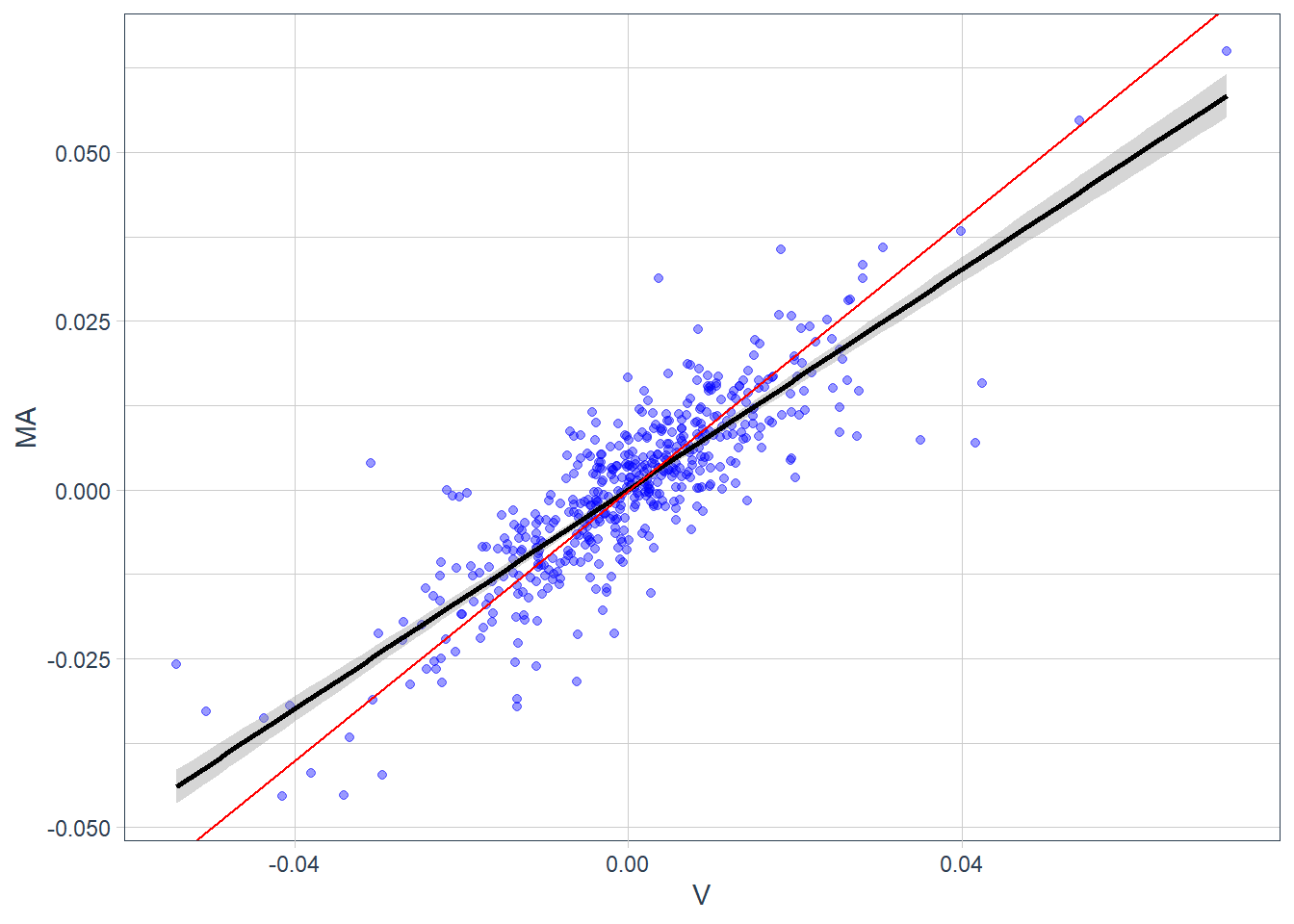
The strength of this fit can be measured by the R-squared. In this regression, the R-squared value reports the share of Mastercard return variation associated with Visa return variation through the fitted linear model. In particular, almost 72% of the sample variation in \(MA\) is captured by variation in \(V\). The remaining 28% is residual variation under this specification and could motivate additional risk factors, a different model, or a different sample.
The first regression used Visa returns as the explanatory variable for Mastercard returns. Reversing the direction gives a similar descriptive relationship. At this stage, the exercise describes co-movement; causal interpretation would require a different design.
Call:
lm(formula = V ~ MA, data = reg)

Residuals:
      Min        1Q    Median        3Q       Max
-0.034373 -0.003965 -0.000033  0.003423  0.035421

Coefficients:
              Estimate Std. Error t value Pr(>|t|)
(Intercept) -1.104e-06  3.231e-04  -0.003    0.997
MA           8.852e-01  2.464e-02  35.927   <2e-16 ***
---
Signif. codes:  0 '***' 0.001 '**' 0.01 '*' 0.05 '.' 0.1 ' ' 1

Residual standard error: 0.00725 on 502 degrees of freedom
Multiple R-squared:   0.72, Adjusted R-squared:  0.7194
F-statistic:  1291 on 1 and 502 DF,  p-value: < 2.2e-16
The reverse regression estimates \(V_i = \alpha+\beta MA_i\), with fitted equation \(V_i = -1.104 \times 10^{-5}+0.8852 MA_i\).
4.2 Single-index model
The risk-return trade-off is central to equilibrium asset-pricing theories and models. A full treatment would require more theory, derivation, assumptions, and econometric diagnostics than this chapter can cover. The goal here is applied: motivate the main modeling idea, estimate the relevant quantities in R, and read what the output contributes to the broader portfolio workflow.
The same idea can be extended from two related firms to a market benchmark. The return of an individual asset can be compared with the return of a broad market index. The S&P 500 is commonly used for this purpose because it summarizes the performance of large publicly traded firms in the United States.
Market indexes such as the S&P 500 are important because they summarize broad market behavior. A single stock price tracks one company; an index tracks a basket of constituents. Some indexes are country-specific, while others are based on industries, firm size, or other characteristics. Index returns provide a compact measure of the average movement of a market segment. If the S&P 500 increases on a given day, the usual interpretation is that the large firms represented in the index increased in aggregate value.
The market model is estimated with a regression. \(R_{i,j} = \alpha_i + \beta_i R_{m,j} + \epsilon_{i,j}\), where \(i\) represents a given stock and \(j\) the historical observation. The term \(R_{m,j}\) is the market return, here approximated with the S&P 500. This is a single-index model because it uses one market factor. Multi-factor models add other risk factors, as in the equation below. \(R_{i,j} = \alpha_i + \beta_i R_{m,j} + \delta_i F_j + \epsilon_{i,j}\).
According to the single-index model, the stock return is decomposed into three parts: an intercept \(\alpha_i\), a component proportional to the market index \(\beta_i R_{m,j}\), and a residual component \(\epsilon_{i,j}\). The intercept is the expected return when the market return is zero in this sample regression. It is often discussed as abnormal performance, and that interpretation requires statistical tests and a more formal model. Beta measures the security’s sensitivity to market movements. The residual captures firm-specific variation left after the market component. This simple decomposition can oversimplify real uncertainty because industry events, liquidity conditions, accounting news, and macroeconomic shocks can affect assets in different ways.
The single-index model is estimated for 10 stocks, \(i=1,...10\), using 72 monthly return observations, \(j=1,...,72\). The estimation objective is to obtain \(\alpha_i\) and \(\beta_i\) for each stock.
The estimation starts by downloading the corresponding 10 monthly stock returns. The set keeps the same broad sector logic: VTR represents healthcare real estate exposure and VOD represents telecommunications exposure.
Code
# Download individual asset returns.
R_stocks <- c("NEM", "AMCR", "CLX", "VTR", "KR", "TXN", "F", "TXT",
              "KLAC", "VOD") |>
  tq_get(get = "stock.prices", from = "2010-01-01",
         to = "2015-12-31") |>
  group_by(symbol) |>
  tq_transmute(select     = adjusted,
               mutate_fun = periodReturn,
               period     = "monthly",
               col_rename = "R_stocks")
R_stocks
# A tibble: 692 × 3
# Groups: symbol [10]
symbol date R_stocks
<chr> <date> <dbl>
1 NEM 2010-01-29 -0.115
2 NEM 2010-02-26 0.150
3 NEM 2010-03-31 0.0355
4 NEM 2010-04-30 0.101
5 NEM 2010-05-28 -0.0403
6 NEM 2010-06-30 0.149
7 NEM 2010-07-30 -0.0946
8 NEM 2010-08-31 0.0970
9 NEM 2010-09-30 0.0268
10 NEM 2010-10-29 -0.0310
# ℹ 682 more rowsThe market benchmark is the monthly return of the S&P 500, identified by the symbol ^GSPC.
Code
# A tibble: 72 × 2
   date       R_market
   <date>        <dbl>
 1 2010-01-29  -0.0522
 2 2010-02-26   0.0285
 3 2010-03-31   0.0588
 4 2010-04-30   0.0148
 5 2010-05-28  -0.0820
 6 2010-06-30  -0.0539
 7 2010-07-30   0.0688
 8 2010-08-31  -0.0474
 9 2010-09-30   0.0876
10 2010-10-29   0.0369
# ℹ 62 more rows
The individual stock returns and market returns are joined into one object for estimation.
Code
# A tibble: 692 × 4
# Groups:   symbol [10]
   symbol date       R_stocks R_market
   <chr>  <date>        <dbl>    <dbl>
 1 NEM    2010-01-29  -0.115   -0.0522
 2 NEM    2010-02-26   0.150    0.0285
 3 NEM    2010-03-31   0.0355   0.0588
 4 NEM    2010-04-30   0.101    0.0148
 5 NEM    2010-05-28  -0.0403  -0.0820
 6 NEM    2010-06-30   0.149   -0.0539
 7 NEM    2010-07-30  -0.0946   0.0688
 8 NEM    2010-08-31   0.0970  -0.0474
 9 NEM    2010-09-30   0.0268   0.0876
10 NEM    2010-10-29  -0.0310   0.0369
# ℹ 682 more rows
The tq_performance() function estimates the CAPM-style summary for each stock.
Code
# A tibble: 10 × 4
# Groups:   symbol [10]
   symbol   Alpha  Beta `R-squared`
   <chr>    <dbl> <dbl>       <dbl>
 1 NEM    -0.0084 0.155      0.0032
 2 AMCR    0.0035 0.415      0.0748
 3 CLX     0.0097 0.434      0.195
 4 VTR     0.0029 0.519      0.0982
 5 KR      0.0165 0.713      0.215
 6 TXN     0.0032 1.27       0.575
 7 F      -0.0032 1.39       0.400
 8 TXT     0.0009 1.64       0.431
 9 KLAC    0.0024 1.74       0.541
10 VOD     0.0036 0.799      0.255
The table reports the single-index model estimates for the 10 stocks.
The stocks are arranged by beta. In this specification, beta measures the stock’s exposure to S&P 500 movements. Stocks with low betas are less exposed to market changes, while stocks with high betas are more exposed. A beta greater than 1 means that the stock tends to react more than proportionally to changes in the market benchmark.
Deeper econometric analysis would be needed to validate these interpretations. Alphas are all very close to zero in this sample. The R-squared is also relevant because it reports the proportion of stock-return variation associated with market-return variation in the fitted model. These estimates are descriptive. A formal interpretation would require standard errors, p-values, diagnostics, and usually excess returns over a risk-free rate.
The previous estimates can be compared graphically.
Code
R_stocks_market$symbol <-
  factor(R_stocks_market$symbol, levels =
           unique(R_stocks_market$symbol))
# Plot all results.
R_stocks_market |>
  ggplot(aes(x = R_market, y = R_stocks, color = symbol)) +
  geom_point(alpha = 0.4) +
  geom_smooth(method = "lm", se = FALSE, size = 2) +
  facet_wrap(~symbol, ncol = 5) +
  geom_abline(intercept = 0, color = "black", linetype = 1) +
  theme_minimal() +
  labs(x = "SP500 return", y = "Asset return") +
  theme(legend.position = "none", legend.title = element_blank())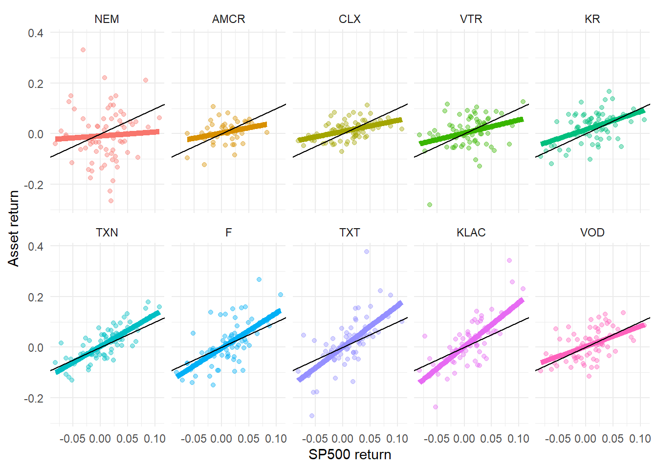
The stocks are sorted so that beta increases across facets. The black line represents \(\beta = 1\) and helps identify assets that are less sensitive or more sensitive than the market benchmark. The \(y\)-axis represents asset returns and the \(x\)-axis represents S&P 500 returns.
Beta is useful because it translates market exposure into a portfolio decision. A portfolio with low-beta stocks is expected to be less sensitive to broad market movements, while a portfolio with high-beta stocks is expected to amplify those movements. This interpretation depends on the historical sample, the market benchmark, and the stability of the estimated relationship.
In practice, beta estimates require statistical checks. Standard errors, p-values, diagnostics, benchmark choice, return frequency, and sample length can change the estimate and its interpretation. Financial sites often report betas without enough detail about the estimation procedure, so professional use requires a transparent and documented methodology. The interpretation above assumes that the estimated betas are stable enough for the intended analysis.
The Capital Asset Pricing Model (CAPM) was created by William Sharpe in 1964, see Sharpe (1964). He won the 1990 Nobel Prize in Economic Sciences, along with Harry Markowitz and Merton Miller, for developing models to assist with investment decision making like the CAPM. CAPM links expected excess return to beta and the market risk premium. The regression above estimates beta from historical returns; CAPM uses beta inside an equilibrium statement about expected returns. In this chapter, the estimated betas serve as a practical bridge between the empirical market model and the CAPM intuition.
The same 10-asset set can also be summarized with annualized returns and annualized Sharpe ratios. With a zero risk-free rate, the annualized Sharpe ratio reported below follows:
\[ SR=\frac{E(R)-R_f}{\sigma(R)}, \qquad R_f=0. \]
Code
# A tibble: 10 × 4
# Groups:   symbol [10]
   symbol AnnualizedReturn `AnnualizedSharpe(Rf=0%)` AnnualizedStdDev
   <fct>             <dbl>                     <dbl>            <dbl>
 1 NEM             -0.139                     -0.385            0.361
 2 F                0.0756                     0.262            0.289
 3 VTR              0.069                      0.316            0.218
 4 TXT              0.146                      0.445            0.329
 5 AMCR             0.0782                     0.489            0.16
 6 VOD              0.115                      0.55             0.209
 7 KLAC             0.187                      0.598            0.312
 8 TXN              0.164                      0.745            0.220
 9 CLX              0.167                      1.29             0.129
10 KR               0.288                      1.42             0.203
A stock beta measures individual asset sensitivity with respect to the market. The annualized Sharpe ratio above measures return per unit of risk. The annualized Sharpe ratios reported by table.AnnualizedReturns use a zero risk-free rate by default, as shown in the column name. If a nonzero risk-free rate is relevant, these values should be recomputed with that assumption. The next figure compares these two dimensions visually.
Code
# Calculate annualized returns.
R_stocks_market_stats <- R_stocks_market |>
    tq_performance(Ra = R_stocks, Rb = NULL,
                   performance_fun = table.AnnualizedReturns) |>
# Mean variance plot.
  ggplot(aes(x = AnnualizedStdDev, y = AnnualizedReturn, color = symbol)) +
  geom_point(size = 5) +
  geom_abline(intercept = 0, color = "red") +
  geom_text(aes(label = paste0(round(`AnnualizedSharpe(Rf=0%)`, 3))),
            vjust = 2, color = "black", size = 3.5) +
  geom_text(aes(label = paste0(symbol)),
            vjust = -1, color = "black", size = 3.5) + ylim(-0.17, 0.35) +
  labs(subtitle = "Numerical values represent return per unit of risk.",
       x = "Risk", y = "Expected return") +
  theme_tq() +
  theme(legend.position = "none", legend.title = element_blank())

R_stocks_market_stats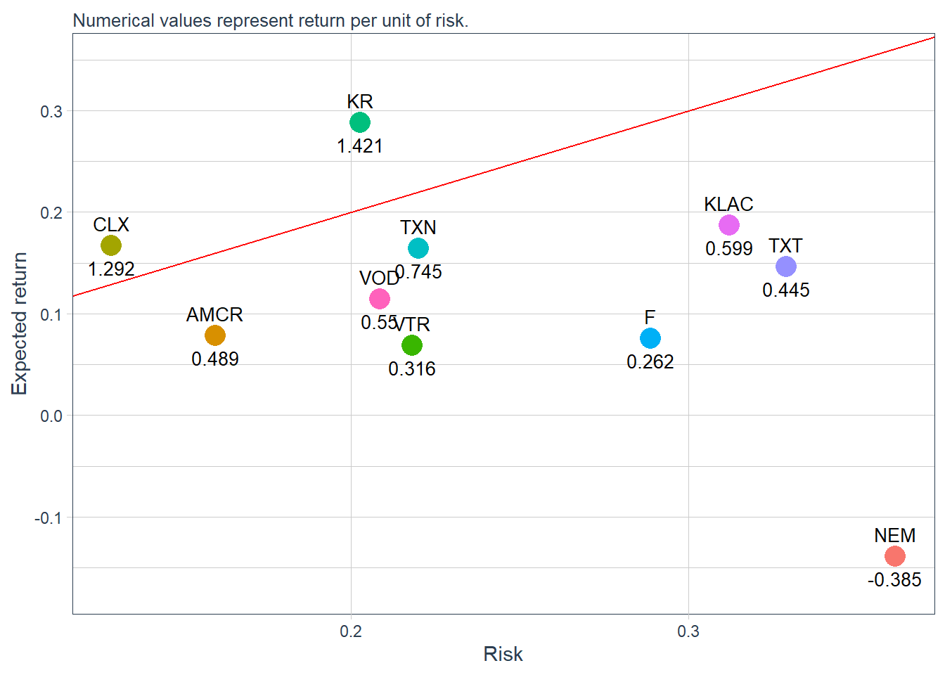
The reference line has slope 1. Assets above this line have return per unit of risk above 1 under the zero risk-free-rate convention used here. Assets below the line have return per unit of risk below 1.
The Sharpe ratio can also be shown directly.
Code
R_stocks_market_stats <- R_stocks_market |>
    tq_performance(Ra = R_stocks, Rb = NULL,
                   performance_fun = table.AnnualizedReturns) |>
  rename("Sharpe" = `AnnualizedSharpe(Rf=0%)`) |>
  ggplot(aes(x = symbol, y = Sharpe, fill = Sharpe)) +
  geom_bar(stat = "identity") +
  scale_fill_gradient(low = "red", high = "blue")

R_stocks_market_stats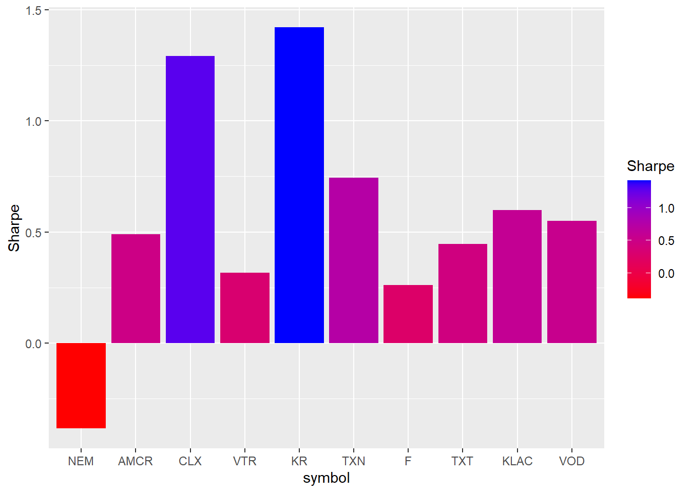
The beta and Sharpe-ratio estimates can also be used to form simple portfolio comparisons. A portfolio combines several smaller positions into a single investment object. The first benchmark is an equally weighted portfolio with 10% invested in each of the 10 assets. It gives every asset the same weight, with no tilt toward high-beta or high-Sharpe-ratio stocks.
For \(N=10\) assets, the equal weight is defined below.
\[ w_i=\frac{1}{N}=0.1. \]
Code
# Weights.
wts <- c(0.1, 0.1, 0.1, 0.1, 0.1, 0.1, 0.1, 0.1, 0.1, 0.1)
# Portfolio creation.
portfolio_returns_monthly <- R_stocks_market |>
    tq_portfolio(assets_col  = symbol,
                 returns_col = R_stocks,
                 weights     = wts,
                 col_rename  = "Ra")
portfolio_returns_monthly |>
  # Visualization.
  ggplot(aes(x = date, y = Ra)) +
  geom_bar(stat = "identity", fill = "blue") +
  labs(subtitle = "10% in each one of the 10 assets.",
       caption = "The fitted line summarizes the sample trend in monthly portfolio returns.",
       x = "", y = "Monthly returns") +
  geom_smooth(method = "lm", color = "red") +
  theme_tq() +
  scale_color_tq() +
  scale_y_continuous(labels = scales::percent)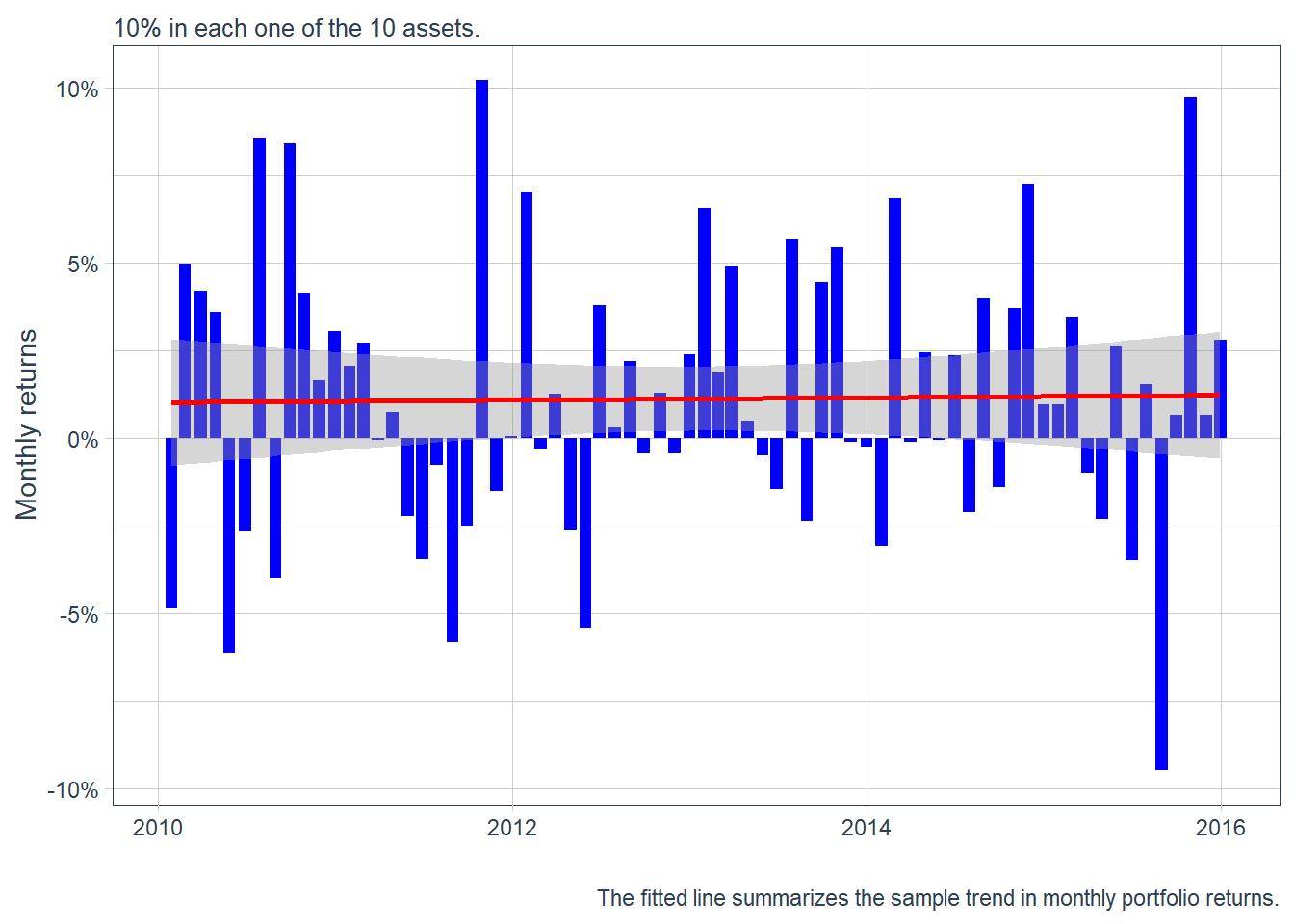
A monthly returns plot shows period-by-period variation. Investment growth shows the cumulative path. In this case, the initial investment is 10,000 USD. If \(R^p_t\) is the portfolio return, the dollar value is defined below.
\[ V_t = 10000\prod_{j=1}^{t}(1+R^p_j). \]
Code
# Cumulative returns.
portfolio_growth_monthly <- R_stocks_market |>
    tq_portfolio(assets_col   = symbol,
                 returns_col  = R_stocks,
                 weights      = wts,
                 col_rename   = "investment.growth",
                 wealth.index = TRUE) |>
    mutate(investment.growth = investment.growth * 10000)

portfolio_growth_monthly |>
  ggplot(aes(x = date, y = investment.growth)) +
  geom_line(size = 2, color = "blue") +
  geom_point(aes(x = as.Date("2010-01-01"), y = 10000),
             size = 4, col = "black", alpha = 0.4) +
  labs(subtitle = "10% in each one of the 10 assets.",
      caption = "Investment growth summarizes the portfolio path.",
      x = "", y = "Portfolio value") +
  geom_smooth(method = "loess", color = "black") +
  theme_tq() +
  scale_color_tq() +
  scale_y_continuous(labels = scales::dollar)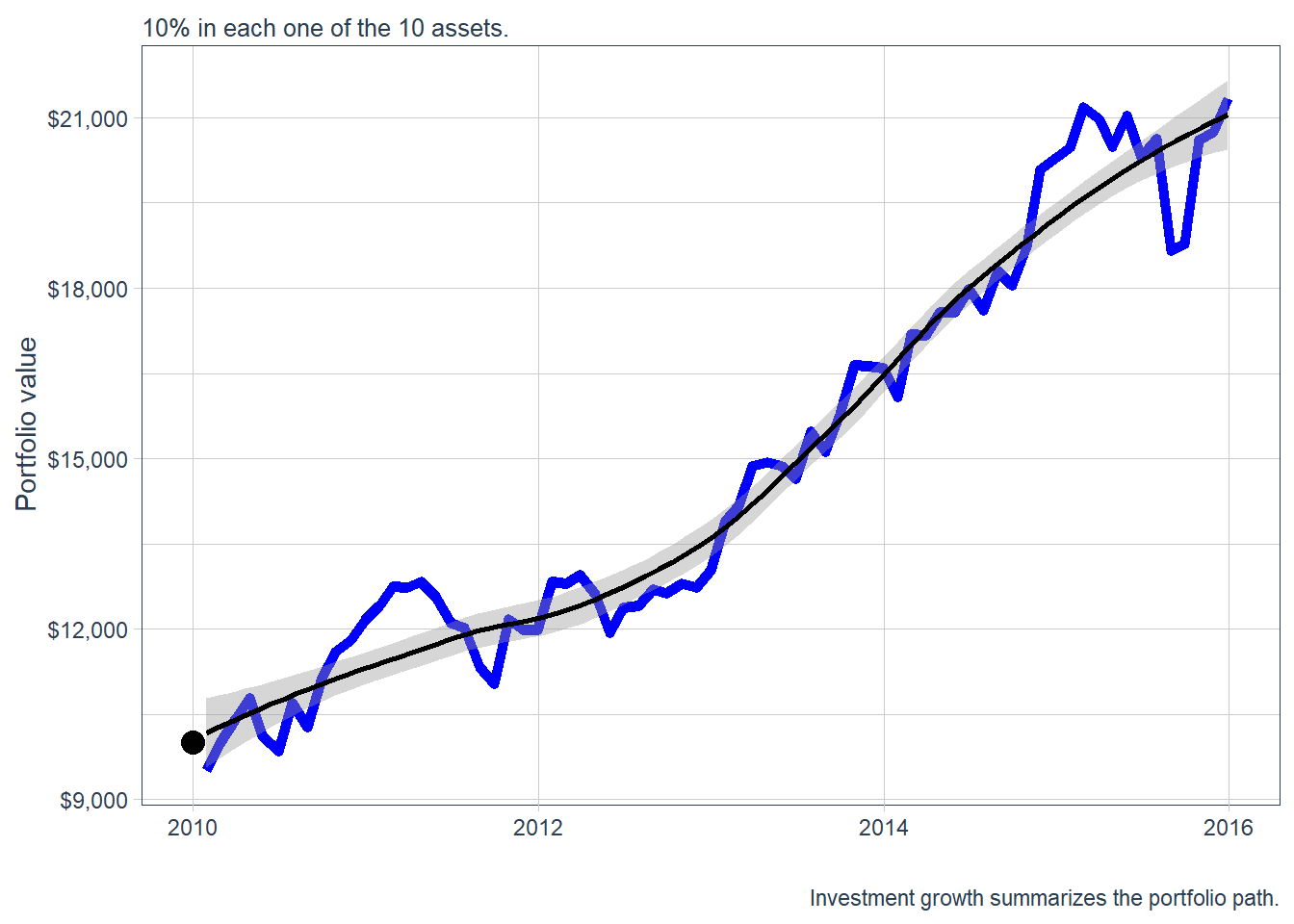
This gives a useful benchmark. The next comparison asks whether beta-based and Sharpe-ratio-based weights would have produced different investment growth. Two tilted portfolios are constructed: one allocates more weight to higher-beta stocks, and the other allocates more weight to higher-Sharpe-ratio stocks. In both cases, the largest four selected assets receive incremental weights of 10%, 20%, 30%, and 40%.
Code
# A tibble: 10 × 3
# Groups:   symbol [10]
   symbol `AnnualizedSharpe(Rf=0%)`  Beta
   <chr>                      <dbl> <dbl>
 1 NEM                       -0.385 0.155
 2 F                          0.262 1.39
 3 VTR                        0.316 0.519
 4 TXT                        0.445 1.64
 5 AMCR                       0.489 0.415
 6 VOD                        0.55  0.799
 7 KLAC                       0.598 1.74
 8 TXN                        0.745 1.27
 9 CLX                        1.29  0.434
10 KR                         1.42  0.713
Code
# Three portfolios.
weights <- c(
    0.1,0.1,0.1,0.1,0.1,0.1,0.1,0.1,0.1,0.1, # equally weighted
    0, 0, 0, 0, 0, 0, 0.1, 0.2, 0.3, 0.4, # sr increasing
    0, 0.2, 0, 0.3, 0, 0, 0.4, 0.1, 0, 0 # beta increasing
)

stocks <- c("NEM", "F", "VTR", "TXT", "AMCR", "VOD",
            "KLAC", "TXN", "CLX", "KR")
weights_table <-  tibble(stocks) |>
    tq_repeat_df(n = 3) |>
    bind_cols(tibble(weights)) |>
    group_by(portfolio)
The resulting portfolios can now be compared through their investment-growth paths.
Code
# See the evolution of three portfolios.
stock_returns_monthly_multi <- R_stocks_market |>
    tq_repeat_df(n = 3)

portfolio_growth_monthly_multi <- stock_returns_monthly_multi |>
    tq_portfolio(assets_col   = symbol,
                 returns_col  = R_stocks,
                 weights      = weights_table,
                 col_rename   = "investment.growth",
                 wealth.index = TRUE) |>
    mutate(investment.growth = investment.growth * 10000)
portfolio_growth_monthly_multi |>
  ggplot(aes(x = date, y = investment.growth, color = factor(portfolio))) +
    geom_line(size = 2) +
    geom_point(aes(x = as.Date("2010-01-01"), y = 10000),
             size = 4, col = "black", alpha = 0.4) +
    labs(title = "Portfolio growth of $10,000",
         subtitle = "1: Equally weighted; 2: Sharpe ratio; 3: Beta",
         caption = "Portfolio 2 has the highest terminal value in this sample.",
         x = "", y = "Portfolio value",
         color = "Portfolio") +
    geom_smooth(method = "loess") +
    theme_tq() + scale_color_tq() +
    scale_y_continuous(labels = scales::dollar)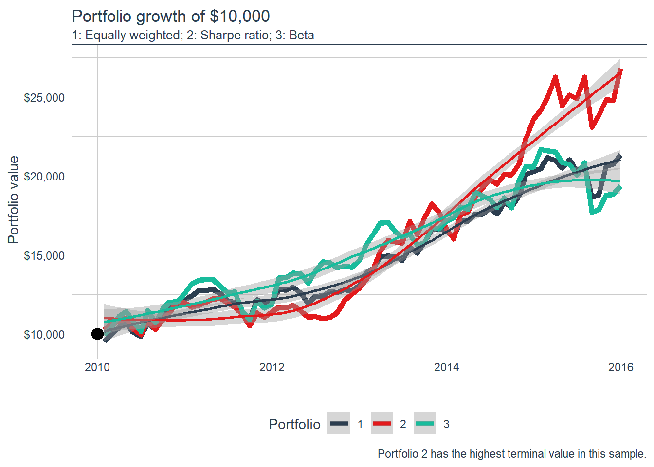
In this historical comparison, the increasing Sharpe ratio portfolio has the highest terminal investment value among the three alternatives. Its weights are 10% in KLAC, 20% in TXN, 30% in CLX, 40% in KR, and 0% in the rest.
The next section turns these return, risk, beta, and Sharpe-ratio summaries into an explicit allocation problem. Portfolio allocation asks which assets enter the portfolio and how much capital each one receives.